Role:
UX/UI Designer
Duration:
8 Months
Tools:
Figma, Photoshop, Lucid, Overflow, Pen & Paper
Problem
There are many existing journaling and note-taking apps on the market, but none seemed to address all of the frustrations I experienced. My entries were scattered among many different formats, which made consolidation and retrieval cumbersome and difficult. I also found myself regretting the times that I didn’t journal, by way of emotional processing as well as for posterity’s sake.
Objective
The primary goal behind the app was to enhance user engagement with journaling by addressing common challenges such as ease of access, organization, and privacy.
Solution
Research and Discovery
To develop a deeper understanding of our user's needs and preferences, we employed a range of research methods:
Secondary Research
Interviews: Offered insights into users' journaling habits and challenges.
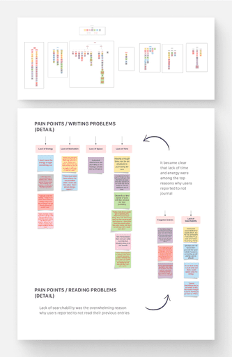
Affinity Maps and Empathy Maps: Helped visualize commonalities among user experiences
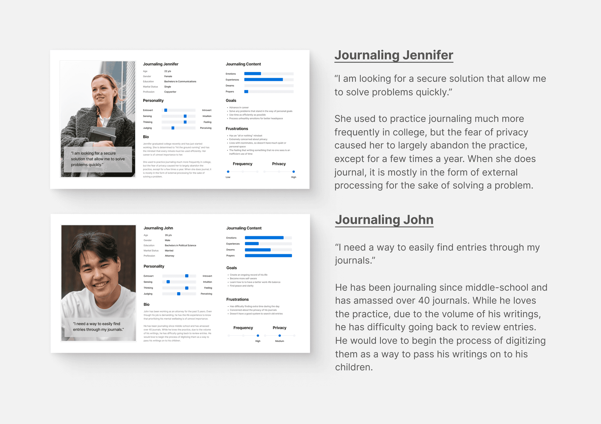
Personas and Jobs-to-be-Done: Assisted in identifying specific user goals.
Secondary Research
In order to better understand the broader context of journaling, as well as to inform and guide the direction of my project, I began with secondary research. Some of the key insights that I discovered were:
There is considerable scientific data to show that journaling has incredible emotional benefits. Compared to individuals who didn't have any journaling practice, those who journaled showed the biggest reduction in symptoms like depression, anxiety, and hostility.
Journaling can also provide some incredible physical benefits. Research finds that writing specifically boosts our immune system and could even make vaccines more effective.
Interviews
To gather user insights, I began the research phase with an initial screener questionnaire. From the responses, I selected 7 individuals for in-person interviews, ensuring a diverse representation of journaling habits and age ranges. These interviews provided a comprehensive understanding of the varying needs and frustrations users experience with existing journaling platforms.
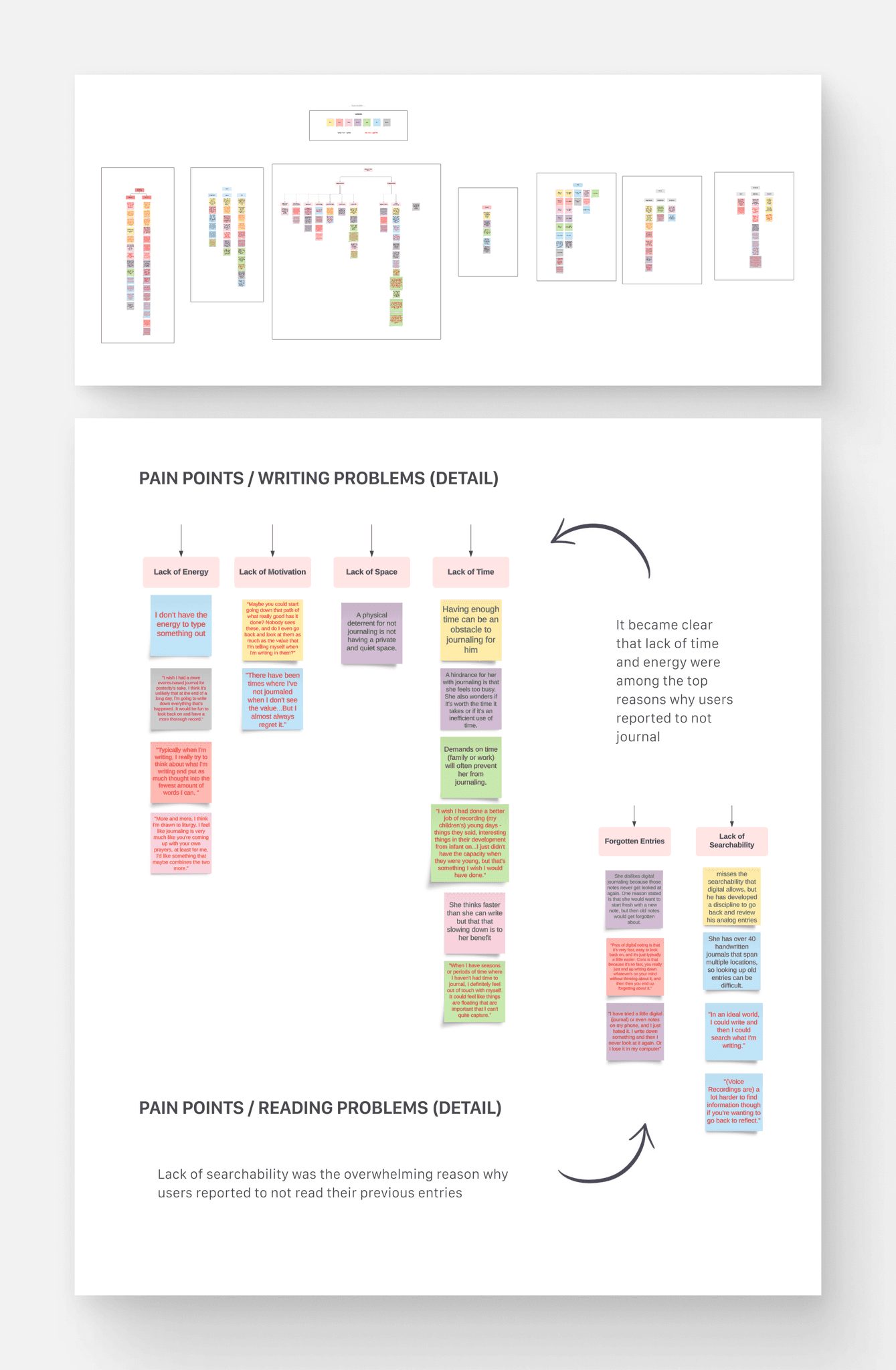
Affinity Map
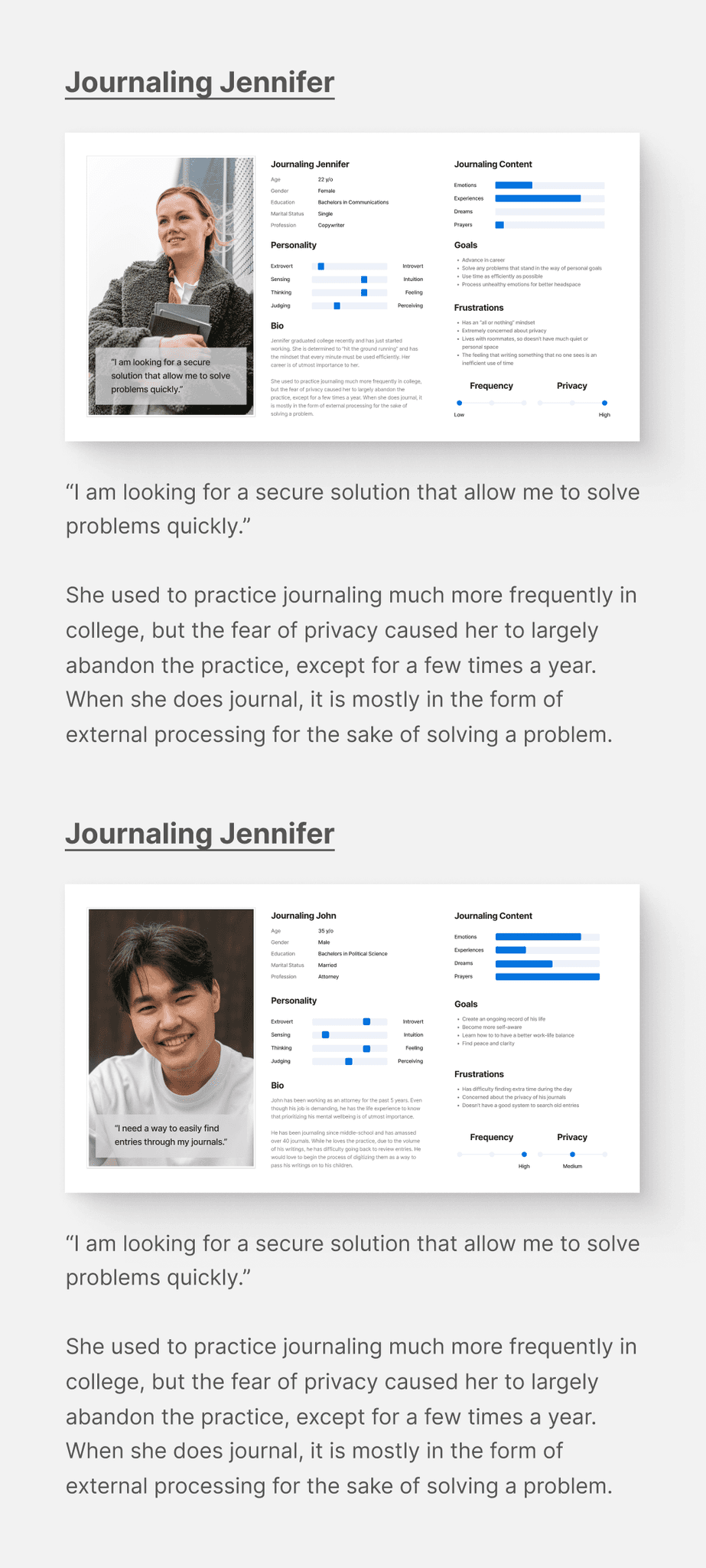
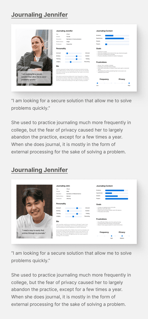
Personas
Key Insights
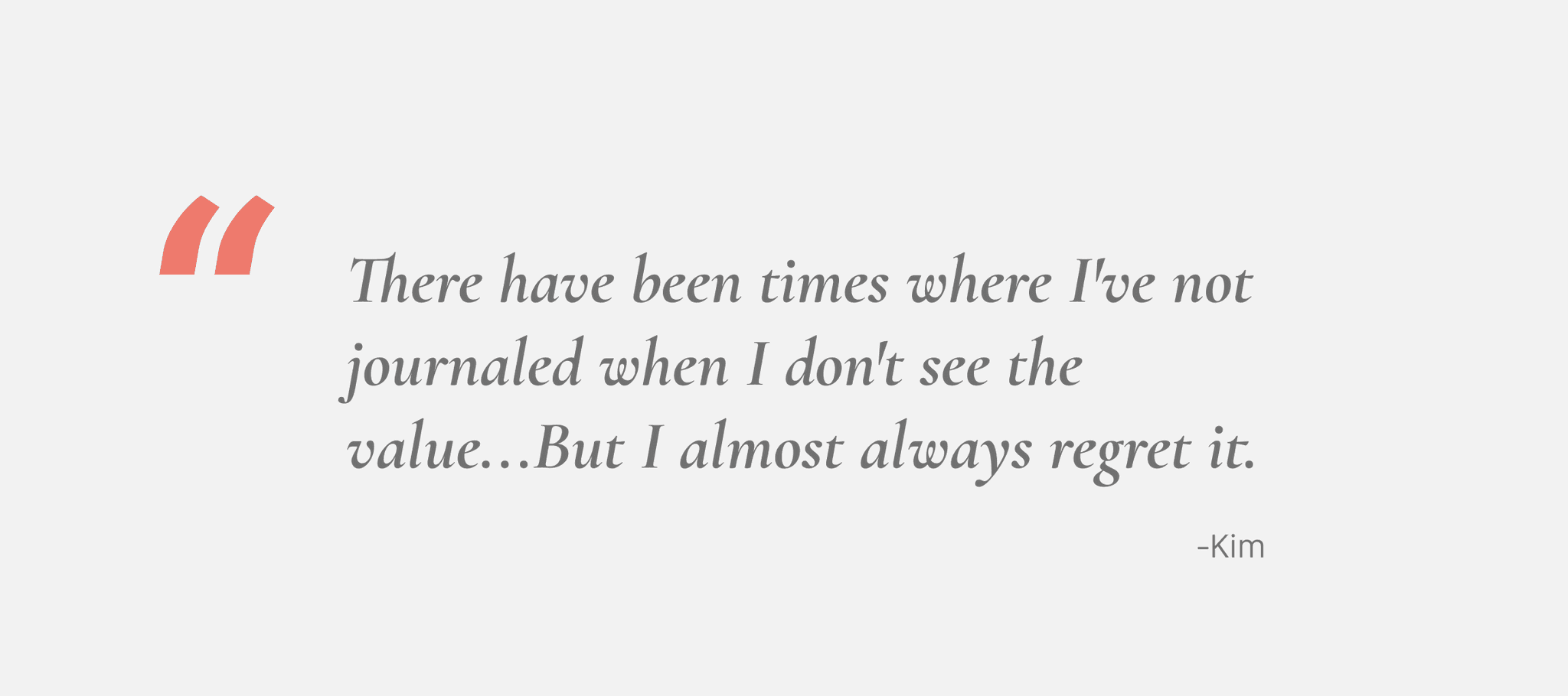
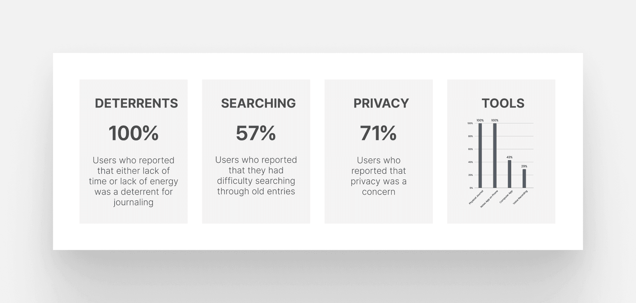
A pronounced gap existed between users' desire to journal and the act itself, primarily due to constraints like time and energy.
Locating past entries was a recurrent problem.
Almost all participants used note-taking apps and journaled at varying frequencies.
Privacy was cited as a huge concern for the majority of users
Design Process
User Stories
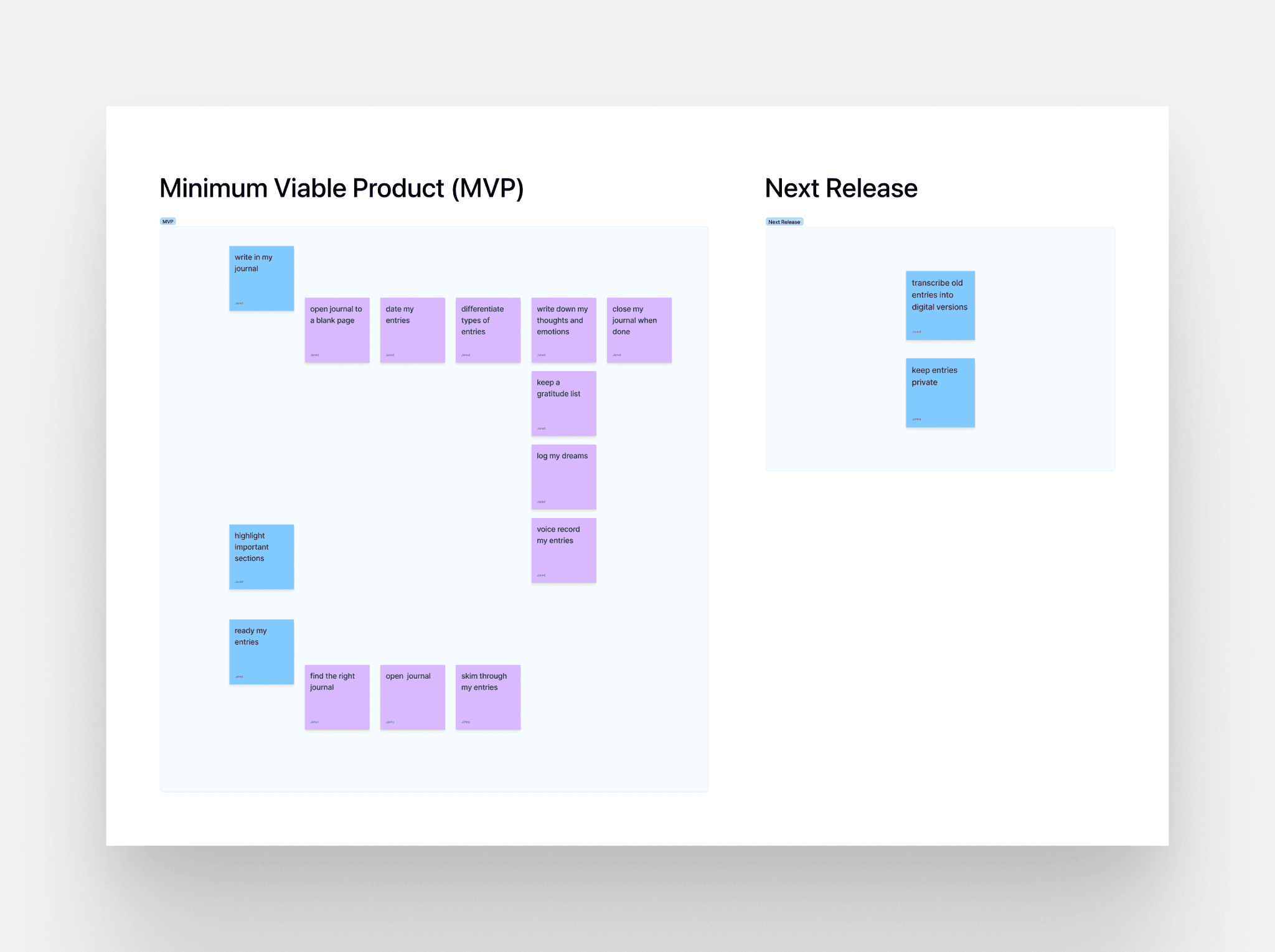
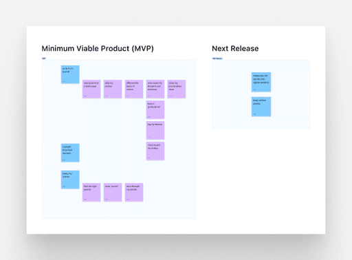
The first part of my design process was to create user stories that included an MVP (minimum viable product). Designing a product that only contained the essential features a user would need to complete critical tasks was useful to quickly validate my hypotheses.
Sitemap
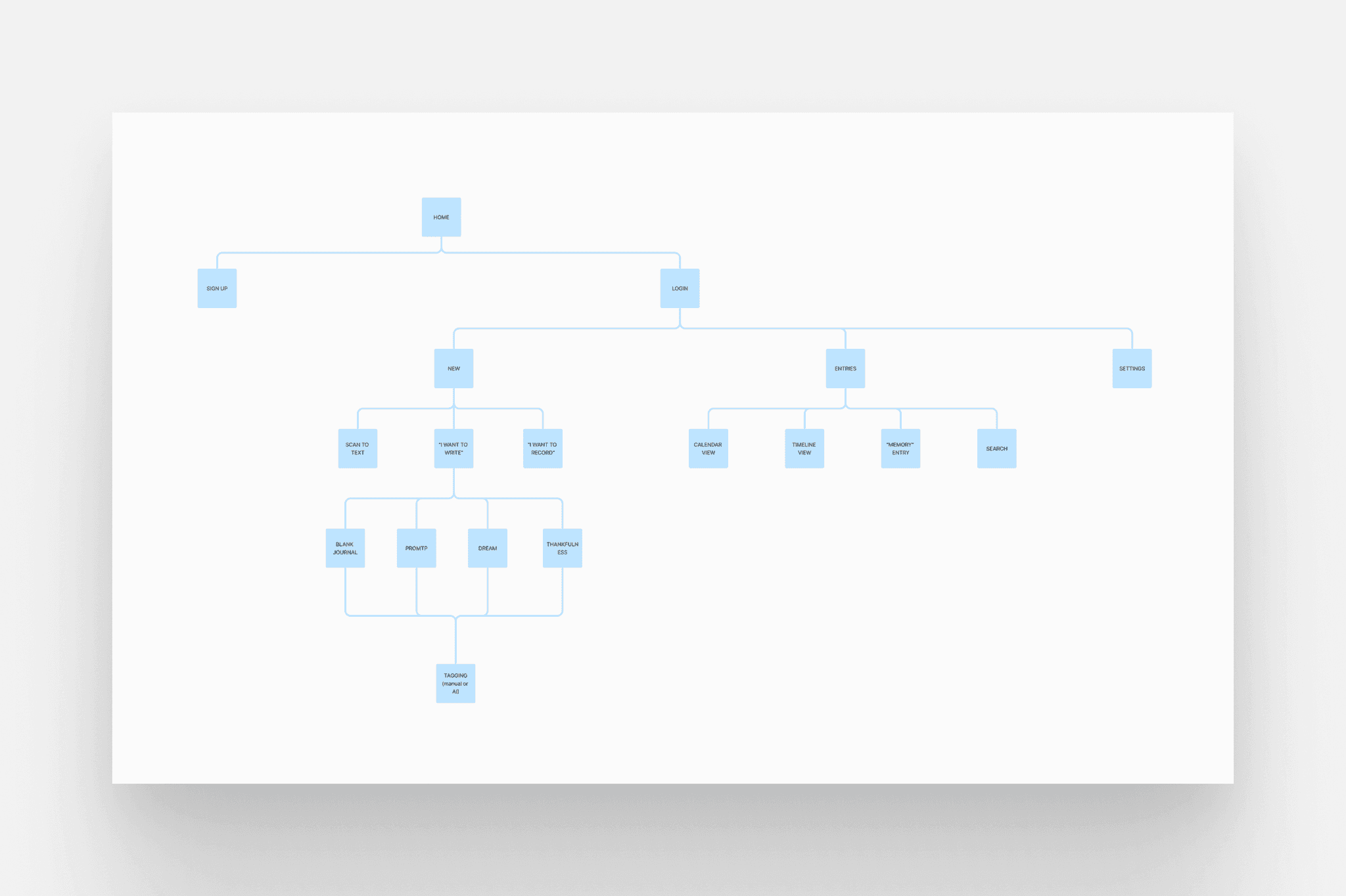
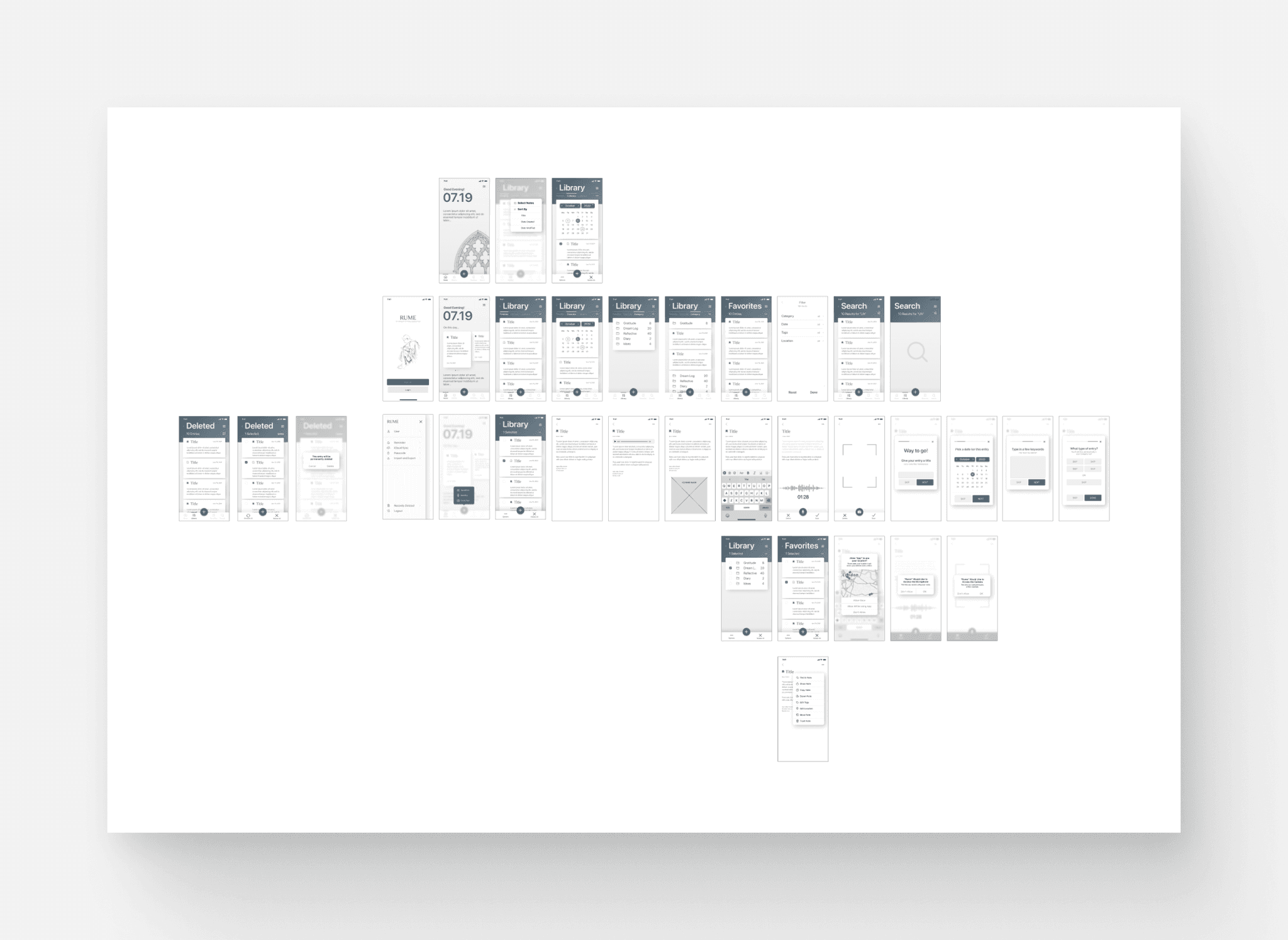
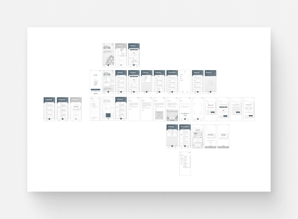
I then created a sitemap that helped me to keep track of all of the screens within my project and how to visualize how they were all connected.
Low-Fidelity
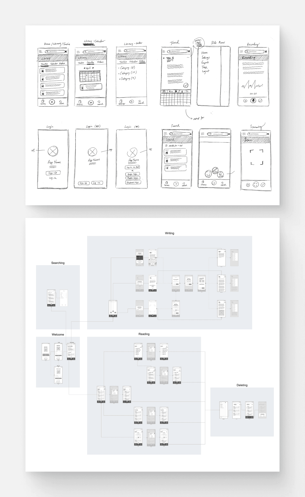
I began the design process by sketching key screens, which allowed for rapid iteration and concept validation. These allowed me to visualize different design ideas and conceptualizing the user flow.
After sketching, I created a series of low-fidelity designs which laid the foundational blueprint for the app's user interface and interaction flow. I then used those low-fidelity designs to create wireflows, which illustrates the app's navigational structure and the user journey from screen to screen.
Brand Identity
App Name
The app's name, "Rume," is derived from the term "ruminate," signifying deep thought and self-reflection — core elements of journaling. Additionally, "Rume" serves as a homonym for "room," reinforcing the idea of the app as a safe and welcoming space for contemplation.
Mission / Vision
Everyone should feel safe. We provide tools to help people process their thoughts, feelings, and emotions so that they can better understand themselves and the world around them.
Attributes
Calming, Effortless, Trustworthy, Organized, Sincere, Safe, Quiet
Style Guide
A style guide was instrumental in maintaining design consistency throughout the high-fidelity mockup stage. It served as a comprehensive reference for colors, typography, and UI elements, ensuring that the visual and interactive aspects of the app remained aligned with the brand attributes and overall vision.
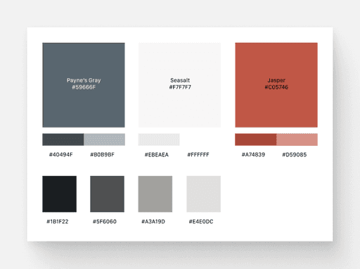
Color Palette
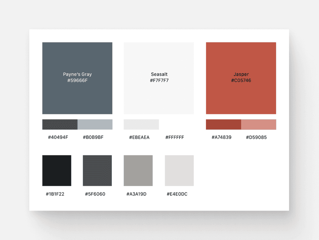
The color palette was inspired by the nuanced hues of old books and sacred texts, aiming to imbue the app with a sense of nostalgia, warmth, and the reverence of timeless wisdom.
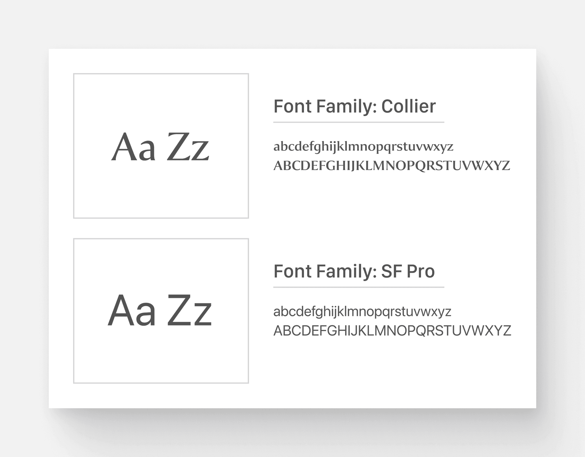
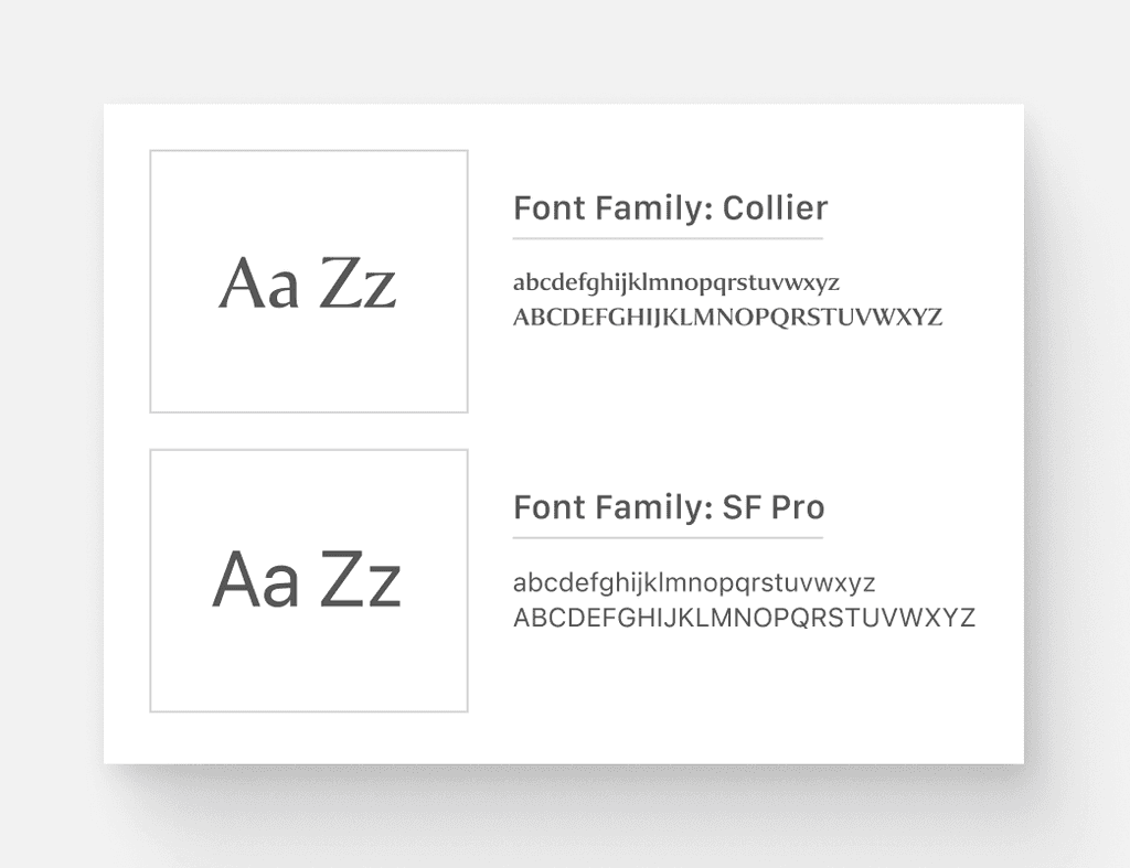
Typography
The choice of the Collier font was influenced by a desire to merge architectural elegance with readability, bridging the gap between serif and sans-serif while evoking a sense of history and gravitas. SF Pro was also chosen to complement Collier for its readability and to ensure a cohesive and functional text hierarchy within the app.
Image Assets
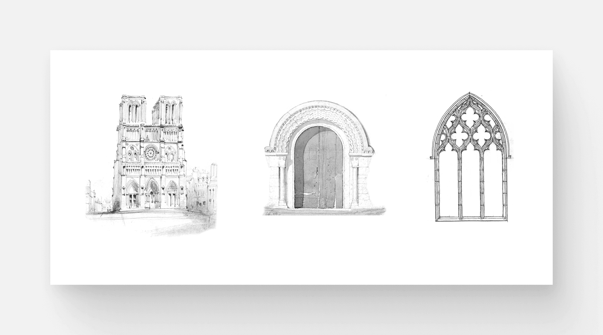
In choosing imagery, I found myself drawn to historic artworks of sacred spaces and architecture, which resonate with the app's theme of reflection and sanctuary. These images add a historical and contemplative layer to the overall design, aligning well with the app's mission.
High-Fidelity Mockups
User Testing and Findings
Usability Tests
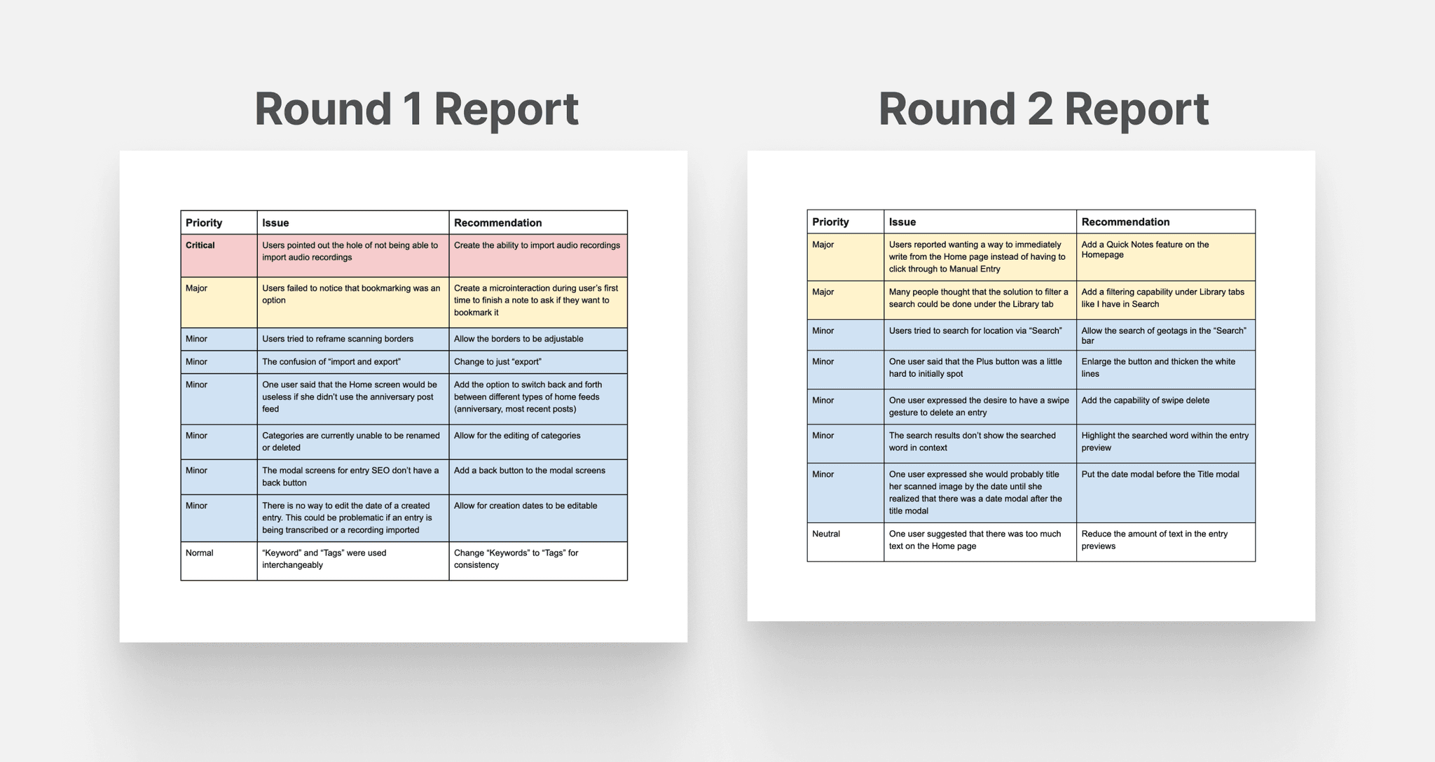
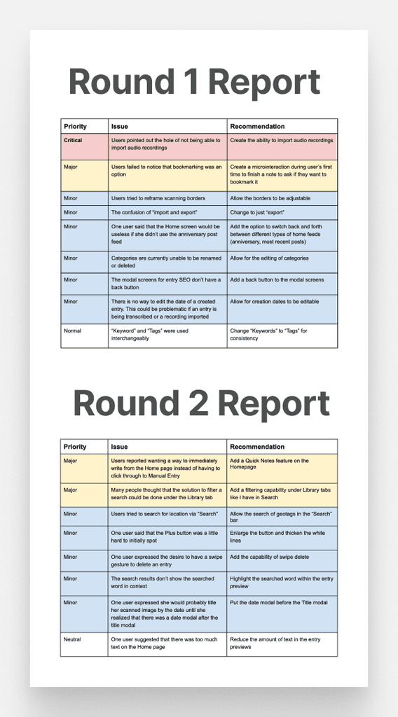
Two rounds of usability tests were conducted, each with five distinct tasks. The tasks were designed to assess the ease with which users could perform essential functions like adding scanned entries, bookmarking, recovering deleted entries, sorting by date, and filtering search results.
Findings
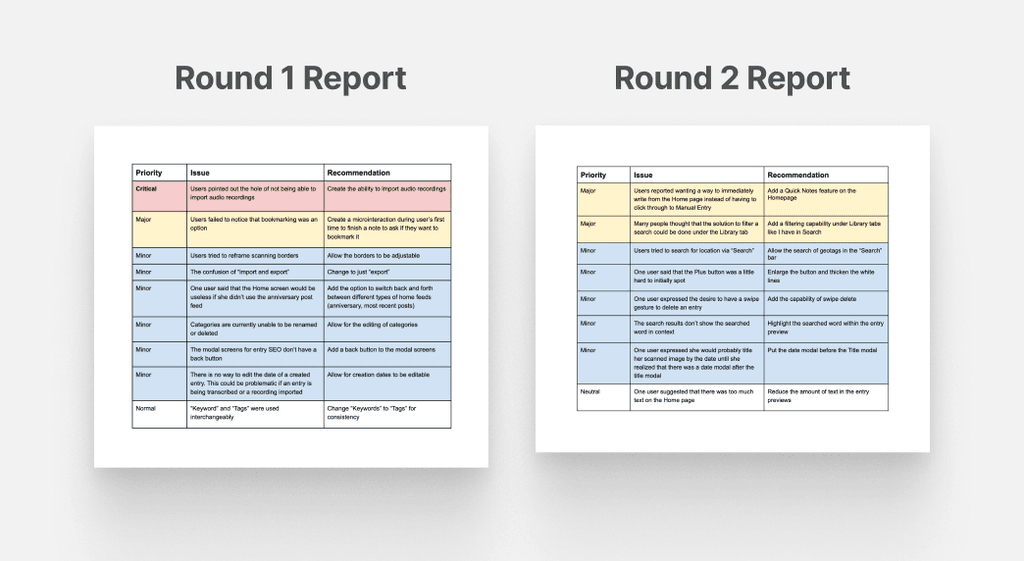
Feedback from the tests led to several design iterations, each round of testing having revealed some important design issues.
Users pointed out the hole of not being able to import audio recordings. This oversight would mean that users wouldn’t be able to consolidate any previously recorded journal entries in a voice memos app, which would impede the goal of being able to consolidate entries across various formats.
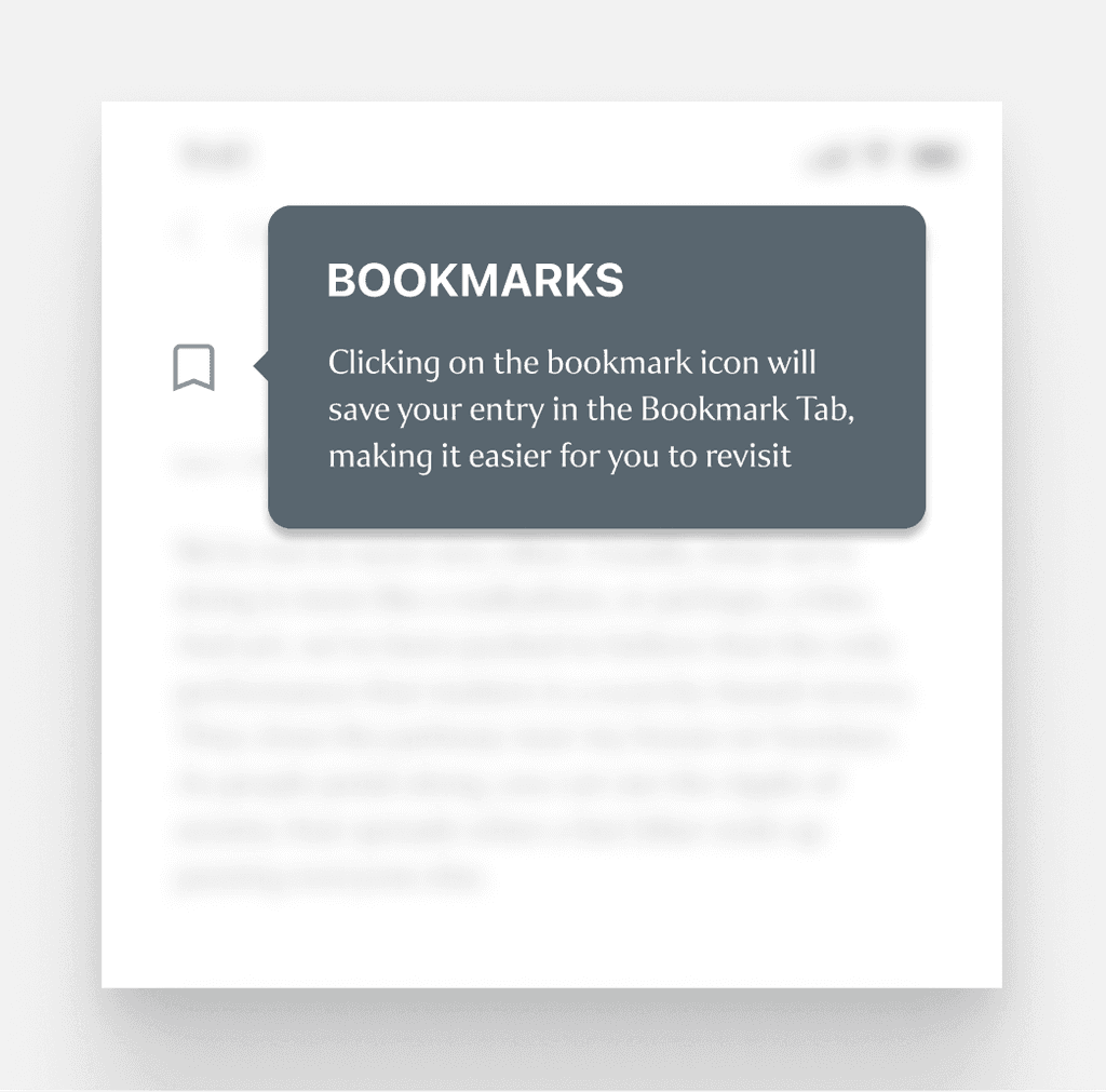
Most users failed to realize that bookmarking entries was an option. Their first instincts were to use tags or keywords to find a note later, and while this is still a valid option, it doesn’t provide the same functionality that the bookmarking feature provides.
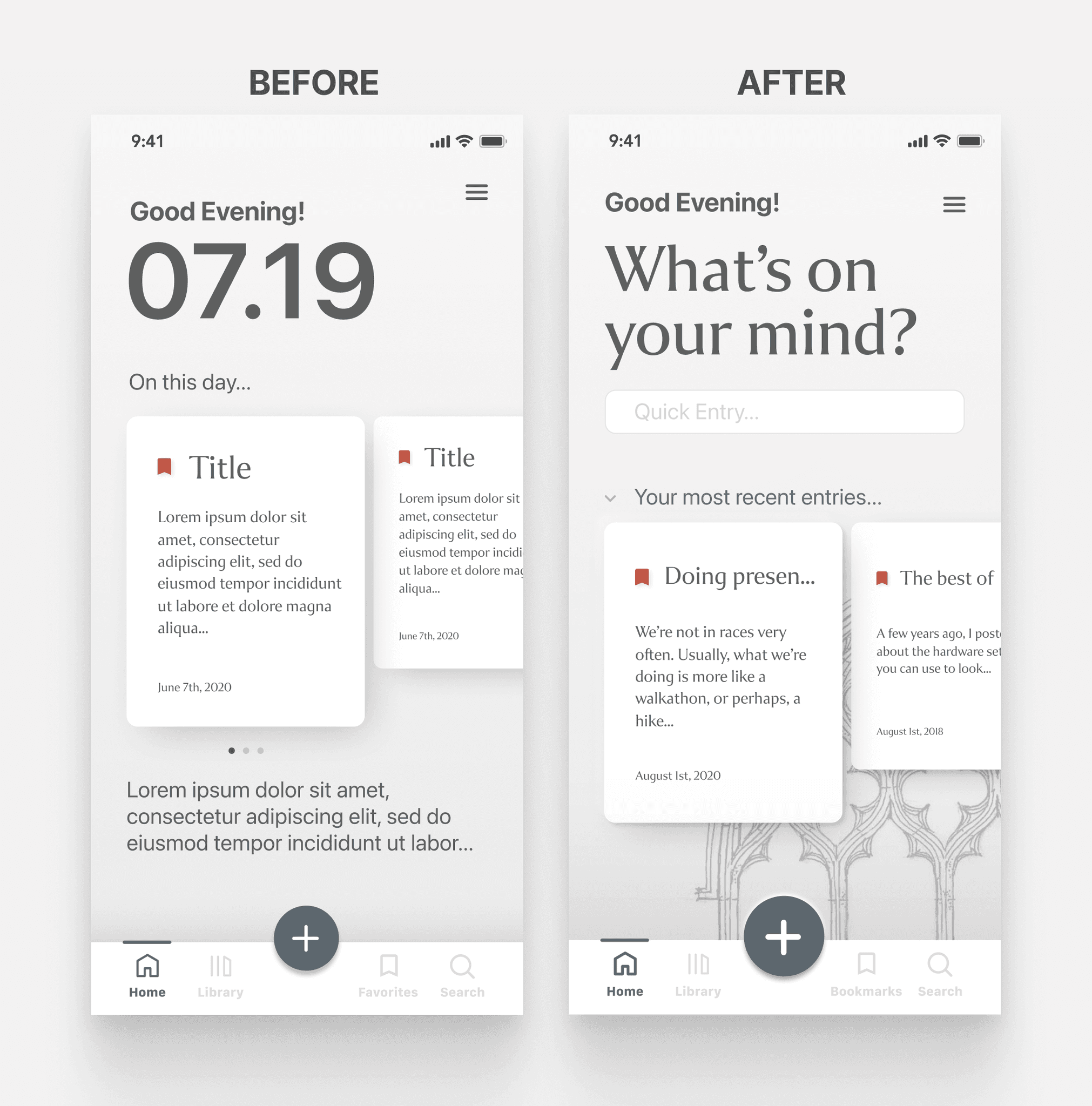
Users reported wanting a way to begin an entry from the home page instead of having to click through to “Manual Entry.” This underscored the need to have a simpler solution path.
There seemed to be a lot of confusion over how to search and filter entries.
Iterations
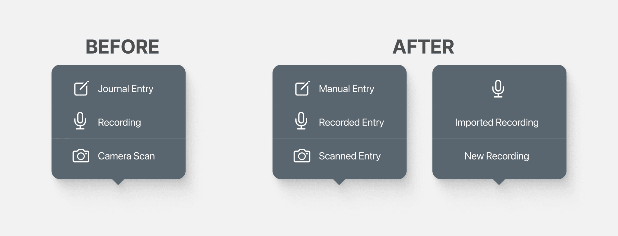
Button Labels
Button labels were renamed to enhance clarity and provide immediate comprehension of their functions.
I also introduced a sub-menu feature that allows for the seamless importing of audio recordings, enhancing the app's multi-format journaling capabilities.
Home Page
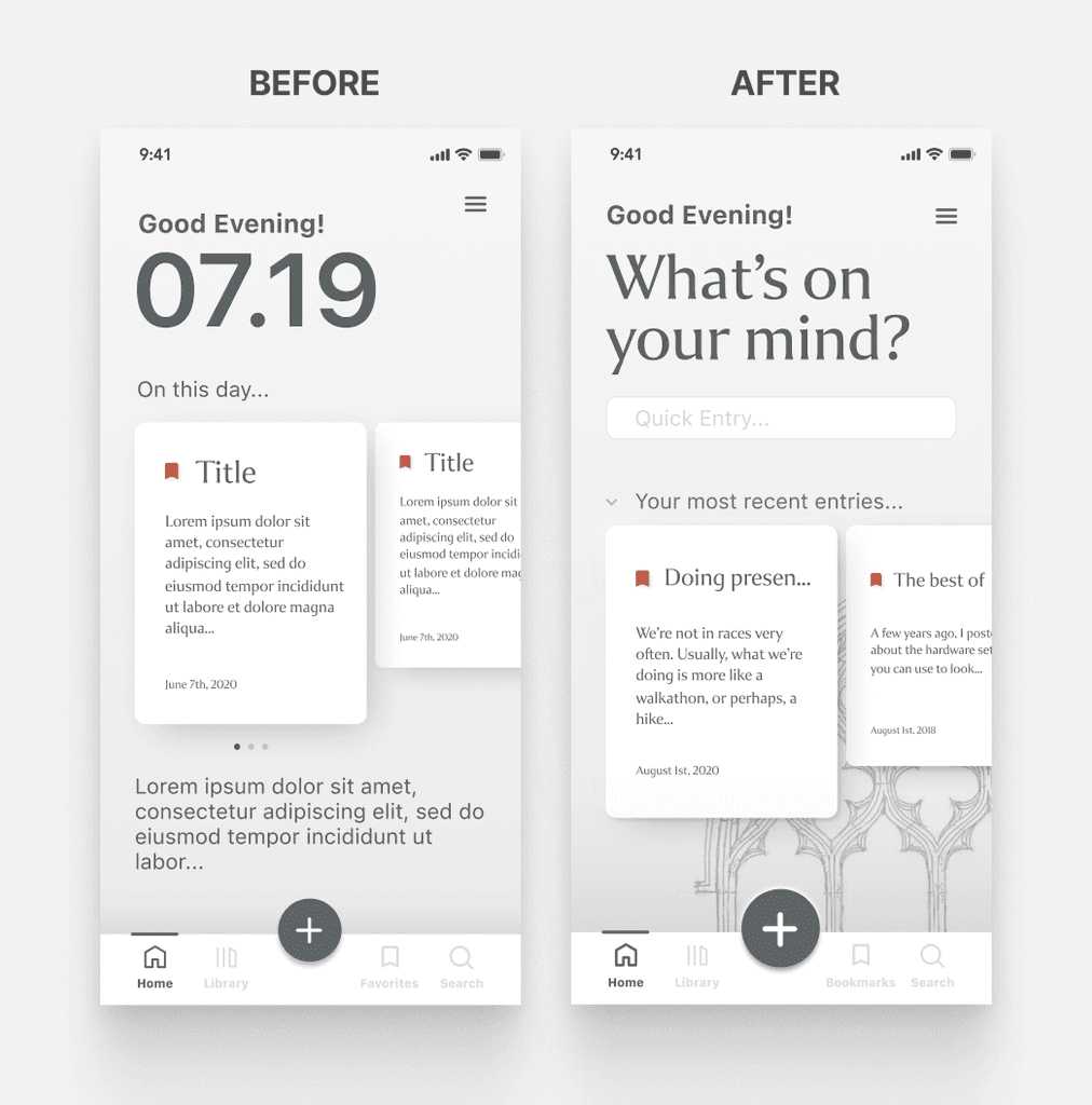
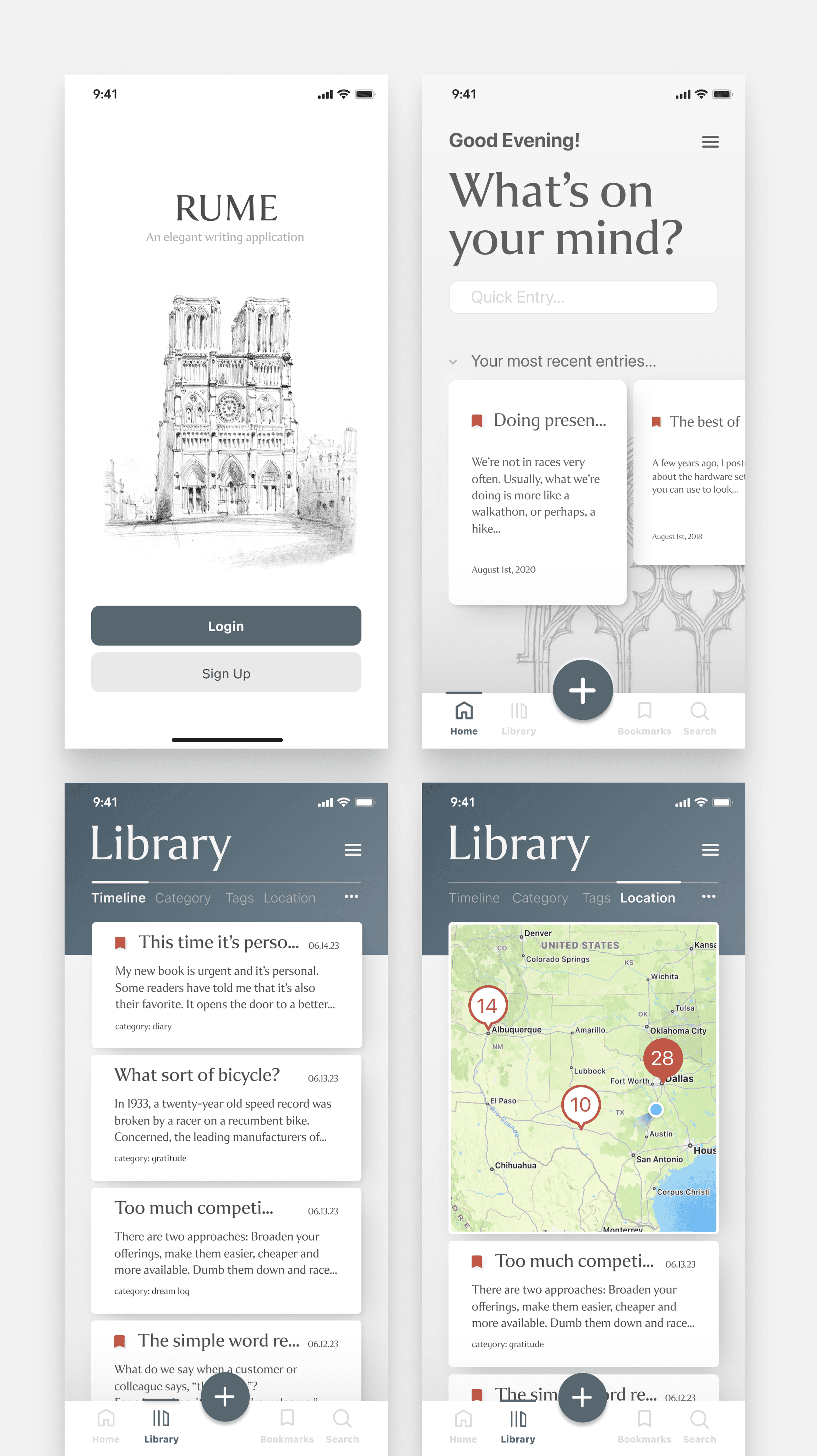
The home page underwent significant modifications to enhance its functionality and user engagement. Previously, the primary offering on the home page was the "anniversary post" feature, leaving little for users uninterested in this aspect. The revamped design now includes a quick entry feature, an option to switch between anniversary posts and most recent entries, and a more prominent 'plus' button for easier navigation and use.
Bookmarks
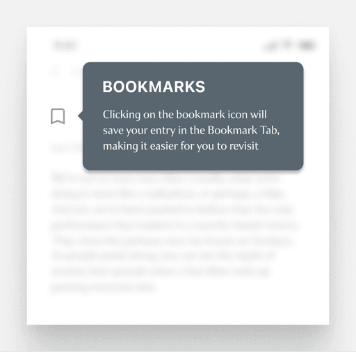
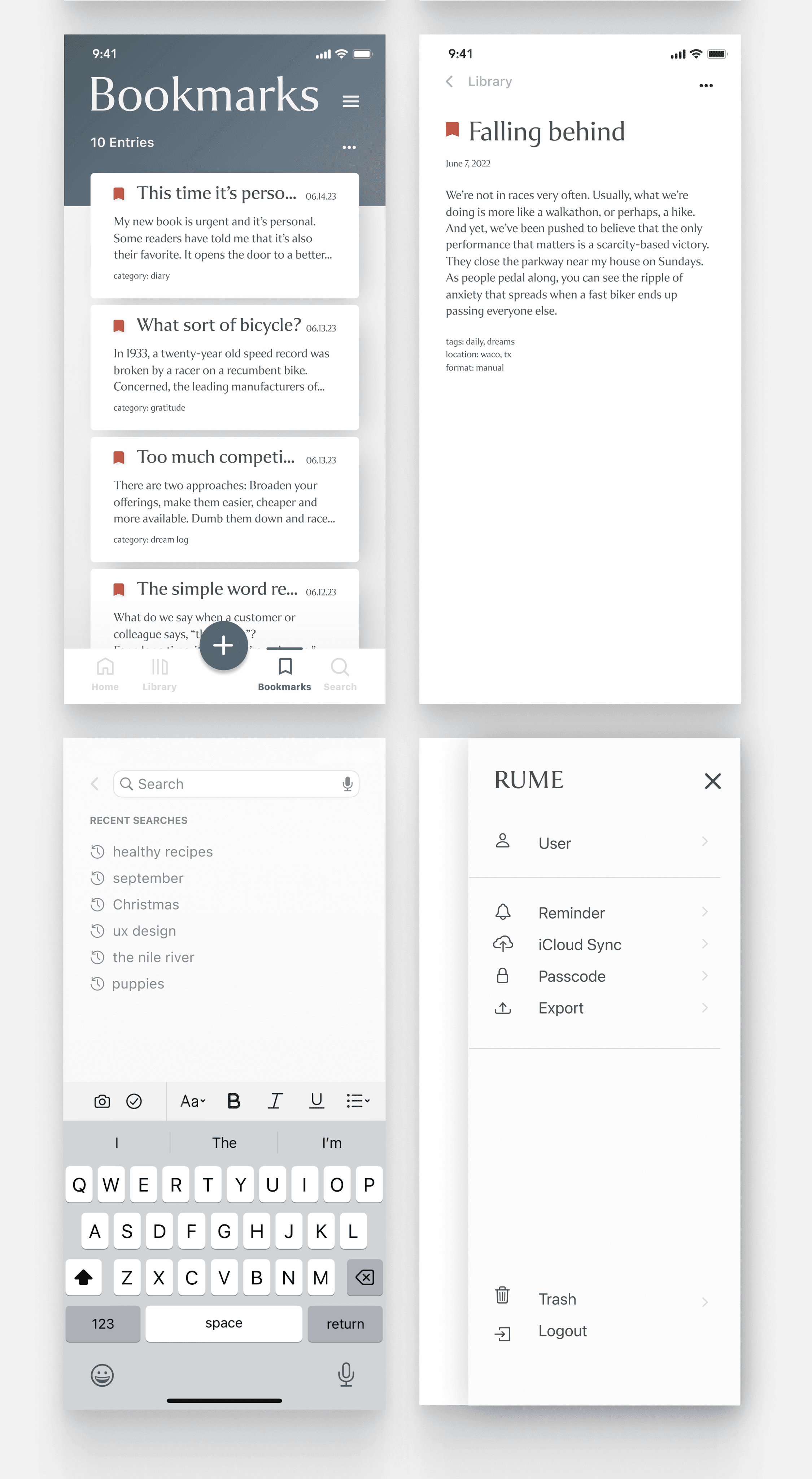
In response to user feedback that revealed the bookmark functionality was going unnoticed, I implemented a popup tooltip. Now, the first time a user creates an entry, a popup appears to explain that clicking the icon will save the entry in the Bookmark tab, thereby increasing awareness and usage of this feature.
Key Interface Screens
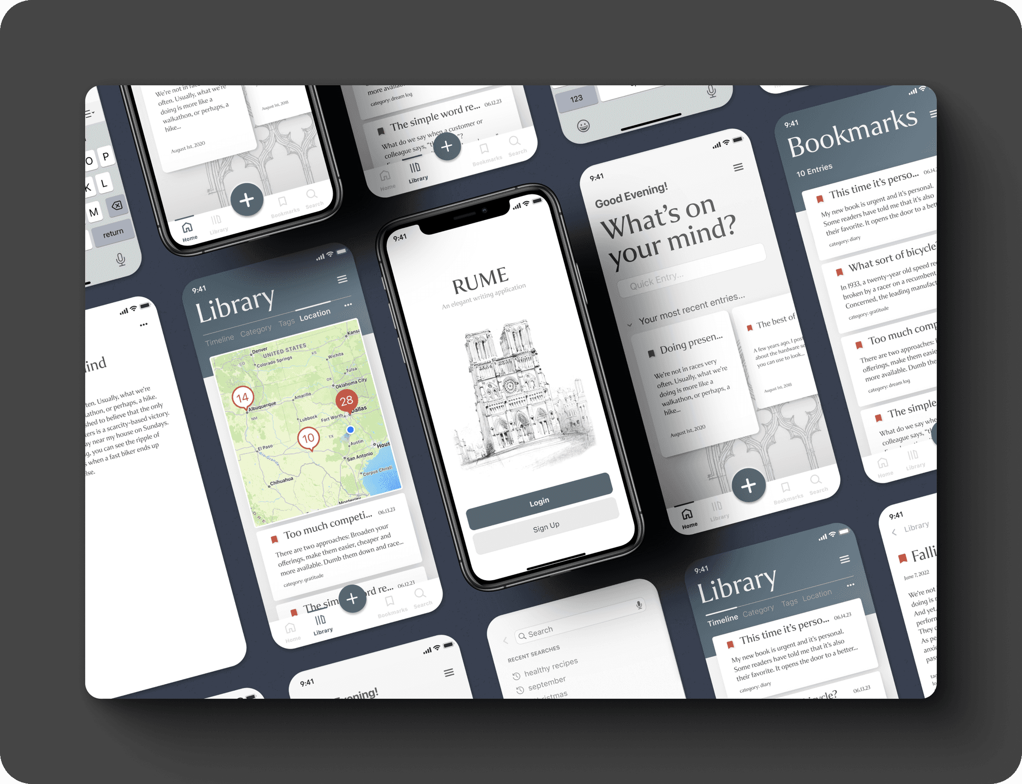
Below, you'll find a showcase of some of the key screens in "Rume," which illustrate the app's primary functionalities and reflect the design choices made to enhance user experience.
Project Learnings
Through the journey of conceptualizing and designing Rume, I've come to deeply appreciate the delicate balance between user intuition and design clarity. This project was a testament to the importance of iterative design, where each round of feedback reshaped and refined the user experience. I've not only grown as a designer but have also been reminded of the invaluable role of user feedback in bringing a vision to fruition.
Next Steps
In the next phase of development, my focus will be on continued iteration and testing to create a working Minimum Viable Product (MVP) for real-world usability tests. Alongside this, I'm excited to delve into the integration of prompts and templates that can further enrich the journaling experience. I also plan to explore compatibility with external tools like smart pens and implement additional privacy features. Lastly, a more comprehensive design for empty states will be developed to ensure that every stage of user interaction is thoughtfully crafted. All of these steps are geared towards creating a more seamless and secure user experience.
