Role:
UX/UI Designer
Duration:
1 Month
Tools:
Project Context
As a design team of 3, we embraced a collaborative approach where each member contributed across the spectrum of the project's needs, from research to user interface design. While we each brought our unique strengths to the table, our roles were fluid, allowing us to share responsibilities and ensure that every aspect of the project benefitted from our collective expertise. This dynamic approach enabled us to seamlessly integrate research insights into UI design, validate our concepts through iterative testing, and refine our strategies in response to user feedback.
Problem
How might we create a seamless and enjoyable online shopping experience for the organization's supporters while also promoting the message of social responsibility?
Solution
In crafting solutions for the project, our team considered a range of factors to address the challenges encountered.
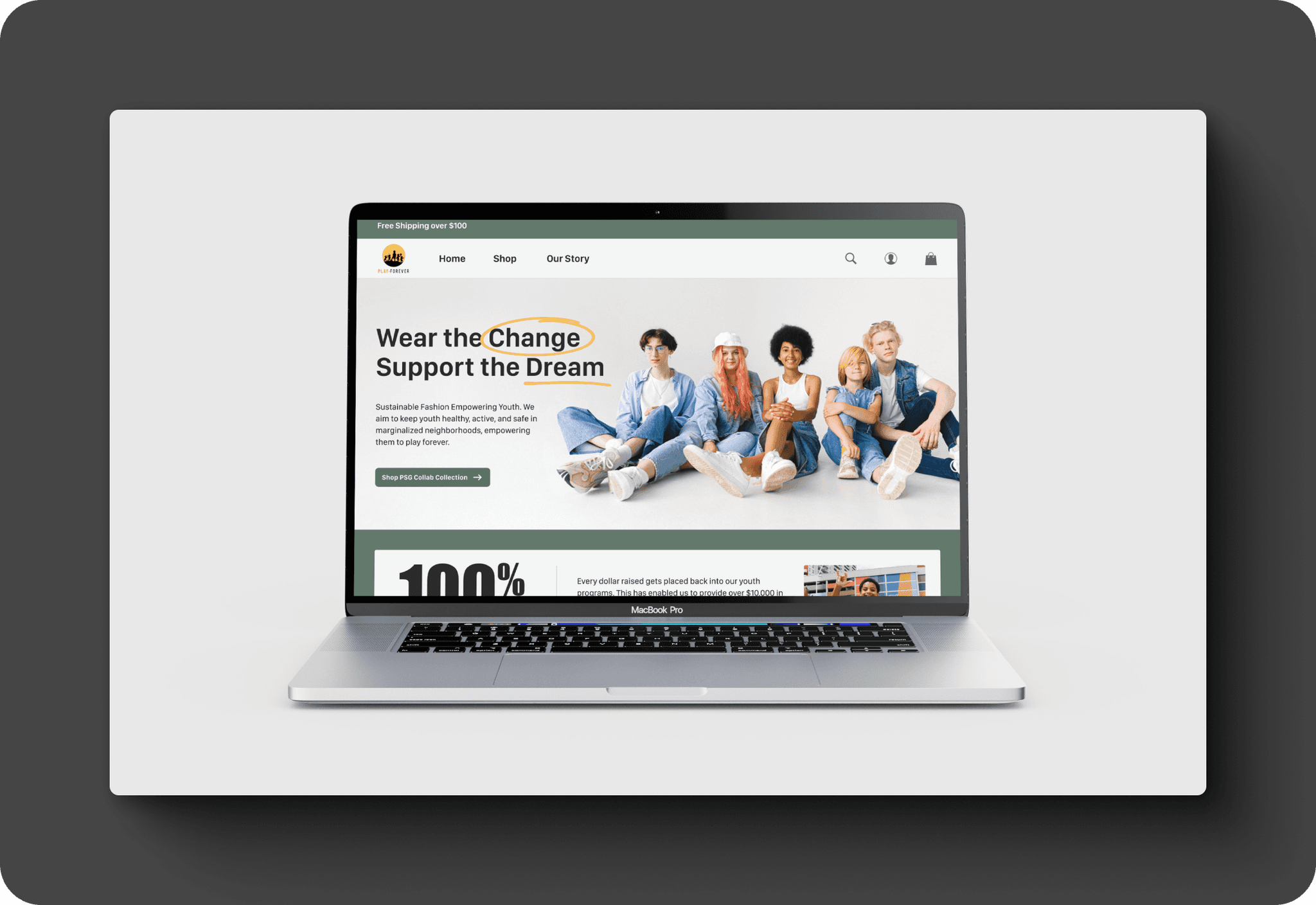
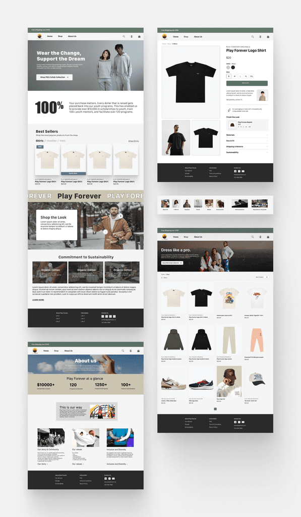
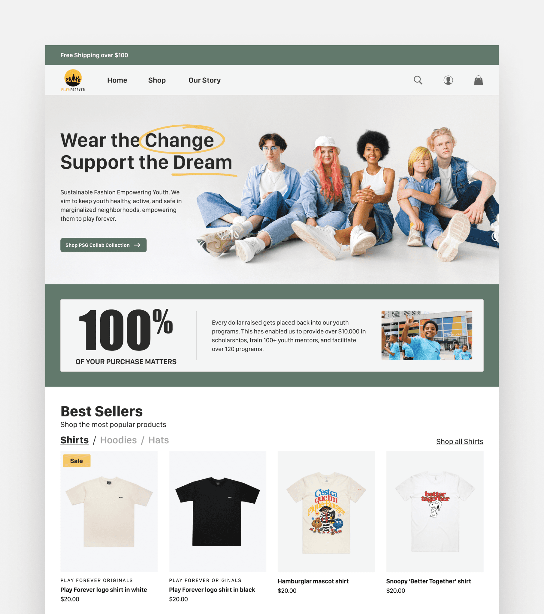
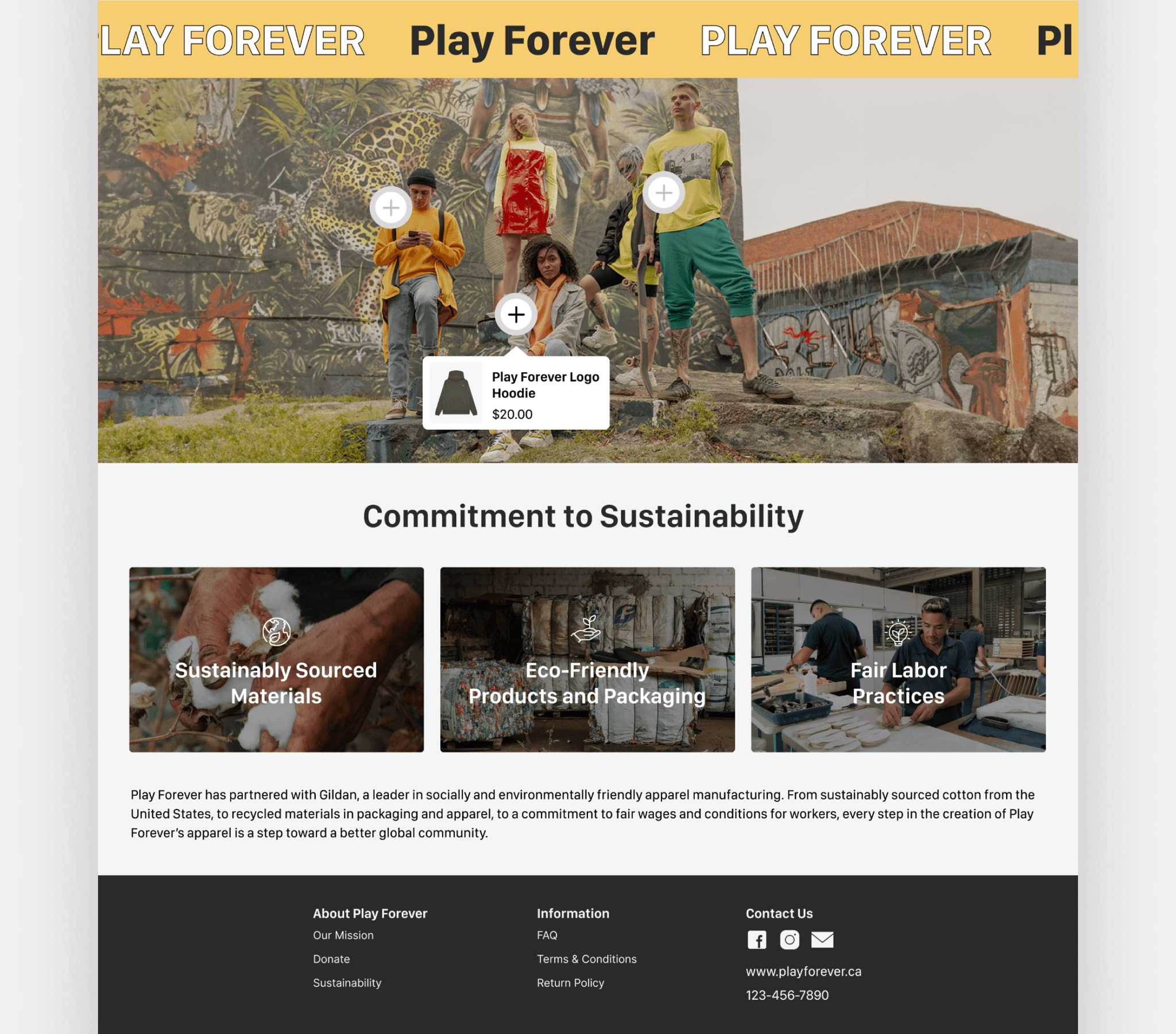
Sustainability: We ensured that Play Forever's commitment to sustainability was prominently highlighted on every page we designed. This approach allowed us to convey the organization's dedication to ethical and environmentally responsible practices.
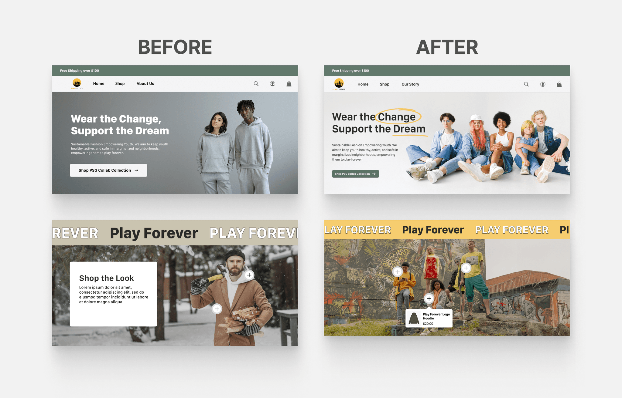
Diverse Representation: Recognizing diversity as one of the organization's core values, we introduced imagery that portrayed a diverse range of individuals, better reflecting Play Forever's ethos.
Accessibility: To ensure inclusivity, we prioritized accessibility features. Our design incorporated text labels, screen reader compatibility, and keyboard navigation, allowing all users to access the platform seamlessly.
Transparency: To enhance transparency, we strategically emphasized Play Forever's mission, financial practices, and historical journey across the platform.
These solutions collectively addressed the project challenges, resulting in an enhanced user experience that aligned with Play Forever's mission, values, and commitment to sustainability.
Research and Discovery
Existing Research
In the user research phase, my role involved a thorough review of an existing report on integrating sustainable operations into the operational ethos of the organization. This underscored the growing consumer demand for environmentally responsible practices and was extremely helpful in aligning our project with the organization’s core values.
Interviews
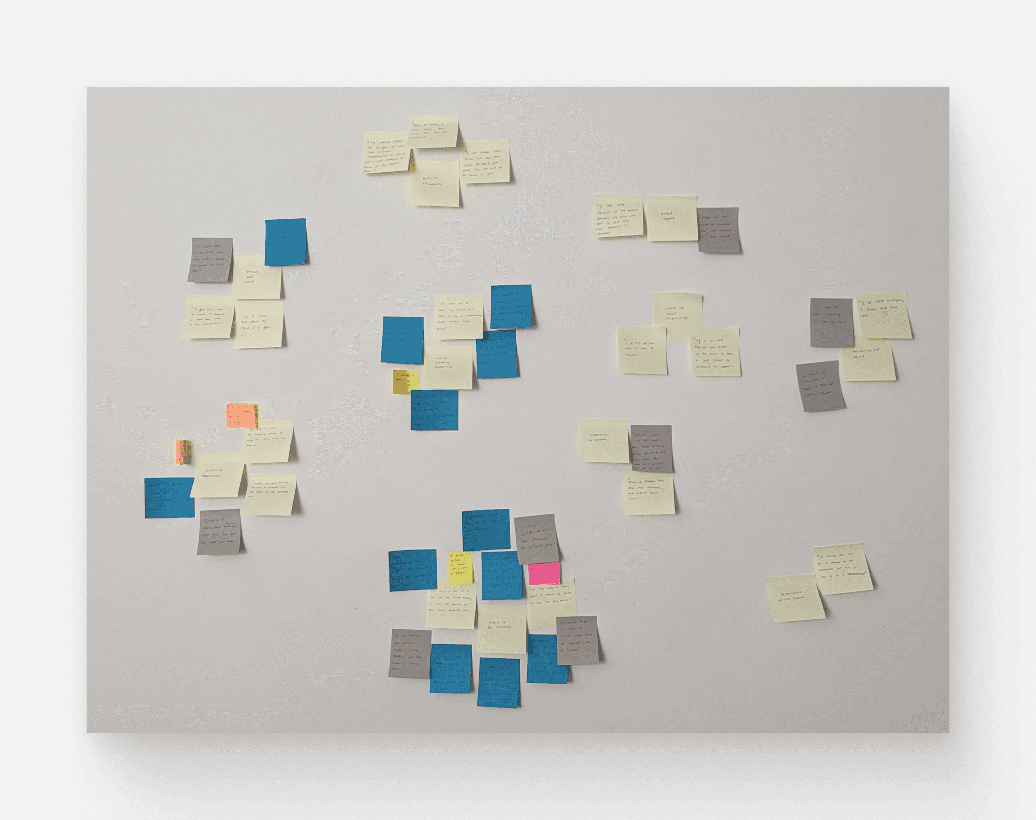
Additionally, in order to understand what pain points our users were experiencing, the team conducted 6 in-depth interviews with individuals aged 18-37 who had been served by Play Forever, were interested in sustainability, and were adept at shopping through e-commerce websites. Their responses were then mapped.
Competitive
Analysis
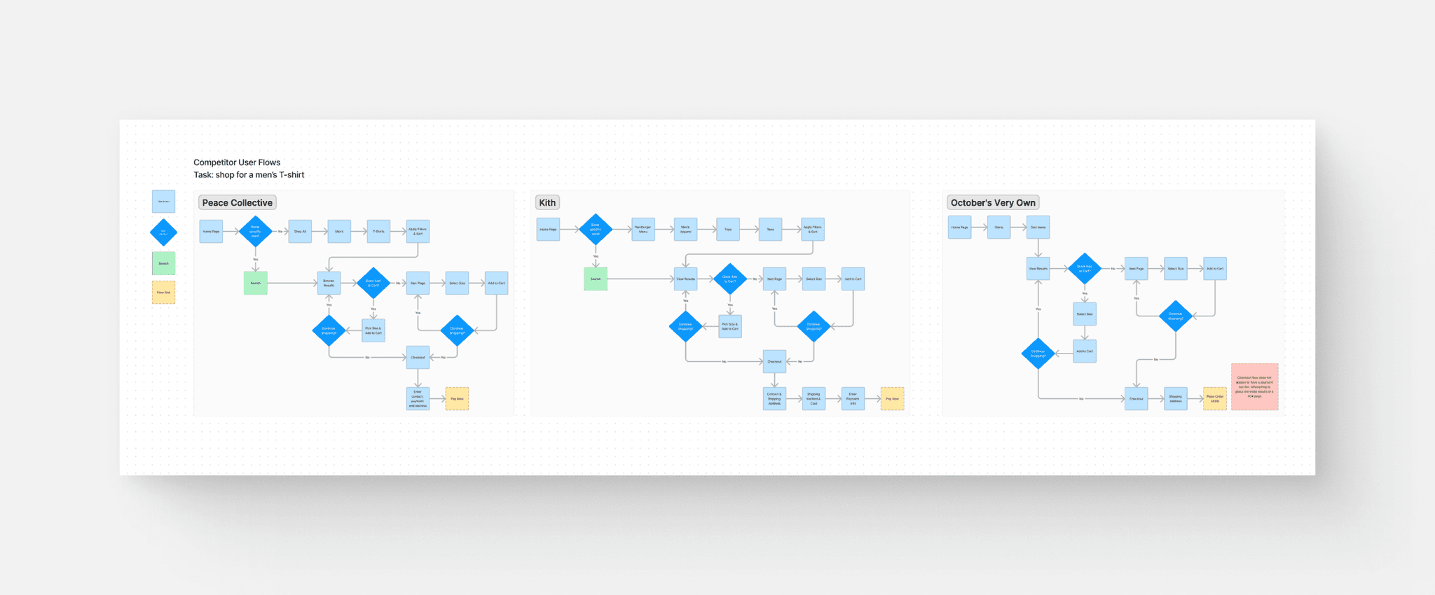
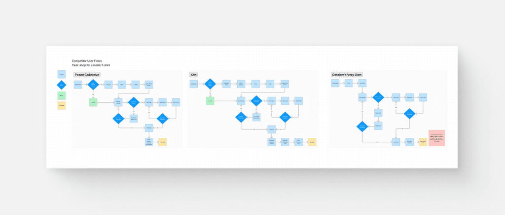
Our team conducted market research on various brands who similarly prioritized sustainability in order to understand how these organizations were addressing similar customer pain points. We conducted heuristic analysis for the brands Peace Collective, Kith, and October’s Very Own and then mapped their user flows.
Research Highlights
Our research revealed several insights.
Consumers are wary of smaller websites and require them to meet a higher trust threshold.
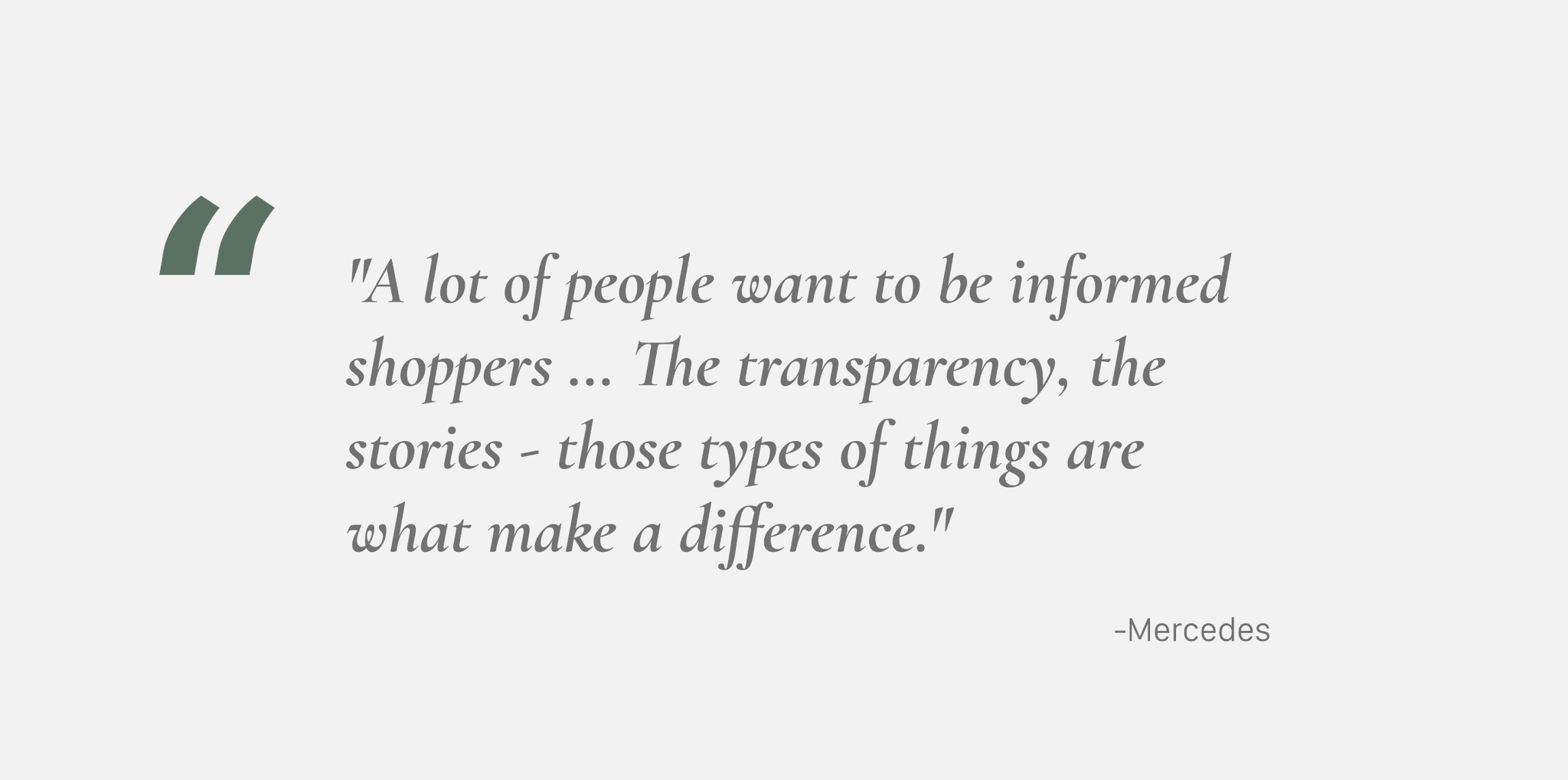
Transparency in how purchases contribute to causes is crucial for building trust.
Key consumer considerations include:
Advocacy for social causes and commitment to sustainability
Competitive pricing
Product quality
Prompt shipping and a fair exchange policy
Exceptional customer service
There's a preference for seeing clothing modeled by diverse individuals in real-world scenarios to gauge fit across various body types and situations.
A diverse range of people should be visibly included and catered to, underscoring the importance of diversity in product presentation.
The website must be accessible for the visually impaired, ensuring inclusivity.
Based off of this preliminary research, our key takeaway was that sustainability and transparency need to be at the forefront of consideration for the design of the project in order to elicit trust.
Design Process
Sitemap
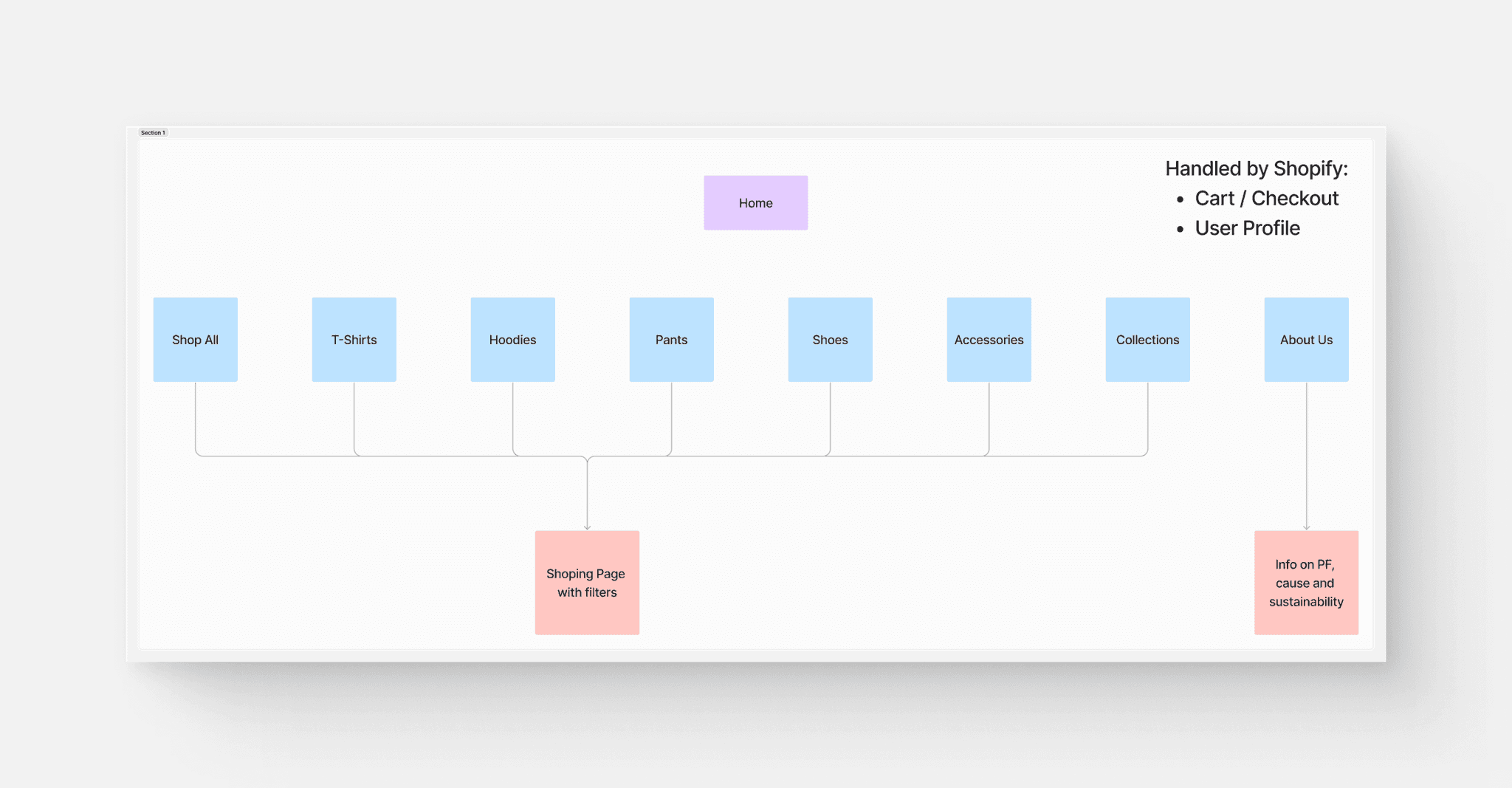
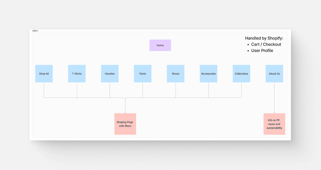
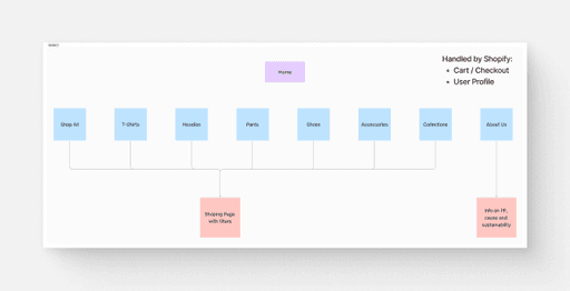
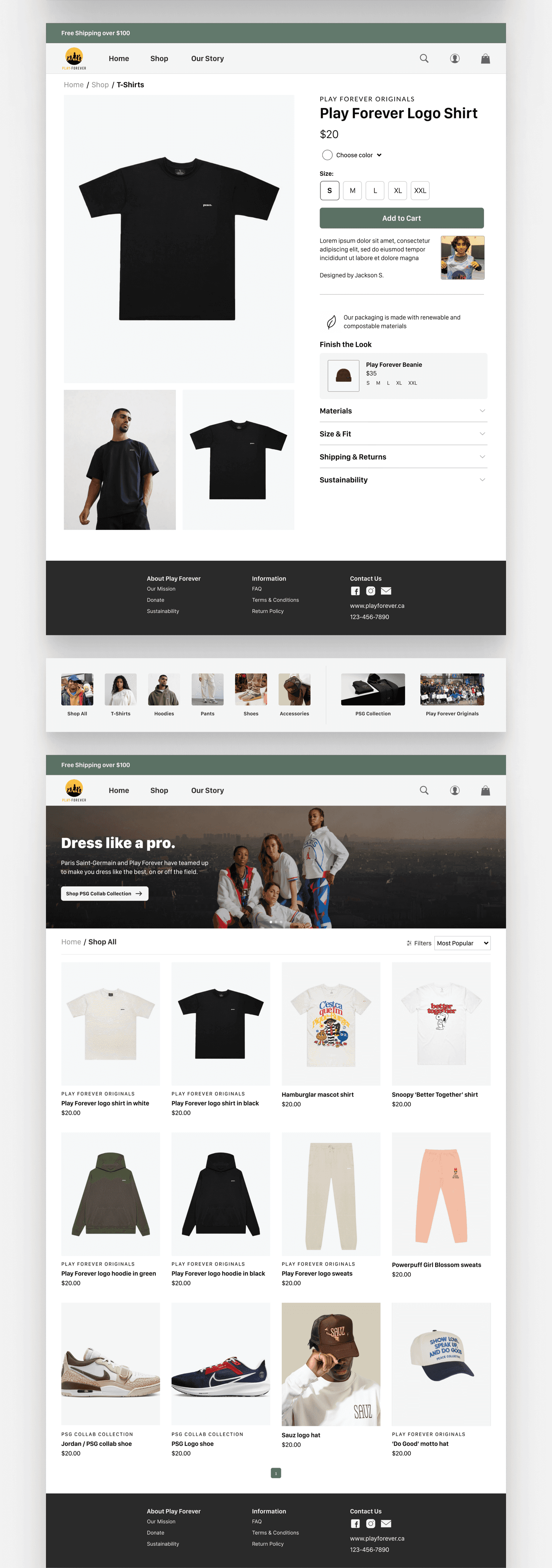
As part of our design process, we crafted a sitemap for the e-commerce store, which helped us logically organize the site's content. This step was crucial in determining which screens needed designing, particularly those highlighting the store’s commitment to sustainability and transparency.
Low Fidelity
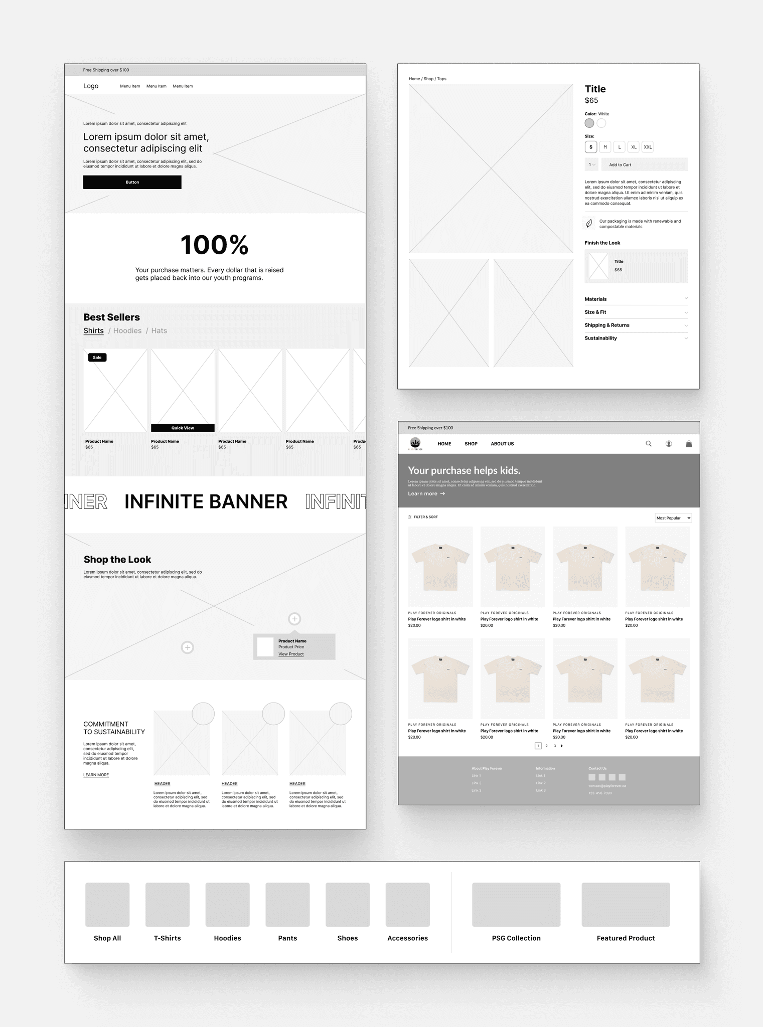
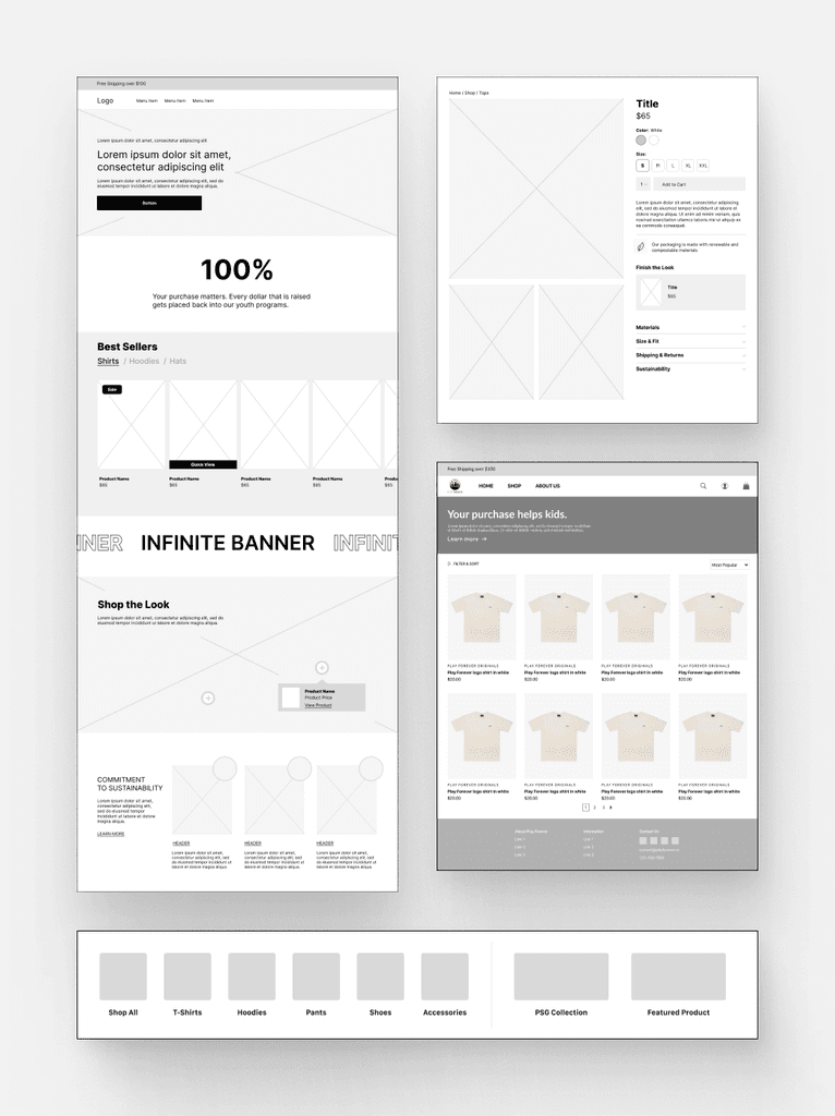
I created low-fidelity designs and a quick prototype to establish the fundamental structure and interaction flow of the website, focusing on functionality and user interaction without getting bogged down in visual details.
Style Guide
I had the responsibility of developing the brand's style guide for the e-commerce store, guided by the organization's core values: Fun, Respect, Empowerment, Diversity and Inclusion, and Community Partnerships. These values helped play a role in shaping our design decisions, ensuring that the visual identity of the site not only resonated with these principles but also communicated them clearly to the users.
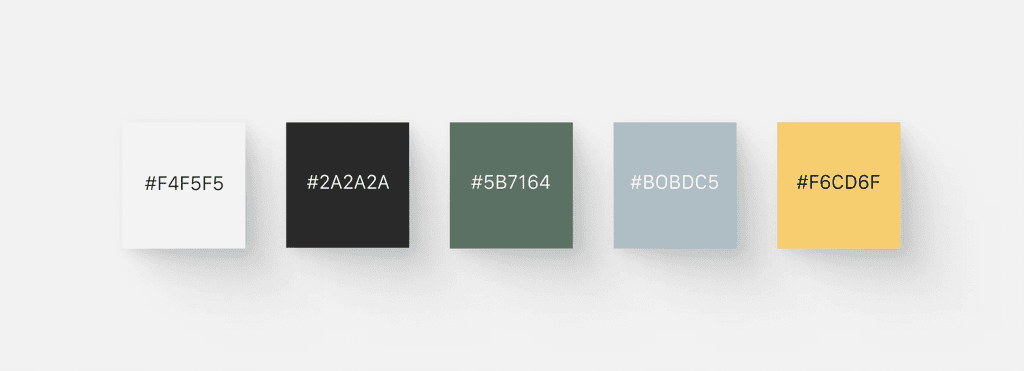
Fun: Taking a cue from the organization's logo, I selected a vibrant yellow accent color to add a sense of playfulness into the user experience, reflecting the organization's focus on fun.
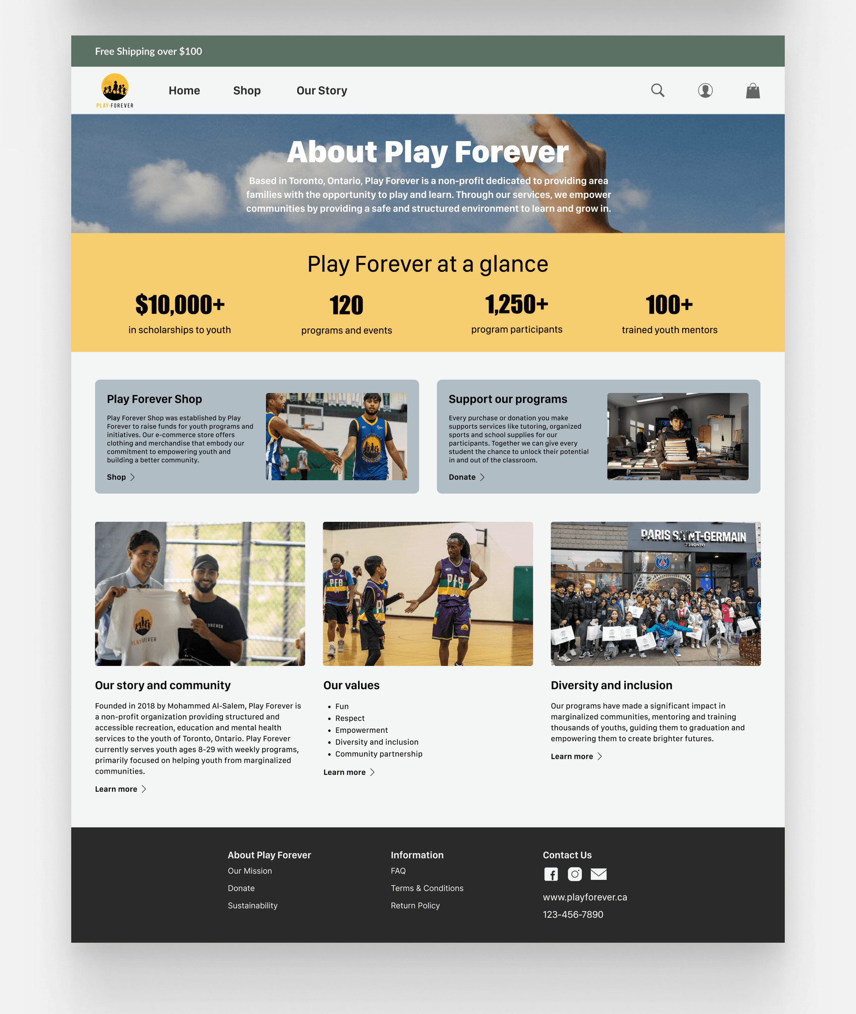
Diversity and Inclusion: The imagery used throughout the site was carefully chosen to reflect and celebrate diversity, ensuring that all users feel represented and included.
By integrating these values into the style guide, we ensured that the e-commerce platform not only serves its functional purpose but also strengthens the organization's brand identity and deepens the connection with its audience.
Color Palette
With the color palette I aimed to create a visual language that communicates the essence of the organization's values. In addition to the aforementioned yellow accent color, I integrated a forest green into the palette to communicate the organization's commitment to environmentally responsible practices.
Typography
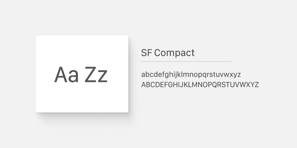
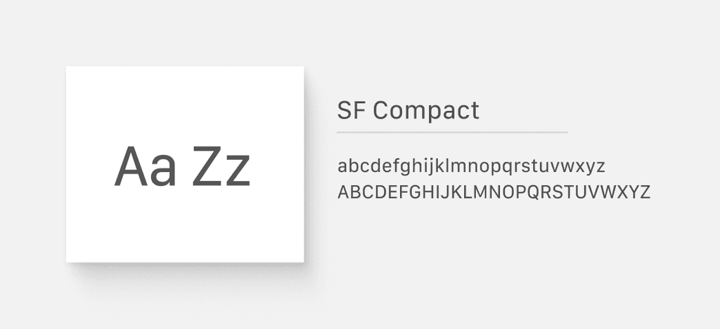
In selecting the typography for the organization's e-commerce site, I chose 'SF Compact' because its clean lines and straightforward appearance align with the youthful, vibrant ethos and core values the organization.
Accessibility
Designing the e-commerce site with accessibility in mind was crucial to ensure inclusivity for all users, including those with disabilities. We adhered to WCAG AA standards for color contrast, making sure text and UI elements are easily distinguishable against their backgrounds. Our user interface (UI) was crafted to support various accessibility needs:
We ensured a logical flow of information that supports screen readers and keyboard navigation, allowing users to navigate the site without relying on a mouse.
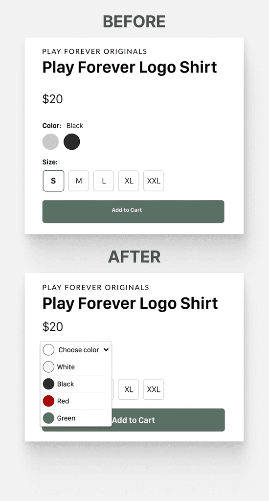
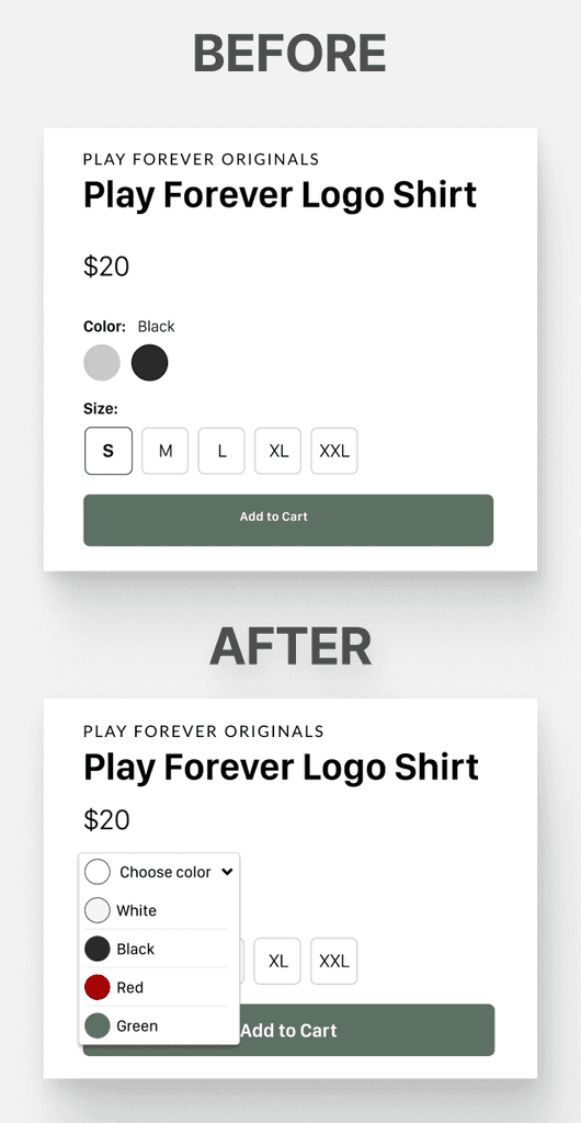
Interactive elements like dropdown menus are operable with clicks, and we avoided designs that require hover states.
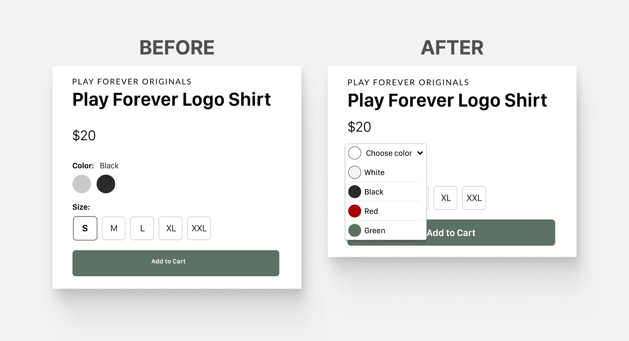
To accommodate users with color vision impairments, we designed UI elements to convey information without relying solely on color, incorporating text labels where necessary.
By focusing on these accessibility principles, we aimed to create a welcoming and usable site for a diverse audience, aligning with the organization's values of inclusivity and empowerment.
To ensure visual consistency in the brand's online presence moving forward, I developed a comprehensive photography guide for our client. This guide outlines key principles for capturing images that align with the brand's ethos and aesthetic, ensuring that future content remains consistent with the established visual identity. It covers aspects such as lighting, composition, and styling, as well as how to represent the brand's values through imagery. This resource empowers the client to maintain a cohesive and engaging visual narrative across all digital platforms, reinforcing the brand's identity and values with every photograph.
High Fidelity Designs
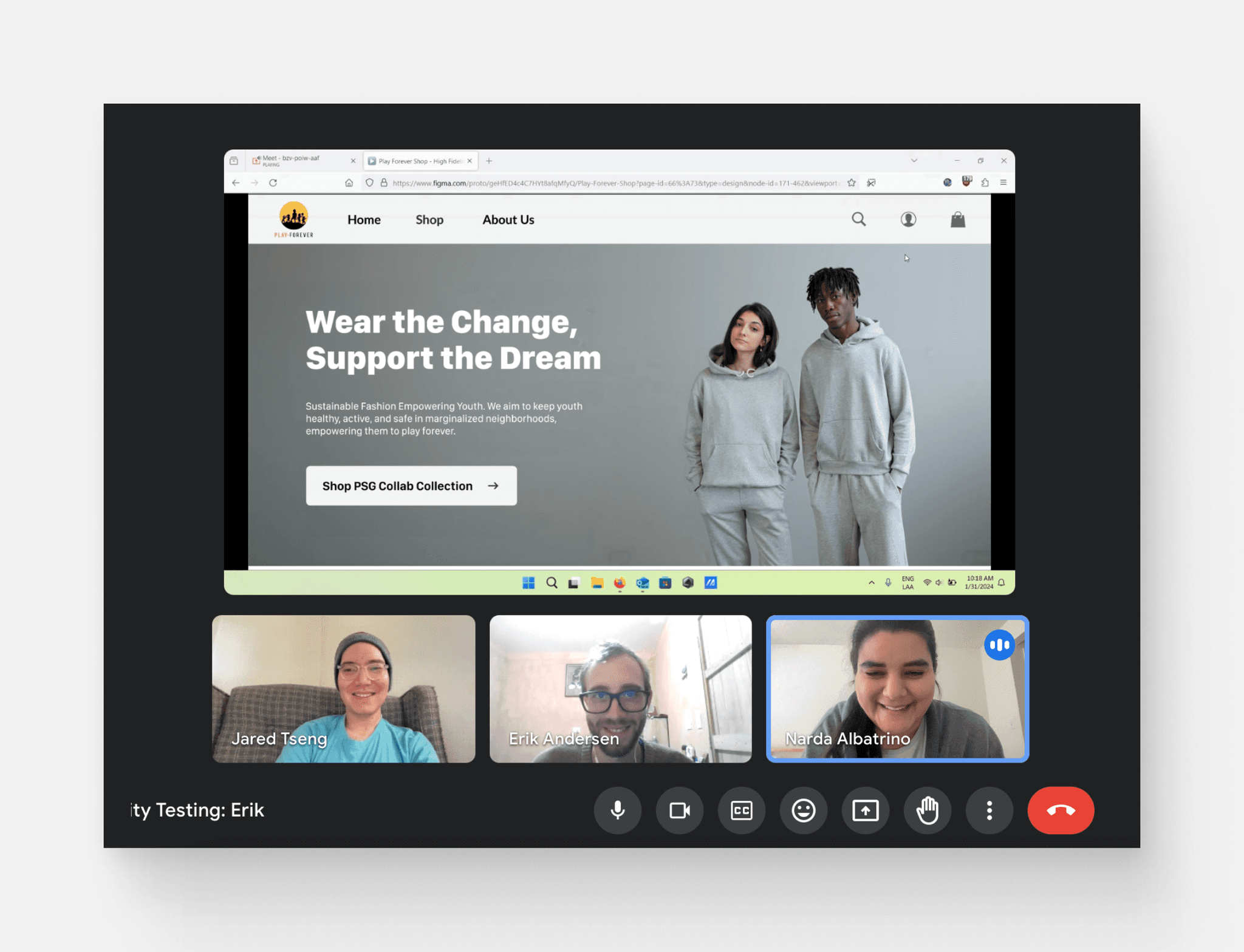
To accommodate time constraints, our team conducted a single round of usability testing involving three users before finalizing our designs. During this round, we employed high-fidelity wireframes to assess the shopping experience on the Play Forever e-commerce website. Our primary objective was to gather valuable insights into the overall user experience. Additionally, we aimed to delve deeper into the motivations of potential users, their attitudes towards sustainability, transparency, social and environmental concerns, and their trust levels in the shopping process. This usability testing phase played a crucial role in refining our designs to better cater to user needs and preferences.
Findings
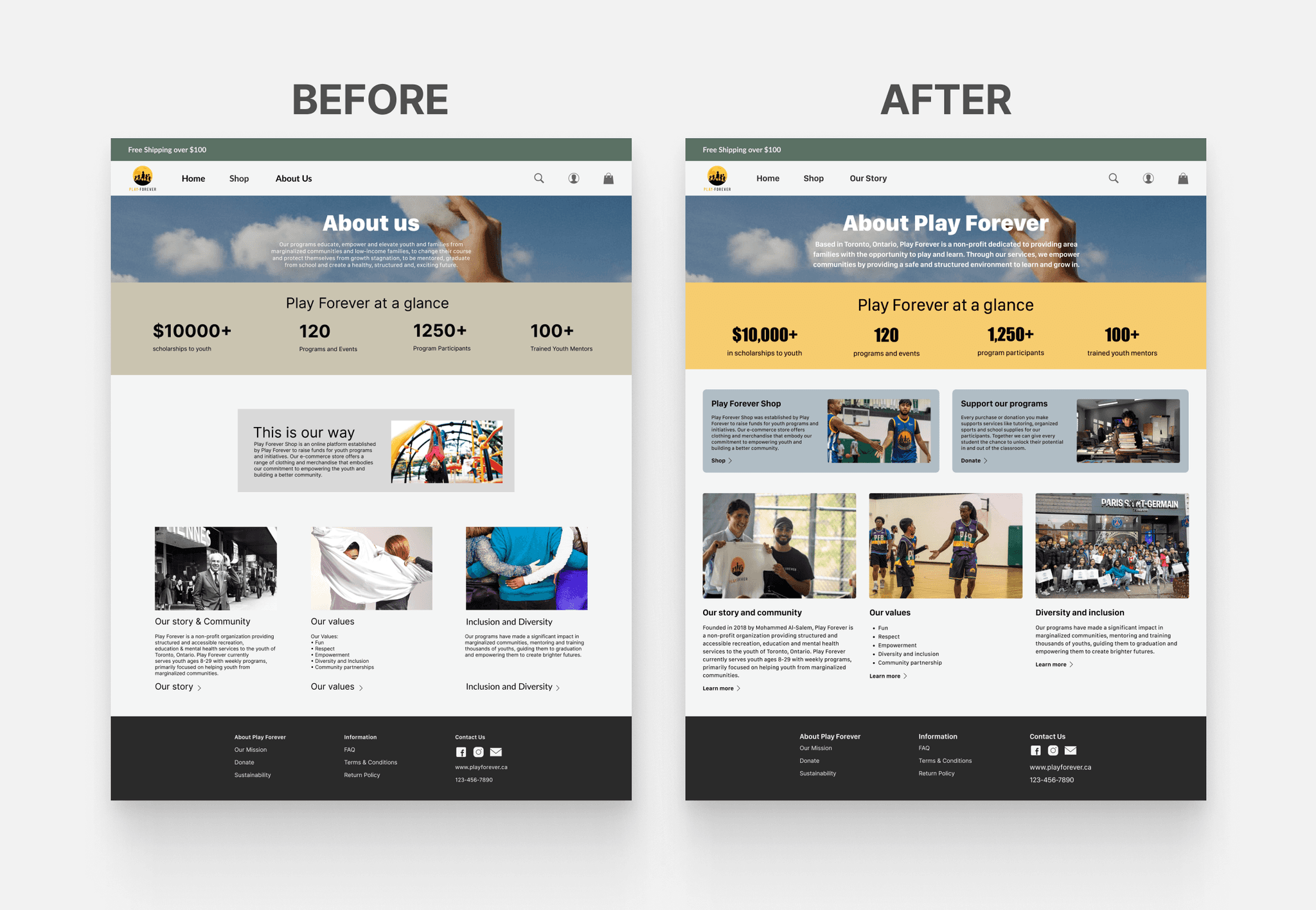
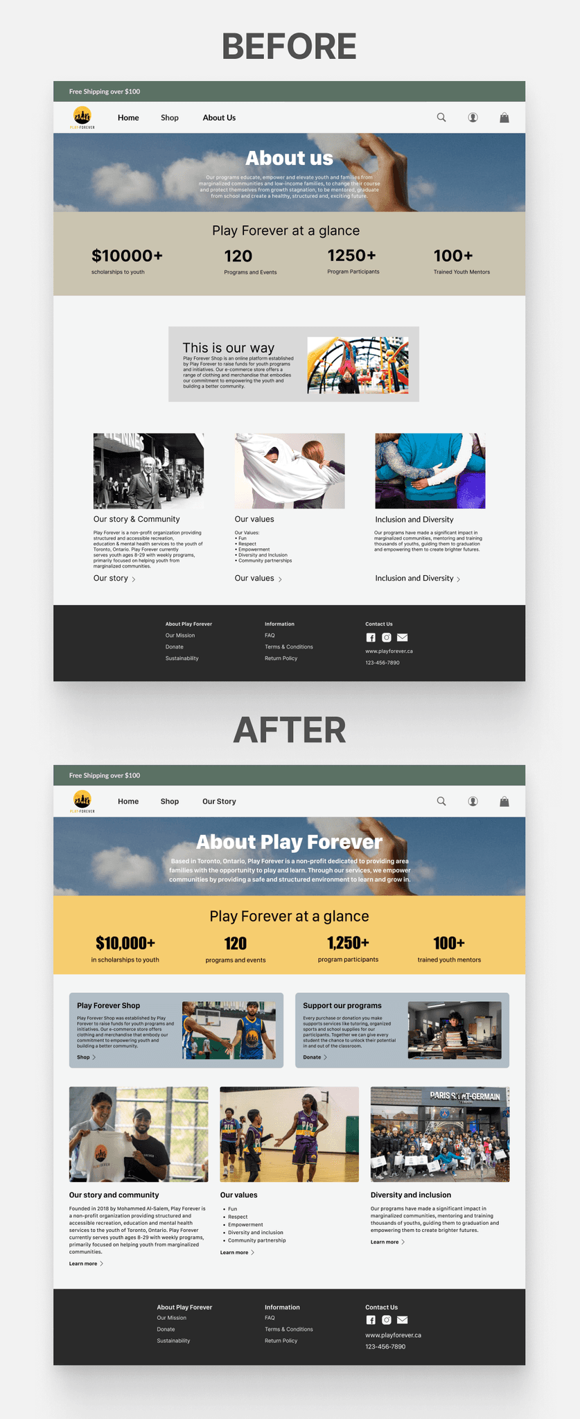
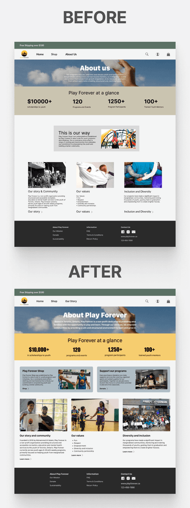
A stronger emphasis on sustainability is needed to better communicate the organization's commitment to environmental responsibility.
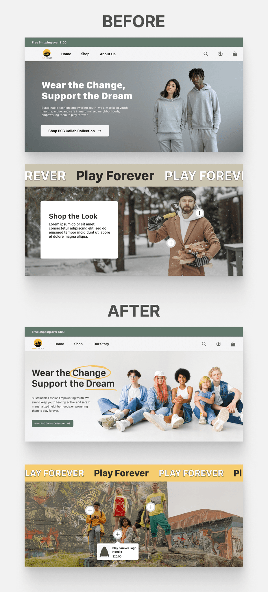
Imagery didn't align with the organization's personality and brand, revealing a need for a more coherent visual narrative that accurately reflects Play Forever's values and mission.
The lack of imagery representing the organization's programs resulted in reduced transparency and user confidence, indicating a need to feature program-related visuals.
Users expressed a desire for greater transparency regarding where their money is allocated, highlighting the importance of providing clear information on how donations and purchases contribute to the organization's causes.
Iterations
Accessibility-Focused Elements: Following the guidelines outlined in our style guide, we redesigned UI elements to convey information effectively without relying solely on color. This included adding text labels where necessary to ensure users with color vision deficiencies can use screen readers to access the information
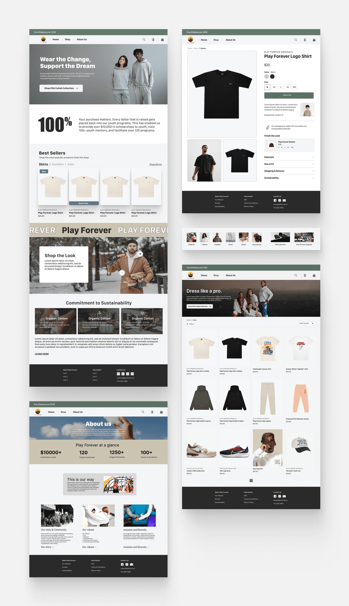
Mission Clarity & Engagement:To strengthen transparency and trust with users, we focused on enhancing the About page. Our goal was to provide users with a more comprehensive understanding of Play Forever's mission, financial practices, and historical journey. Additionally, we introduced a "Donate" button to provide users with a convenient and direct way to support the mission.
Final Designs
Project Learnings
During my engagement in this project, I gained valuable insights into the importance of effective collaboration and sustainability practices. Task allocation based on team members' strengths improved project efficiency and fostered team synergy. Exploring the NGO sector offered valuable insights into its distinct challenges and opportunities. Furthermore, I deepened my understanding of sustainability, appreciating its multifaceted nature and the significance of ethical and environmentally responsible practices.
Next Steps
With additional time, I would focus on expanding the messaging of our commitment to sustainability by creating dedicated pages that provide detailed information on material sourcing, carbon footprint, and fair labor practices. The continuation of user interviews to gain deeper insights into shopping motivations and practices would inform our future design decisions. Additionally, the introduction of a reviews and ratings feature would enhance user engagement and provide valuable feedback.
