Role:
UX/UI Designer
Duration:
2 Months
Tools:
Problem
Data indicates that 50% of site users open an average of 7 item pages but abandon the site without adding items to their cart. Additionally, 70% of users who add items to their cart do not complete their purchase, primarily abandoning the cart at the registration page.
Objective
The primary objective is to streamline and optimize the purchasing process to reduce user drop-offs and improve conversion rates from browsing to successful checkout, thereby increasing revenue.
Solution
Research and Discovery
Competitive Research
The investigation began with an in-depth study of industry leaders in the broader ecommerce space, including Amazon and Target, along with specialized entities like Trek Bikes. This research aimed to uncover best practices, emerging trends, and key features that drive user engagement and sales conversion in online retail.
Heuristic Analysis
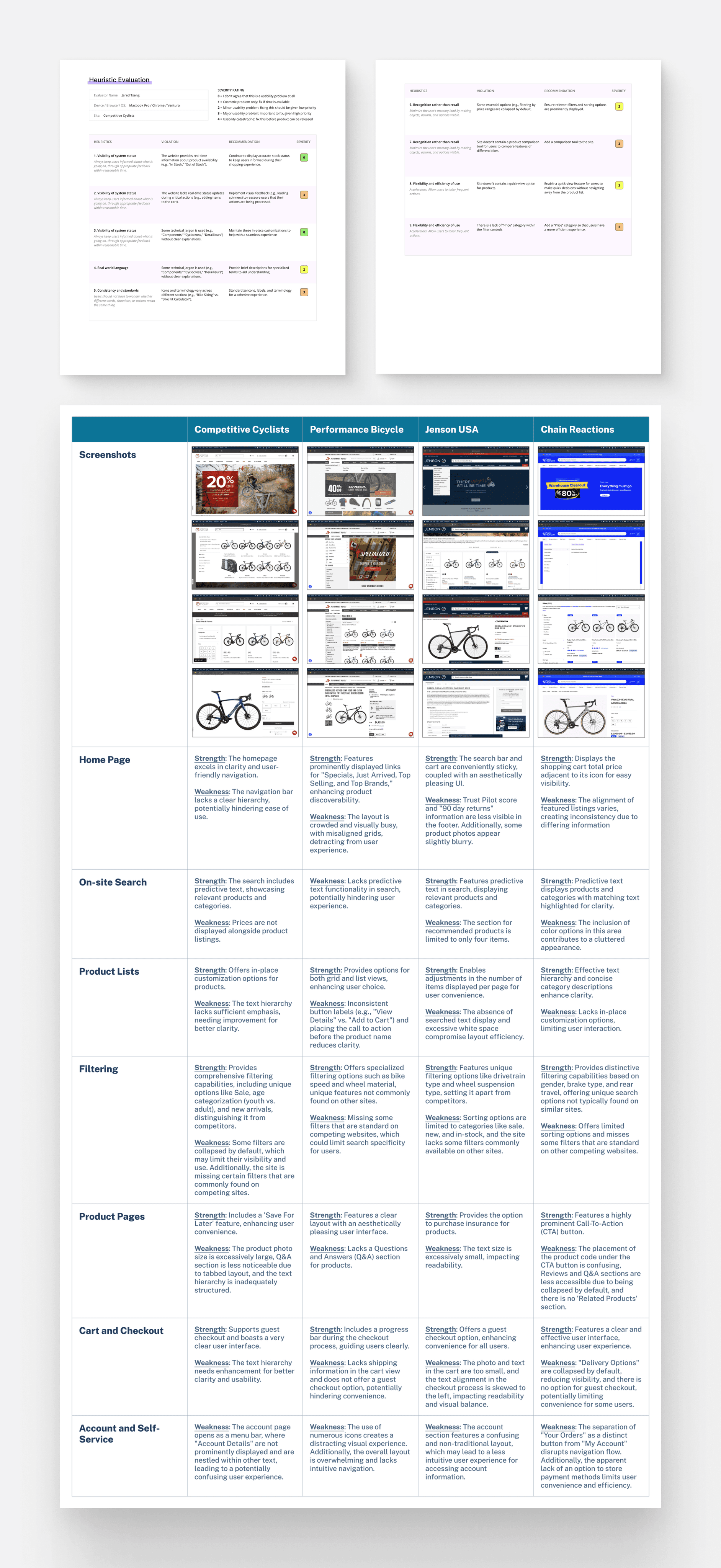
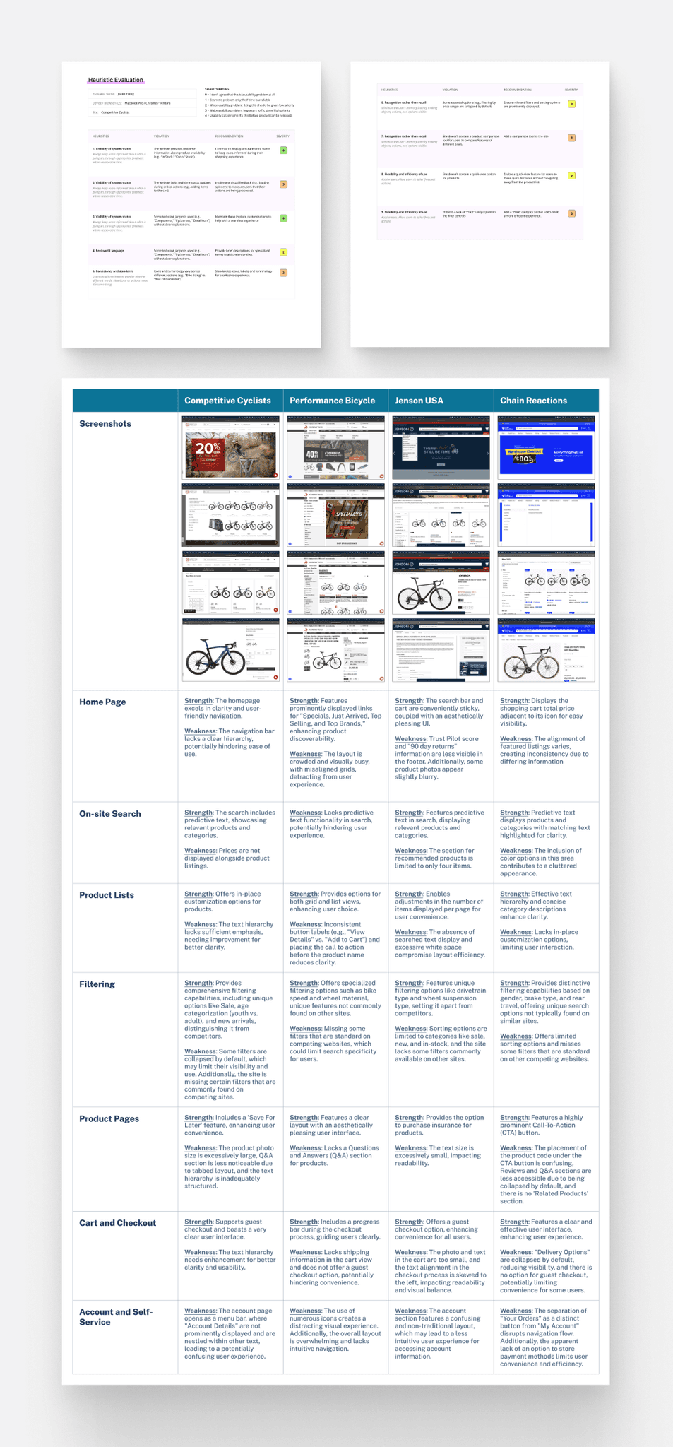
The research then narrowed its focus to top-performing bike shops including Competitive Cyclists, Performance Bicycle, Jenson USA, and Chain Reactions. Here, a heuristic analysis was employed to evaluate their websites critically. This involved a detailed examination of the usability, design, and overall user experience of these sites. By analyzing the strengths and weaknesses of various pages and features, valuable insights were gathered on what constitutes an effective online presence in the bike retail sector.
Research Highlights
Design Process
User Flow
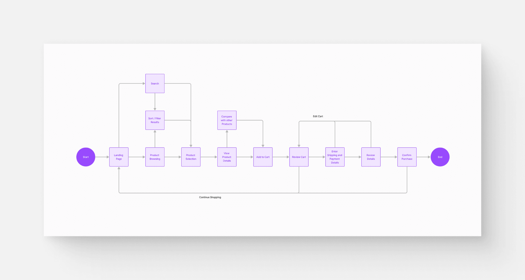
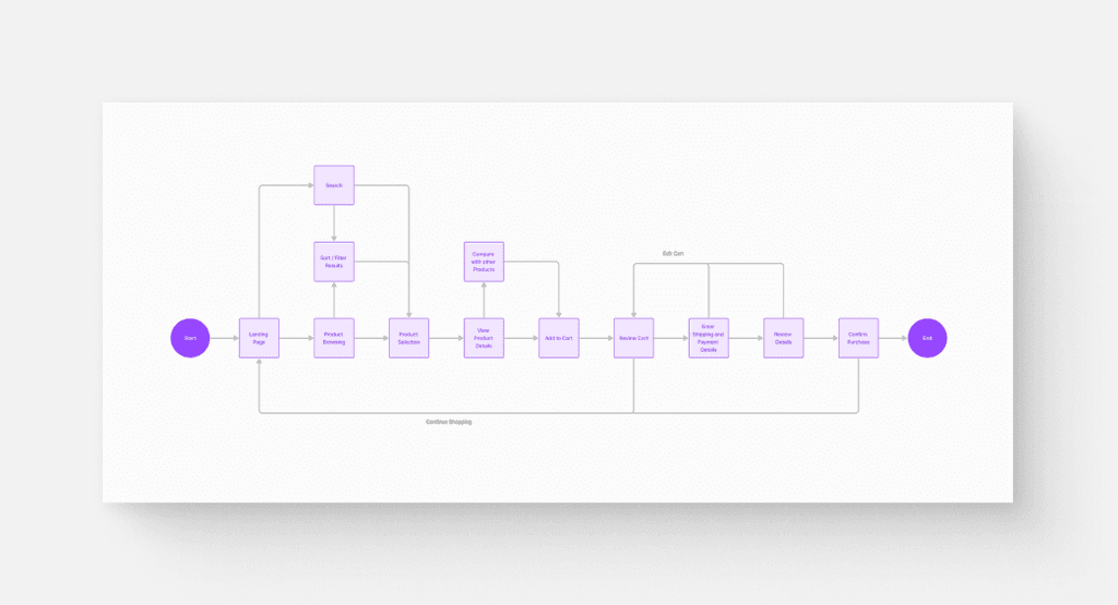
After synthesizing this research, I created a user flow to effectively visualize and optimize the journey of a typical user from initial entry to the final goal
Low Fidelity
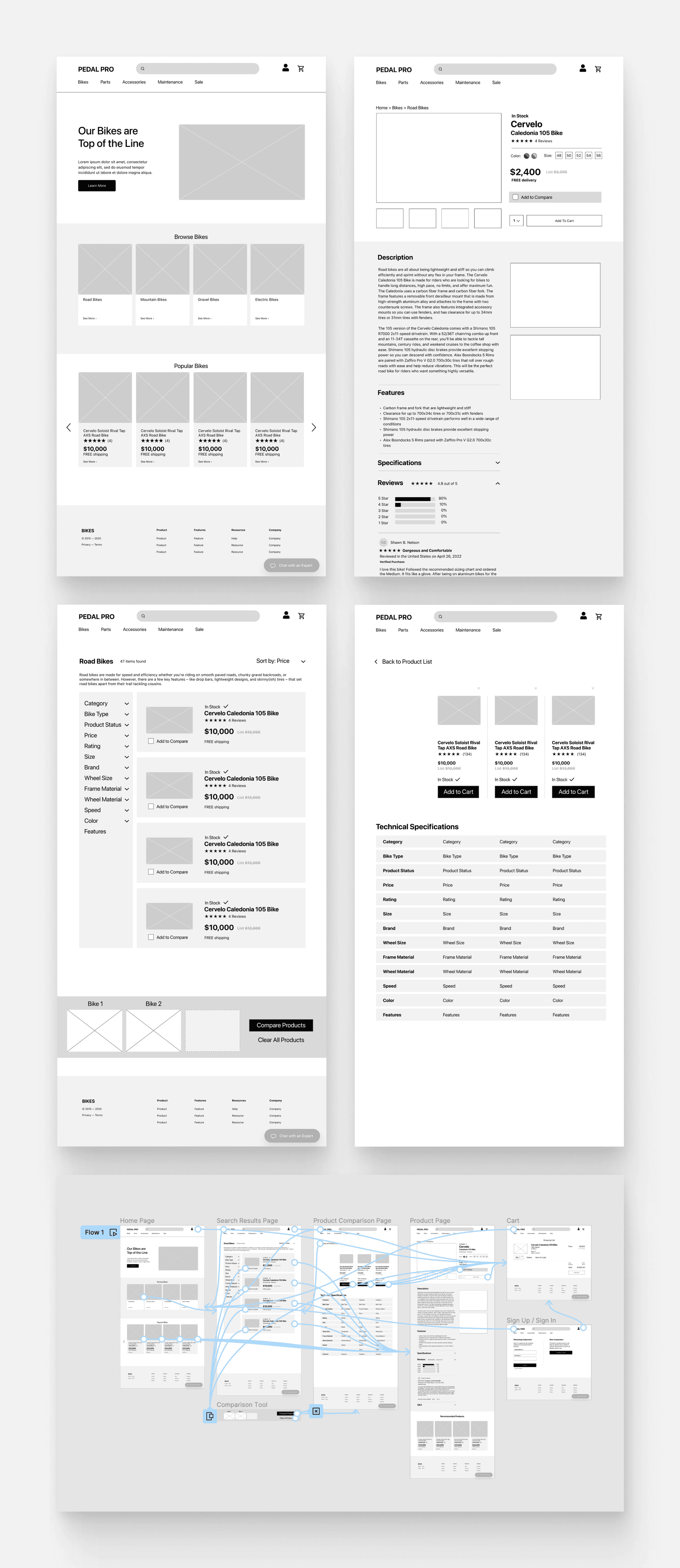
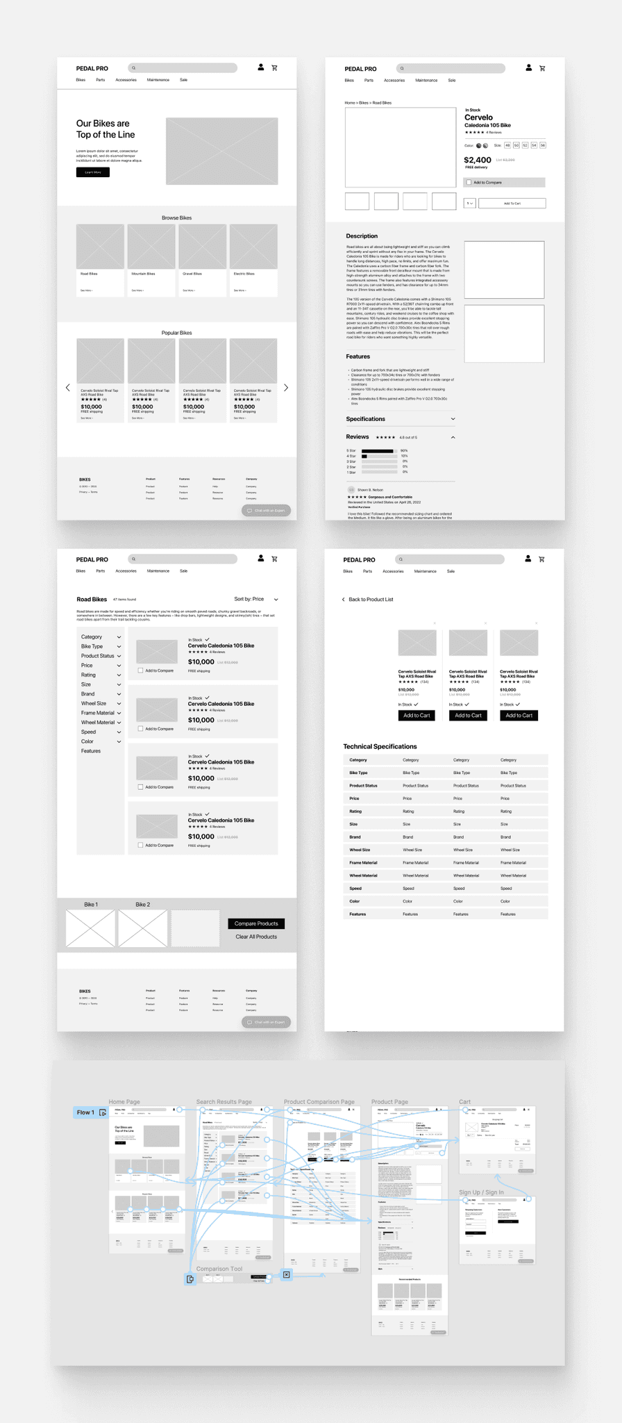
I created low-fidelity designs and a quick prototype to establish the fundamental structure and interaction flow of the website, focusing on functionality and user interaction without getting bogged down in visual details.
User Testing (Round 1)
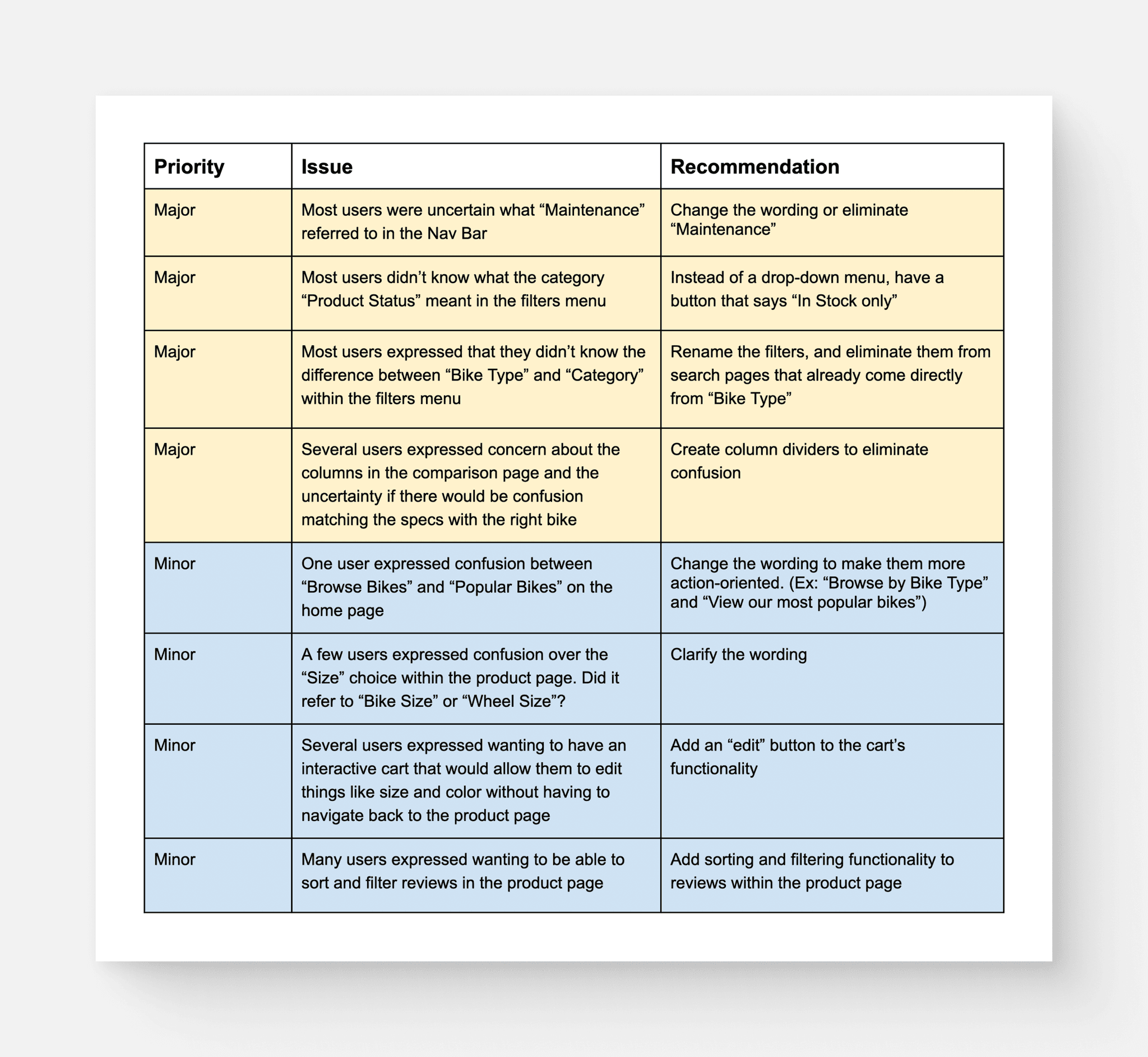
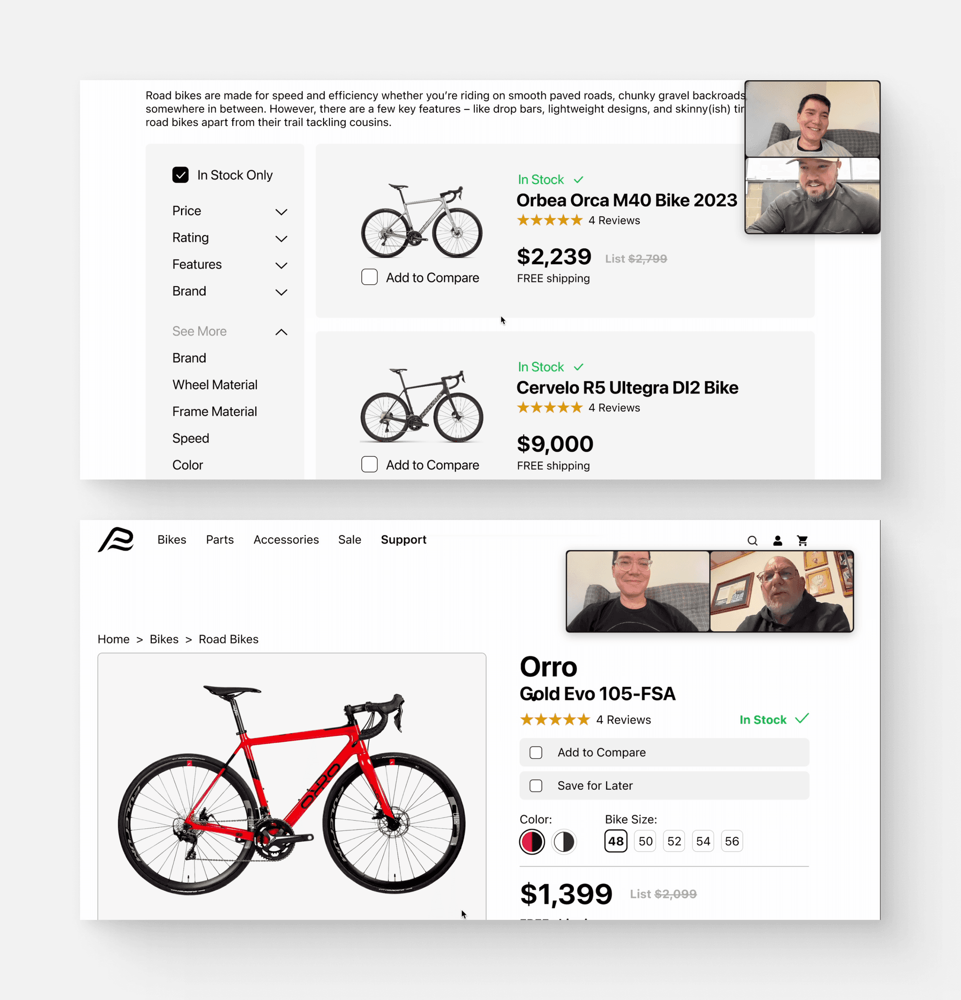
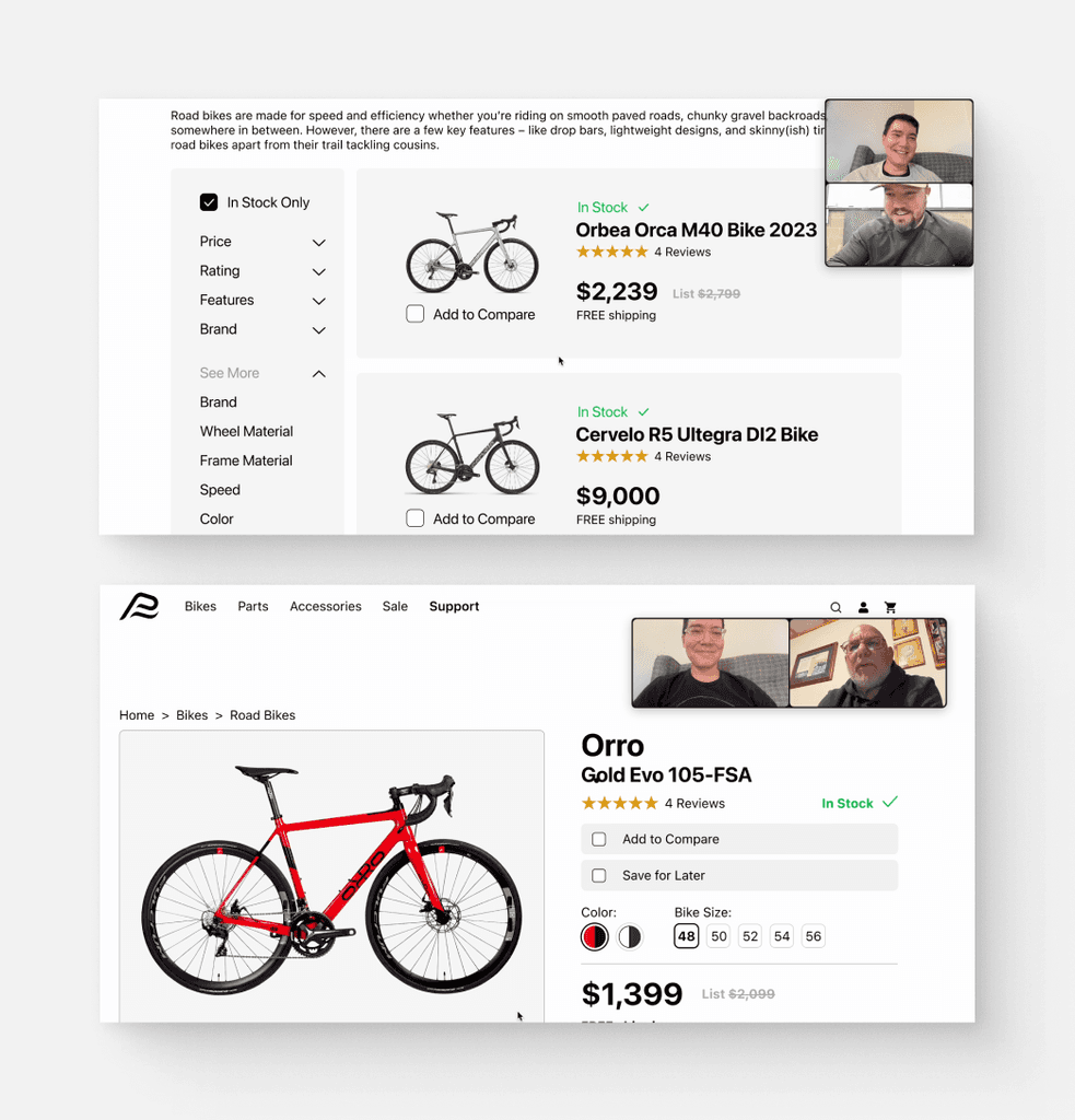
I conducted 5 usability tests both in-person and virtually, focusing on a range of participants who regularly engage in online research before purchasing. The testing primarily focused on the website's navigation, clarity, and overall user-friendliness. The goal was to assess the ease with which users could understand, navigate, and interact with the site, ensuring an intuitive user experience.
Findings
Brand Identity
Company Name
For the company name, I utilized the Shopify Business Name Generator, ultimately choosing “Pedal Pro”. The name's alliteration enhances its memorability, making it a fitting choice for a cycling-focused brand.
Personality
An expert in the field who is always knowledgeable about the very latest trends and best products related to biking.
Attributes
Savvy, Focused, Serious, Dependable
Style Guide
Logo
To create the logo, I sought inspiration for a design that was centered around the initials “PP”, aiming to create something sleek and modern to accurately represent the “Pedal Pro” brand.
Color Palette
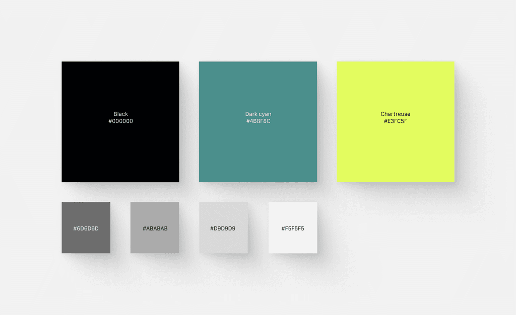
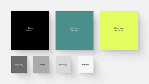
The color palette for Pedal Pro was selected to reflect its brand attributes. Black and gray shades emphasize the brand's seriousness and focus, signifying its commitment and expertise in cycling. Dark cyan adds a touch of sophistication, highlighting the brand's savvy and modern approach. The chartreuse accent introduces a vibrant, energetic element, symbolizing innovation and a forward-thinking mindset.
Typography
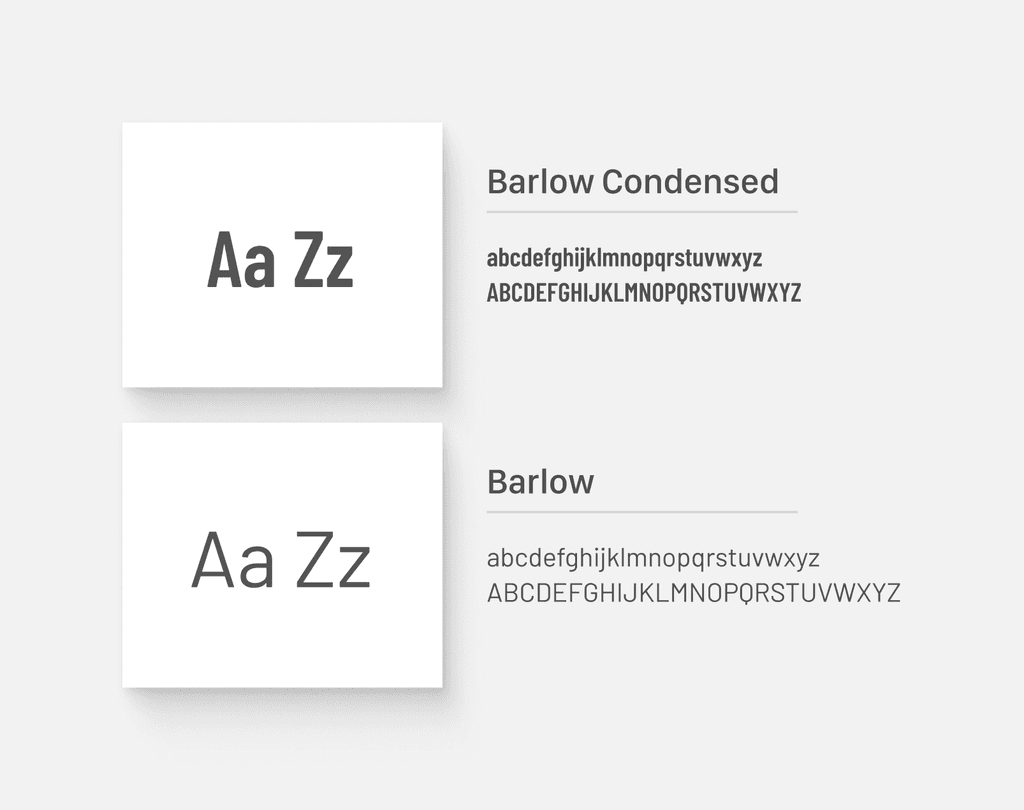
The fonts "Barlow" and "Barlow Condensed" were chosen due to their sleek, modern, and clean appearances. These fonts offer excellent readability, ensuring that information is easily digestible for users.
High Fidelity Designs
I conducted 5 usability tests both in-person and virtually with participants who were chosen based on a set of specific criteria to ensure they provided substantial and relevant insights into the website's usability. These criteria included:
Prior Purchase Experience: Participants must have previously purchased a bicycle valued at over $1,000.
Expertise in Biking: Participants are required to be extremely knowledgeable about biking, ensuring they can provide informed feedback.
Extended Biking Experience: Participants must have a minimum of five years of active involvement in biking, ensuring a depth of experience and familiarity with the activity.
Findings & Iterations
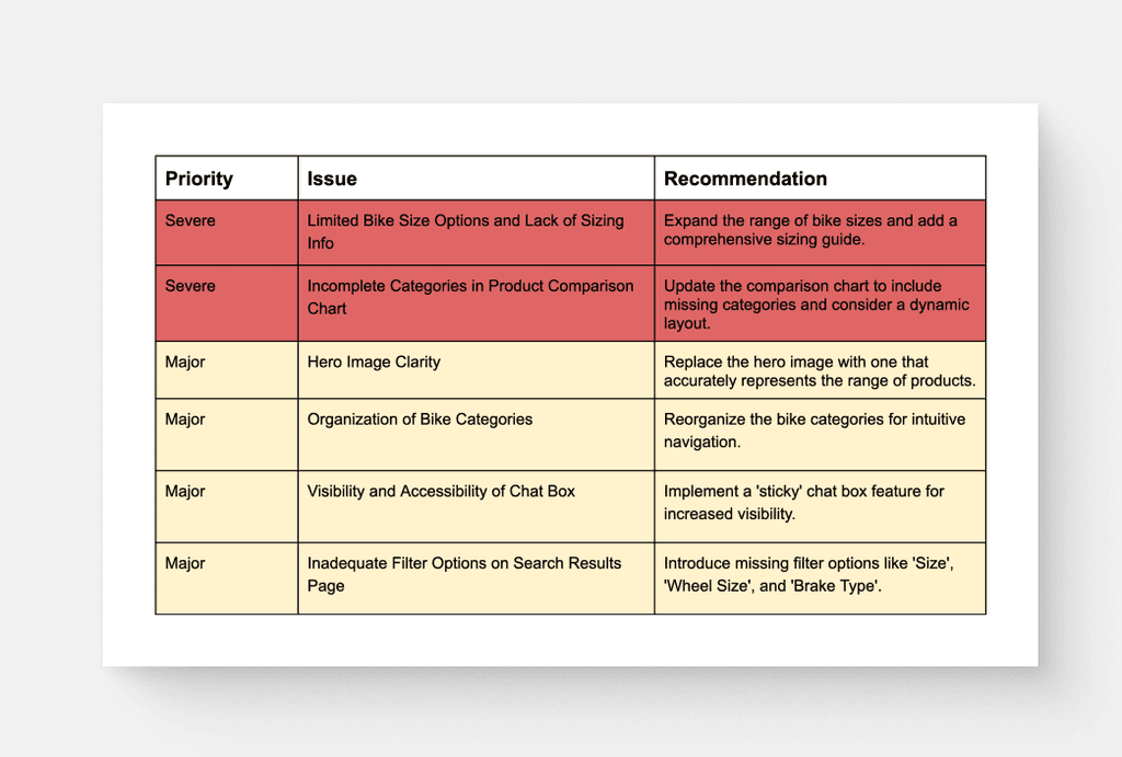
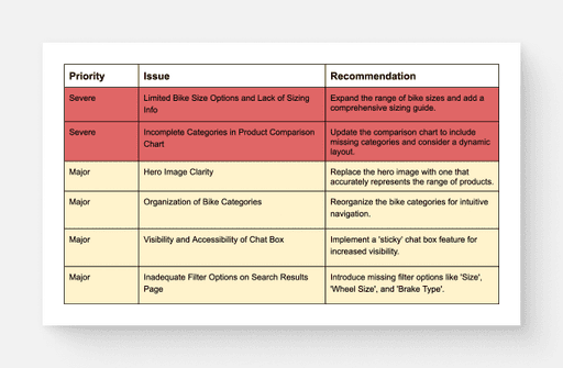
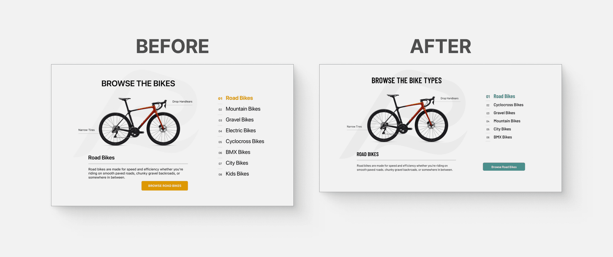
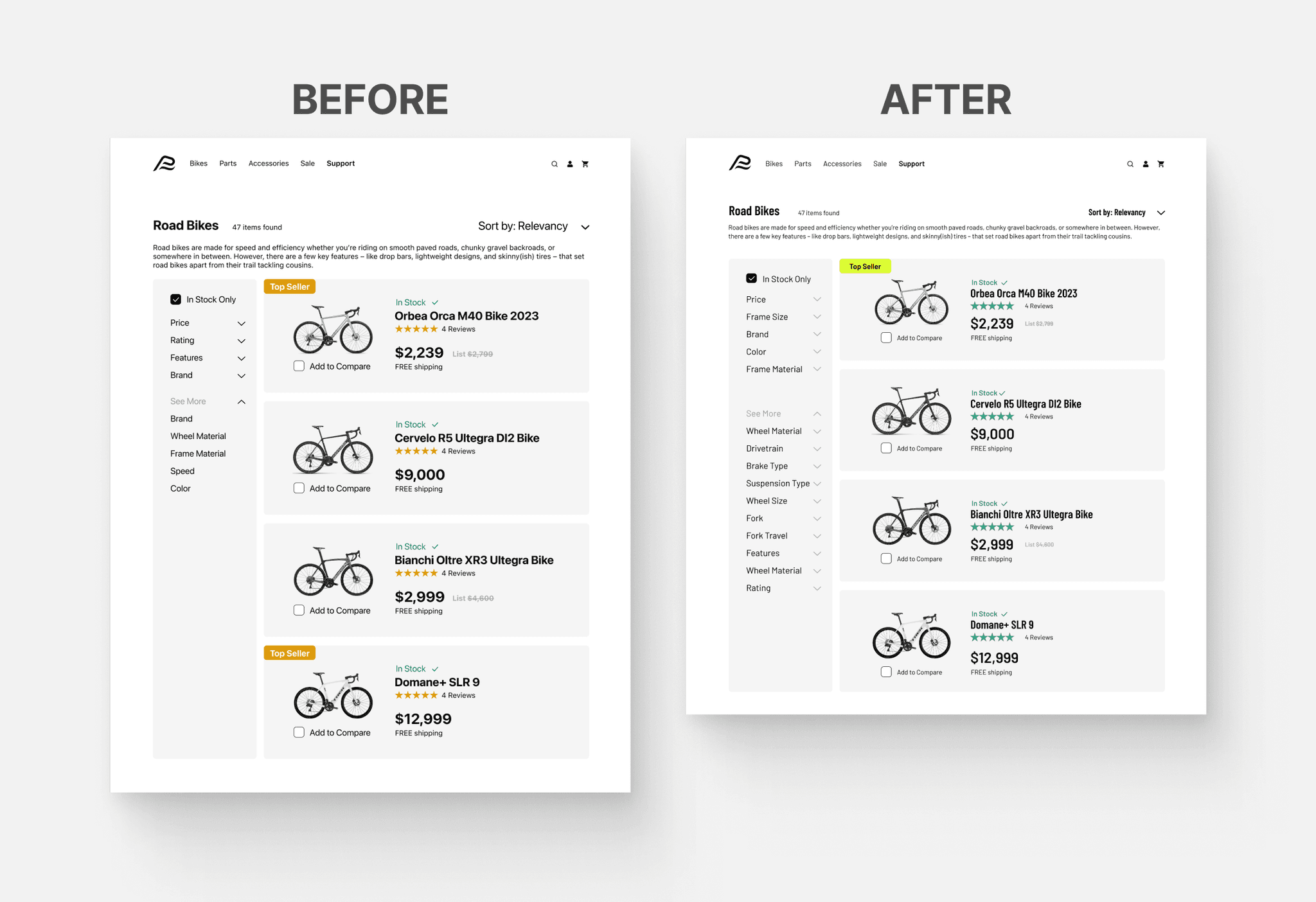
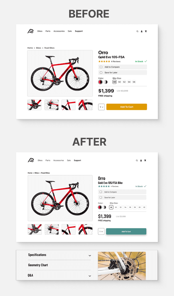
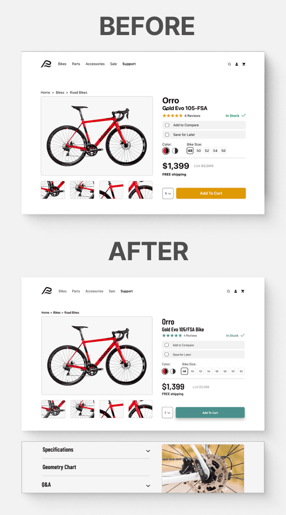
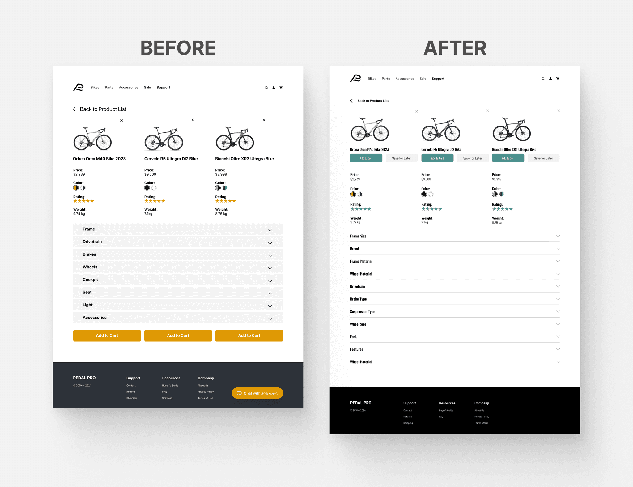
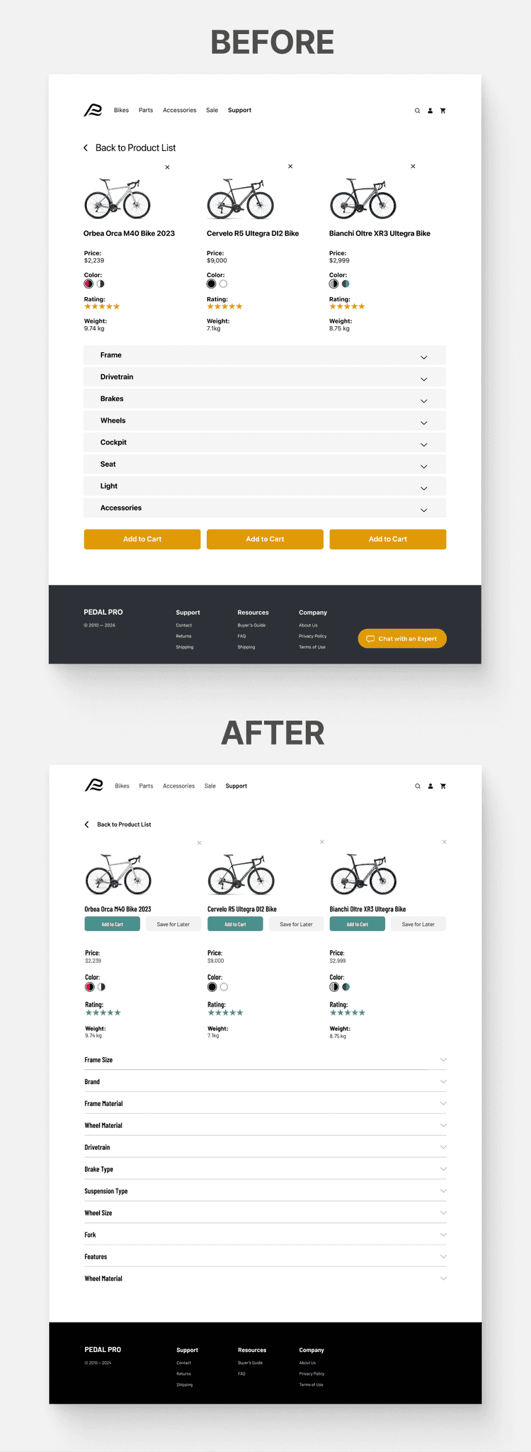
Feedback from the 2nd round of testing led to some significant design iterations. Overall, most of the tasks were completed, but I gained some incredible insights through the user comments within the testing sessions.
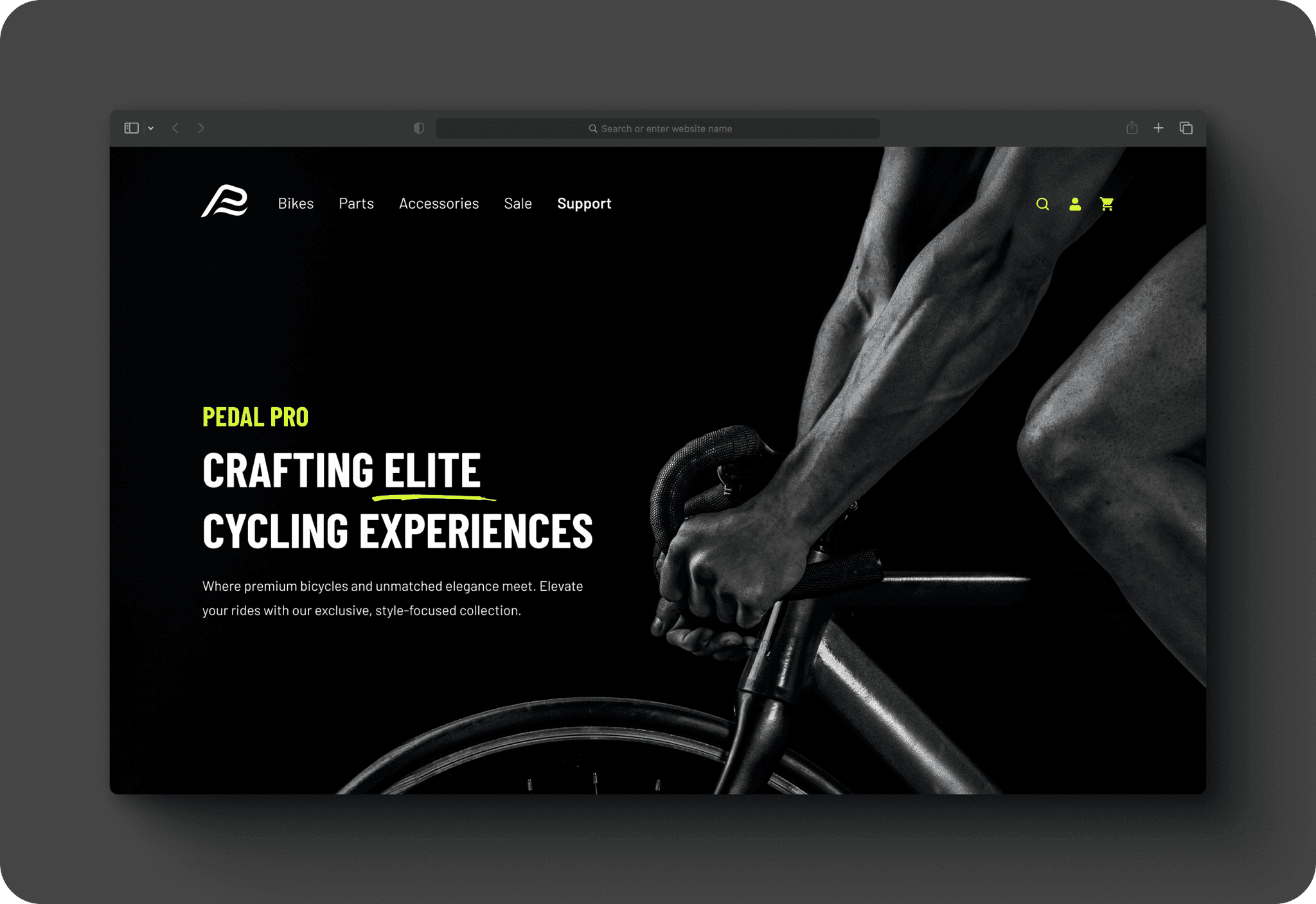
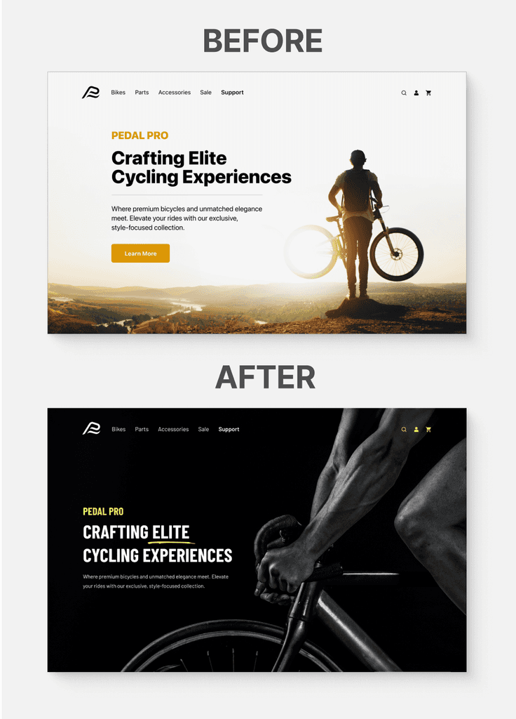
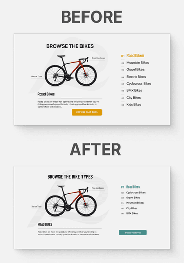
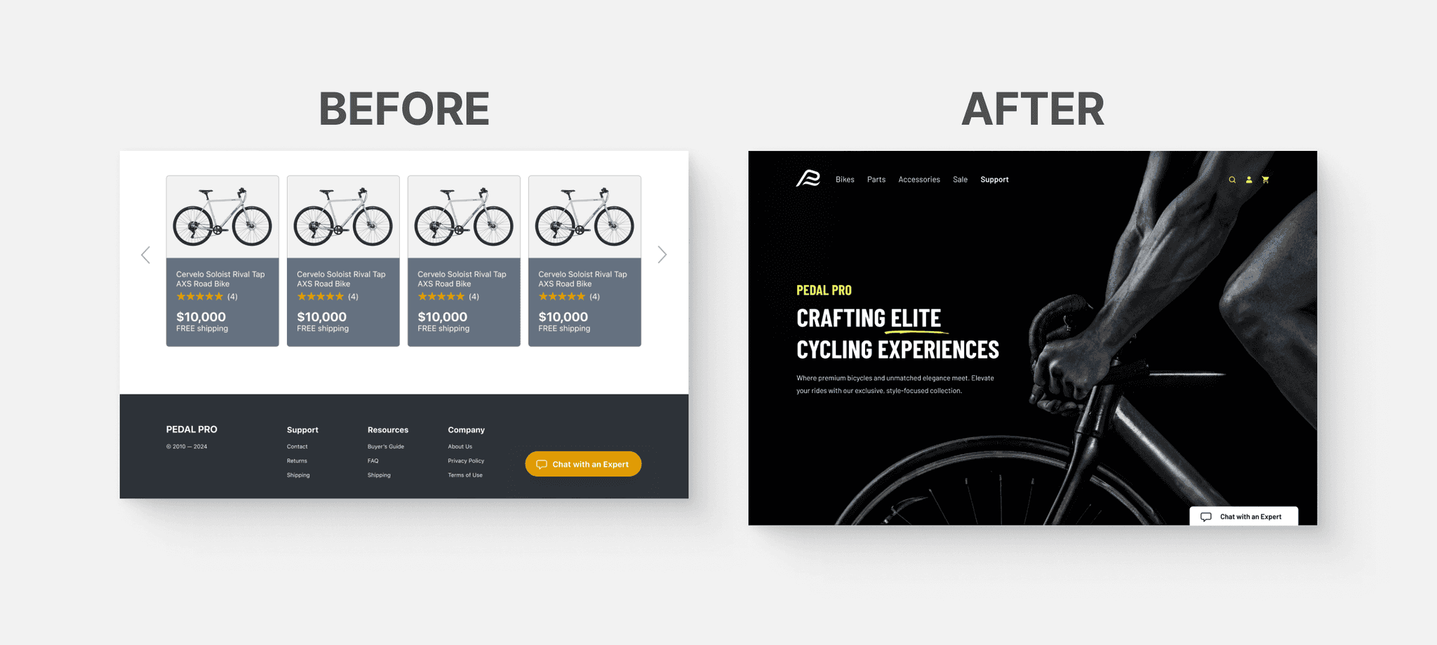
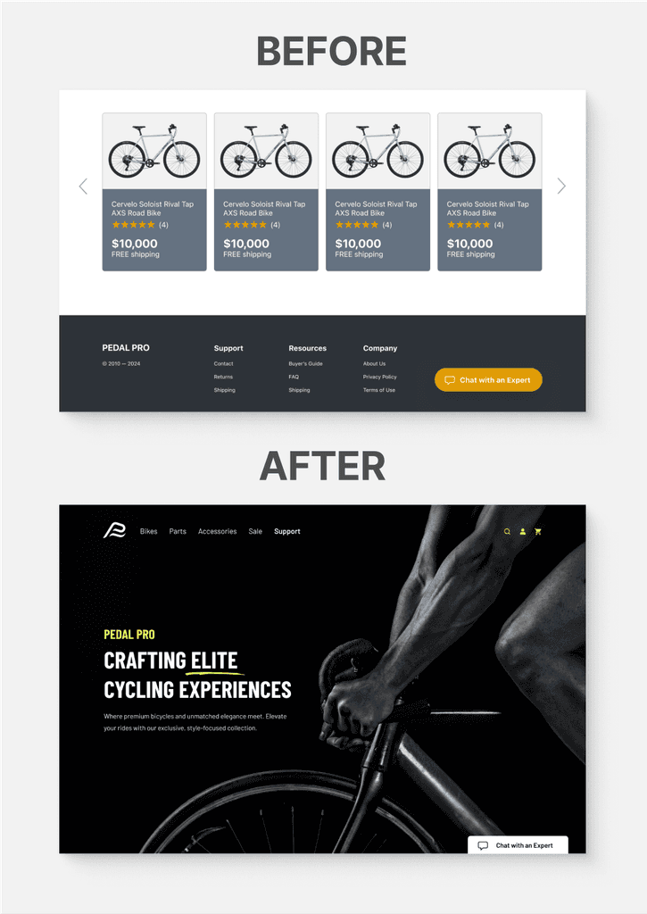
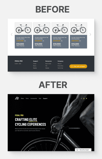
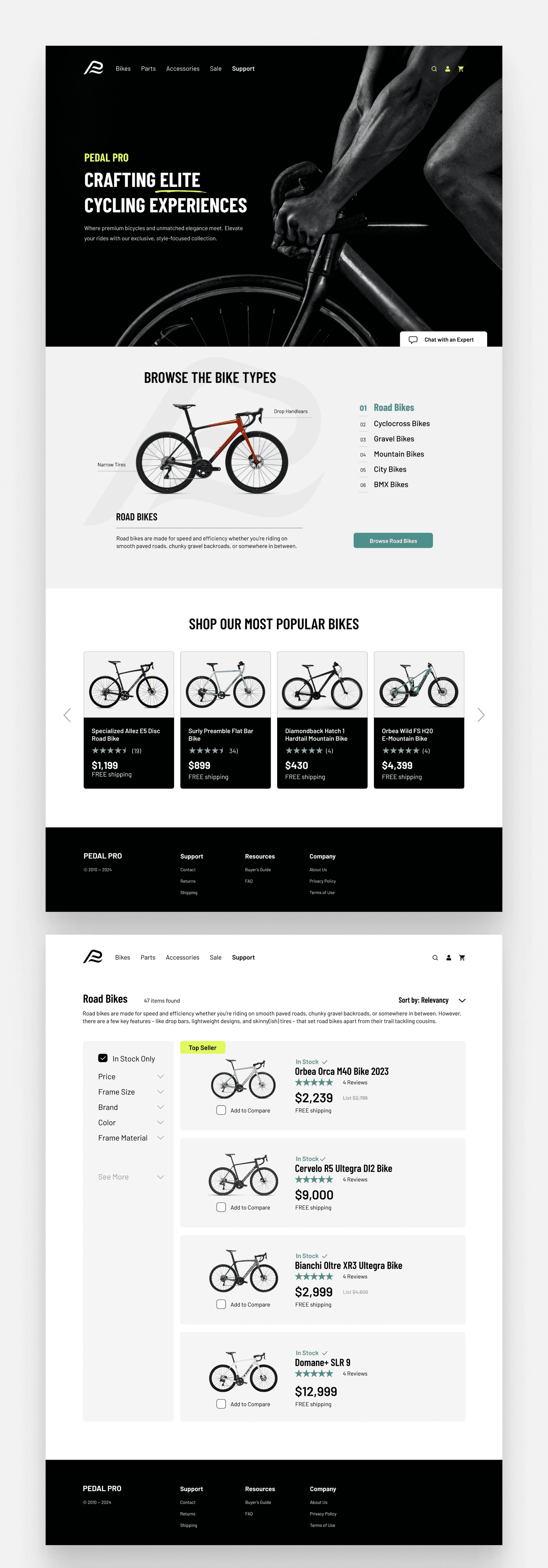
Hero Image Clarity: The image was perceived as focusing solely on mountain bikes, with one tester specifically identifying it as a "slopestyle" bike, not offered on the site. The image change better represents the site's diverse range of bikes and align with the brand's attributes of being savvy, focused, serious, and dependable. This update also led to a revised color palette, consistently applied throughout the site, further reinforcing the brand's identity.
Chat Box Visibility: Users had difficulty locating the chat box, which was located within the footer, often resorting to alternative methods for assistance. Enhancing its visibility through a "sticky" feature on the screen responds to this need for easy access.
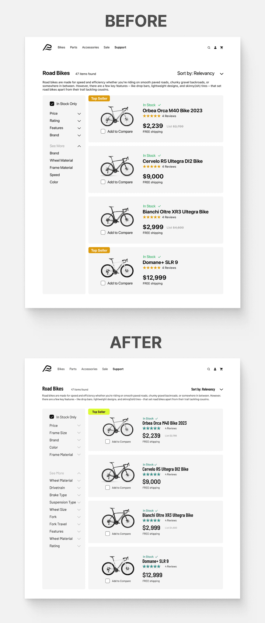
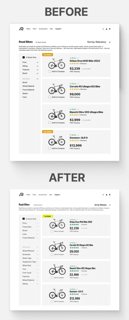
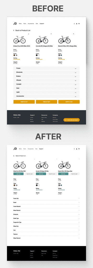
Filter Options: Missing filter categories like 'Size,' 'Wheel Size,' and 'Brake Type' were identified as crucial for bike selection. The proposed additions and reordering of filters like 'Color' and 'Frame Material' are based on their highlighted importance.
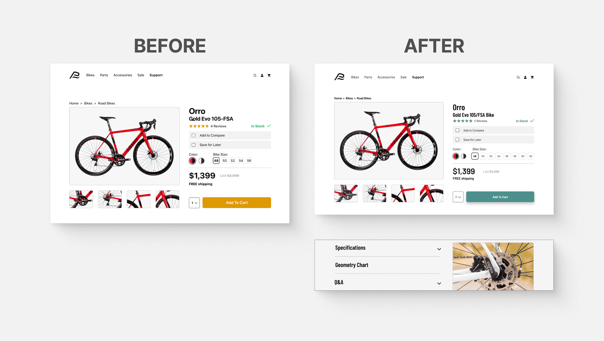
Bike Size Options: Users noted limited size options and the absence of sizing information, prompting the recommendation to expand size ranges and provide detailed sizing guides or geometry charts.
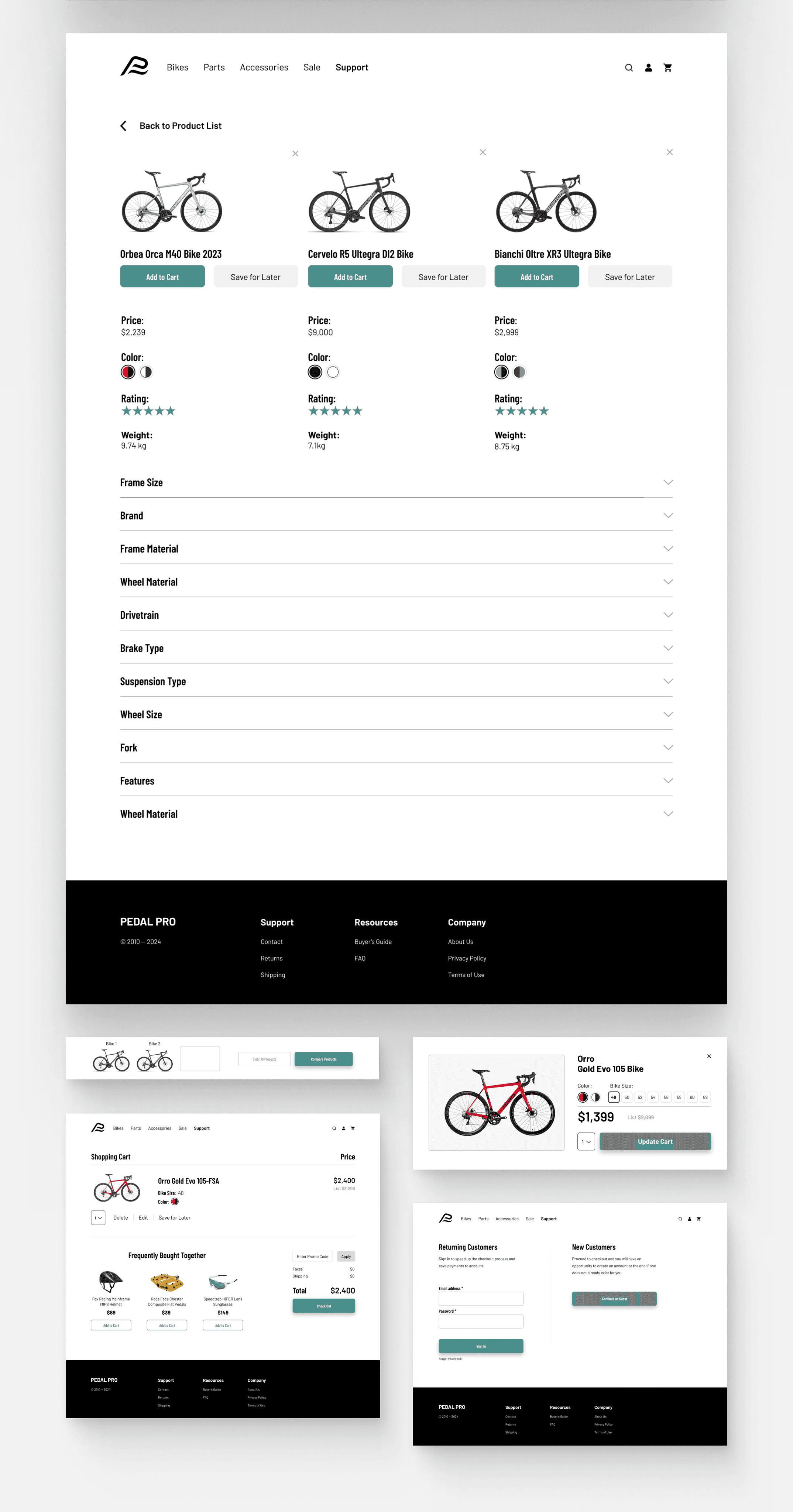
Product Comparison: Feedback indicated missing categories in the comparison chart, such as 'Suspension' and 'Geometry,' and suggested clarity in categories like 'Frame' and 'Fork.' The recommendation for a dynamic chart layout addresses mixed preferences for collapsed or expanded views. Additionally, "Add to Cart" and "Save for Later" buttons were added beneath each bike model, which are designed to be sticky at the top when scrolling. This feature ensures users can easily identify which bike corresponds to specific specifications and keeps the action buttons visible at all times, enhancing usability.
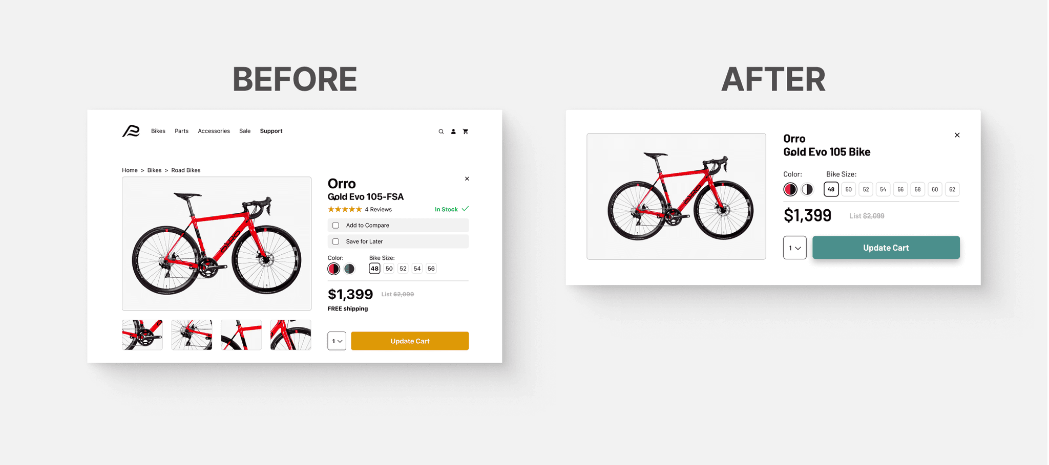
Edit Cart - To enhance the cart experience, I streamlined the "edit" function. Previously, editing a product redirected users away from the cart. Now, a modal popup within the cart lets users easily modify details without leaving the page, fostering a continuous and intuitive checkout process and minimizing the chance of user drop-off.
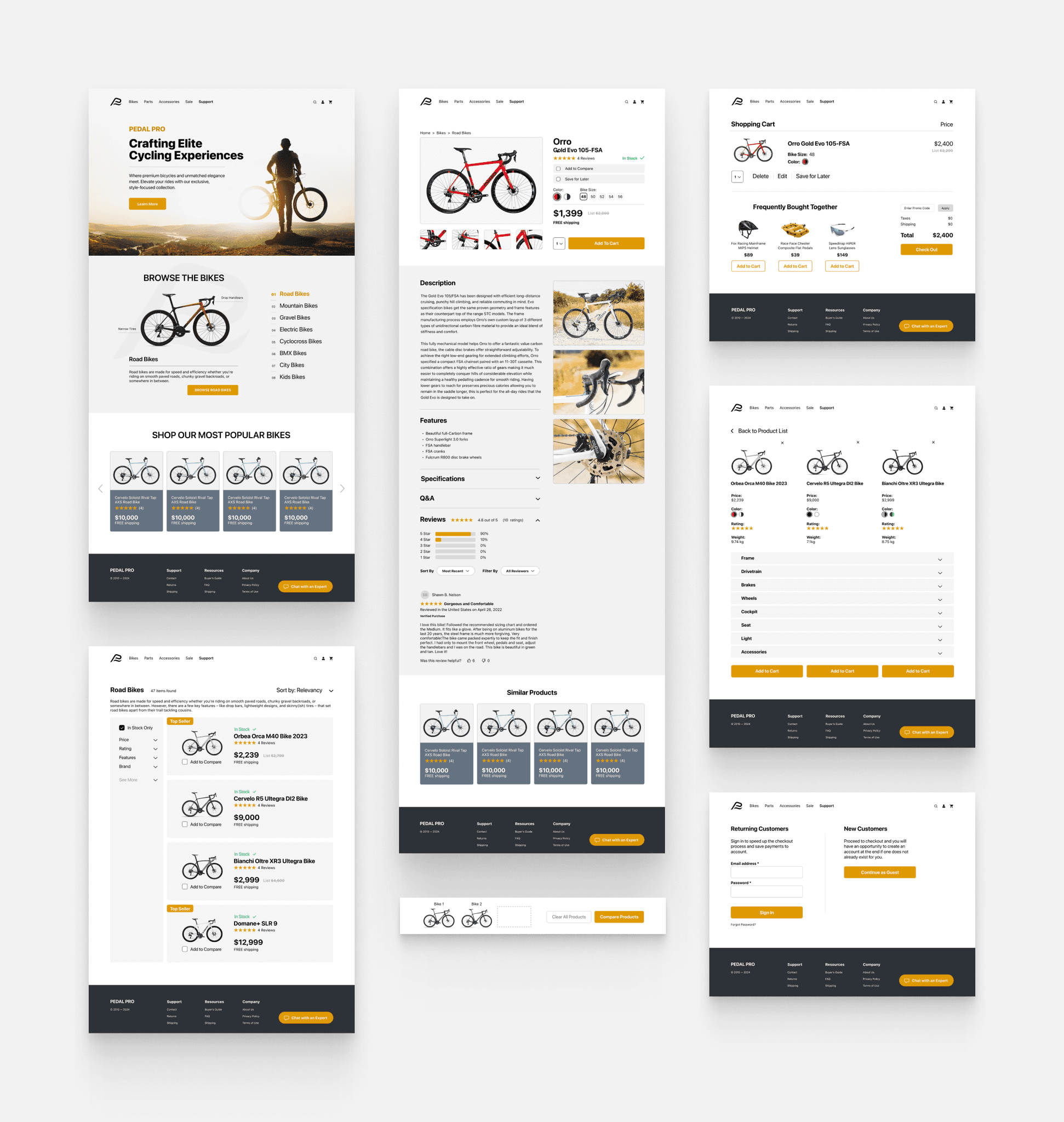
Final Designs
Project Learnings
Throughout this project, I've gained deep insights into the cycling industry and the importance of subject matter expertise in design. Immersing myself in the world of bikes allowed me to design with precision and purpose. Moreover, the caliber of testers proved crucial; their informed feedback was indispensable, highlighting the value of selecting participants aligned with the user base. This process reinforced that thorough research and relevant user testing are not just steps but rather the backbone of user-centered design, leading to actionable insights and a product that truly resonates with its audience.
Next Steps
If I had more time dedicated to this project, I would test different layouts for the comparison page and refine the prototypes. I would also introduce a grid option for search results and test user ratings' placement for optimized engagement. I would also consider adding personalized recommendations to improve user experience.
