Role:
UX/UI Designer
Duration:
5 Days
Tools
Figma, Photoshop, Pen & Paper, Zoom
Context
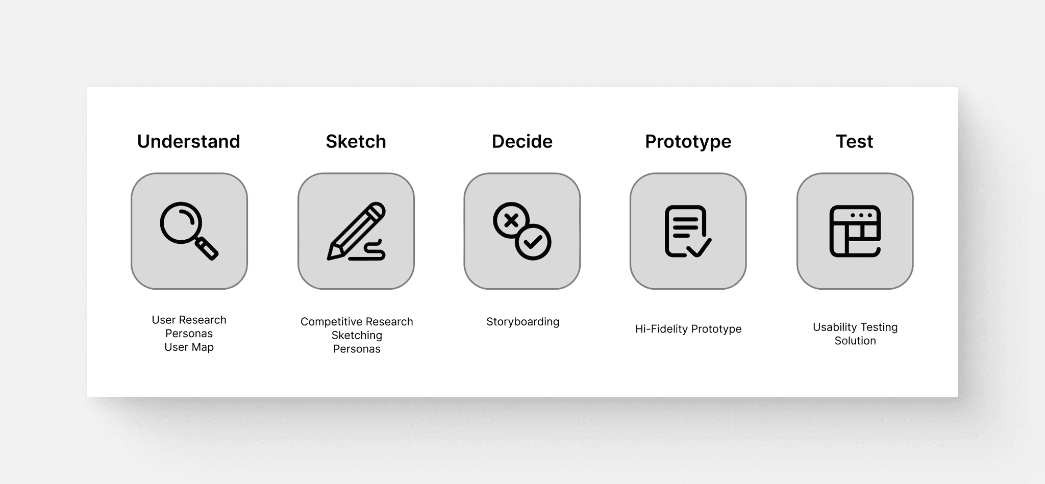
This case study showcases a modified Google Ventures (GV) Design Sprint, adapted for solo execution. This project aimed to develop a Minimum Viable Product (MVP) for a dog adoption website tailored for urban residents.
Problem
CityPups is a new startup that wants to help people living in cities find the perfect dog to adopt. However, CityPups has discovered that people living in cities struggle to find the right dog to adopt due to their unique needs.
Constraints
The solution must be a website, initially designed for larger screens (desktop and laptop).
The primary focus should be on assisting users in finding the right dog to adopt.
CityPups will aggregate adoptable dogs from local organizations and shelters. Users will be redirected to a third-party contact to initiate the adoption process once they decide on a dog.
Day 1 - Understand
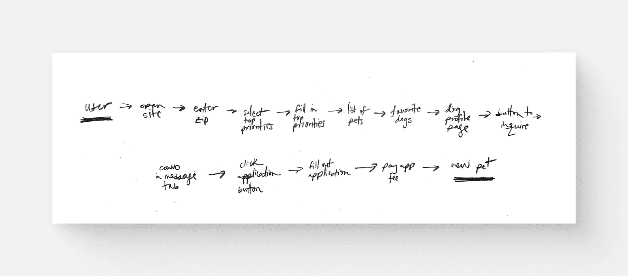
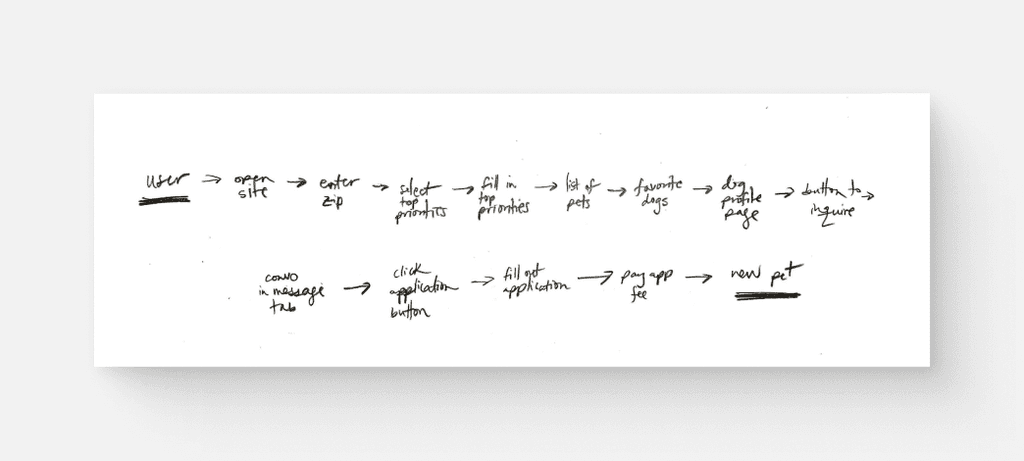
I reviewed the existing research provided by CityPups, including interviews, user personas, and usability tests. I was then able to synthesize this research and began to map out potential steps a user might follow on the platform to successfully find their ideal pup.
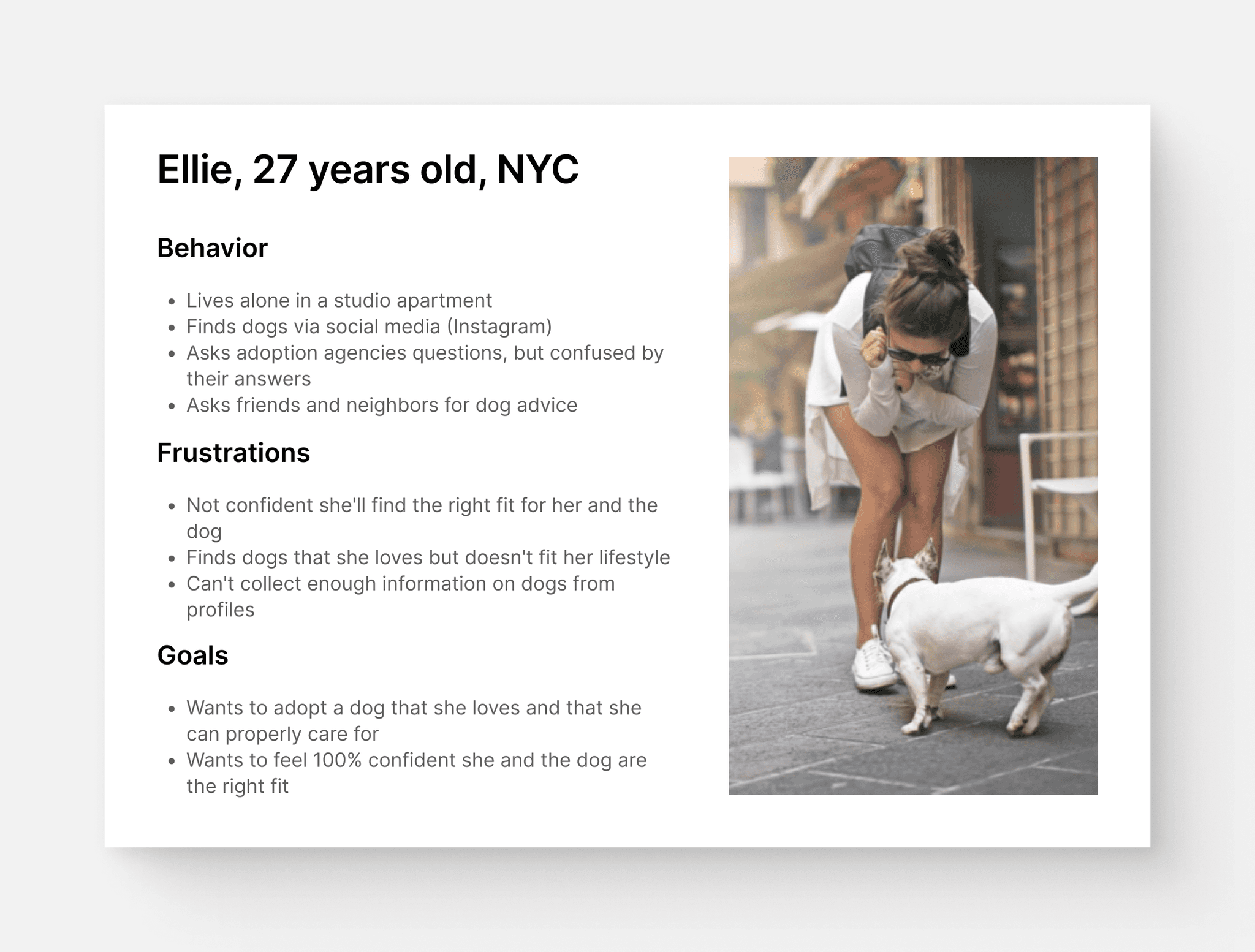
User Persona
Existing Usability Test
Pain-Points and Frustrations
Current site doesn’t allow anything below a 25 mile radius
Wants more information about the dogs’ temperaments and personality on the dog’s profile
There is a large adoption fee
Doesn’t have enough information from the profile to make the next step
Expressed wanting to see videos of dog
Successes
Site had pictures and facts about the dog
Priorities and Considerations
Priorities and Considerations
Level of activity that the dog needs
Size, age, and energy levels of the dog
Knowledge of any health issues
Temperament and if the dog is good with other pets
Photos are important in order to make an emotional connection with the pup and to figure out their personality.
Practicals such as the dog’s size, the amount of space they need, and their energy levels are key considerations.
Owners in cities have unique needs such as long commutes and time away from the home, which might affect how they choose their pup.
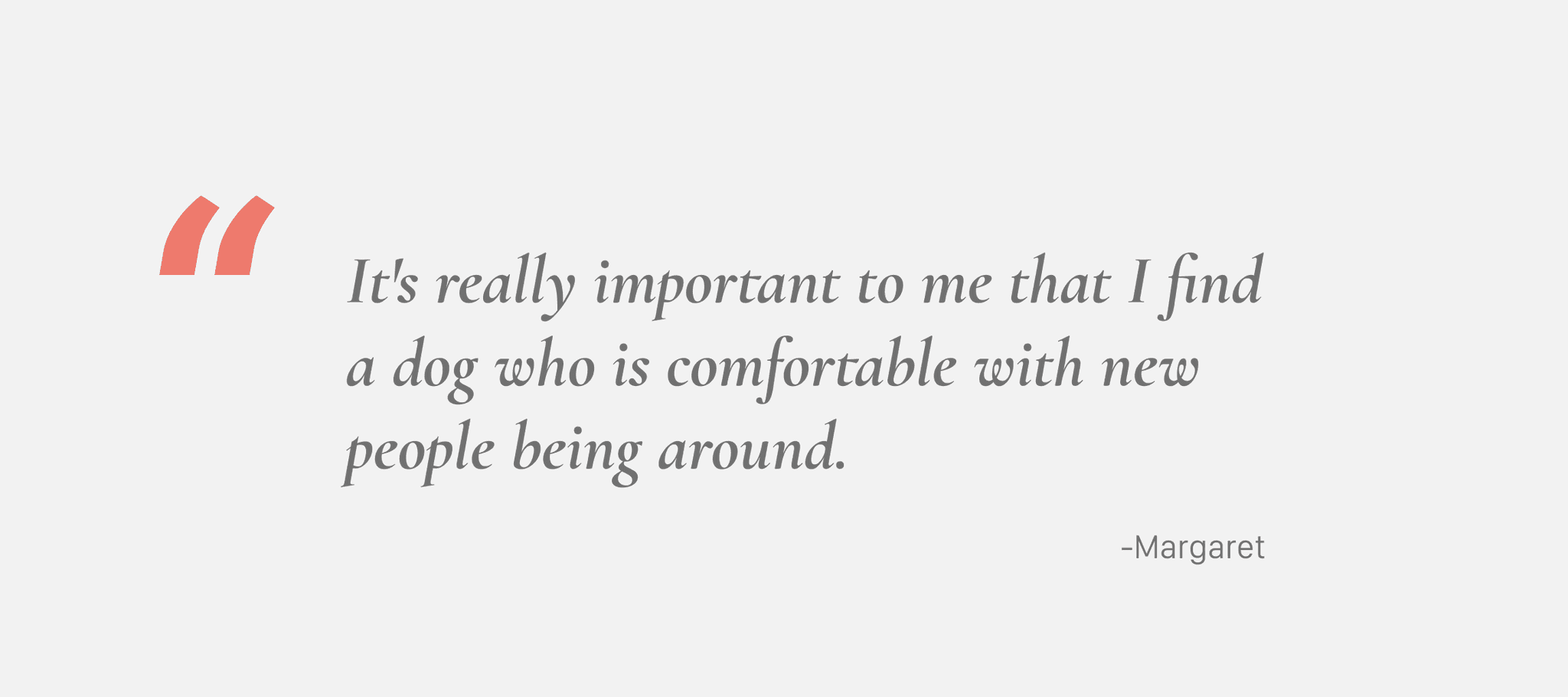
For city residents living closely with others, it's crucial to know how comfortably a pup interacts with people and animals.
Calling and visiting shelters can be a lengthy process.
Mapping
Draft of possible end-to-end experience a user might have.
Day 2 - Sketch
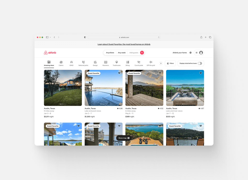
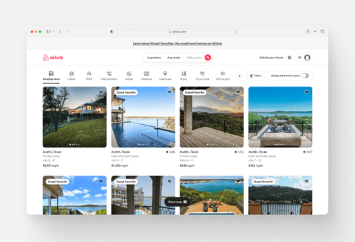
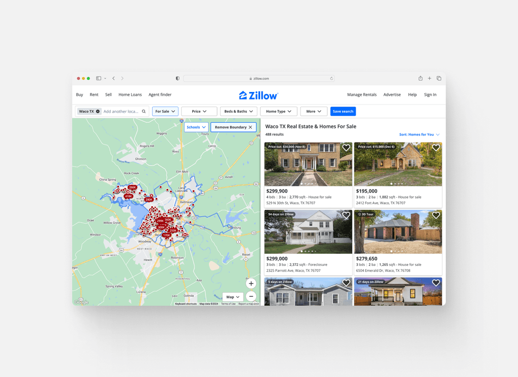
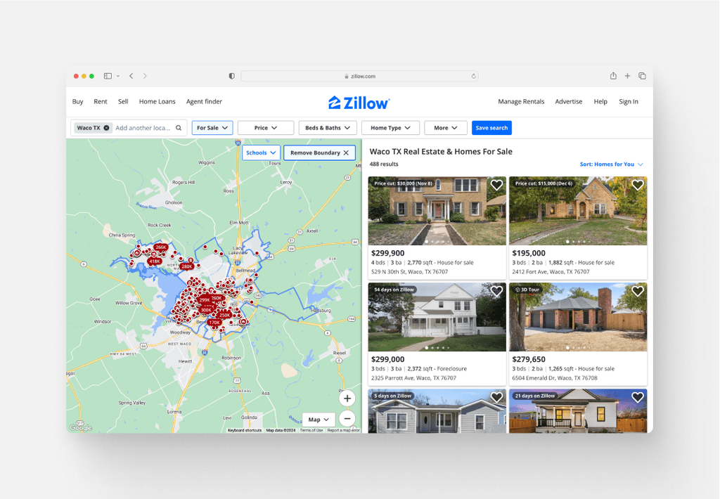
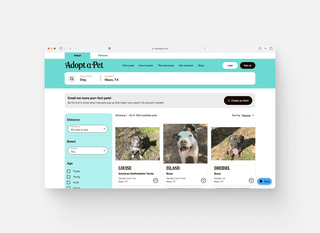
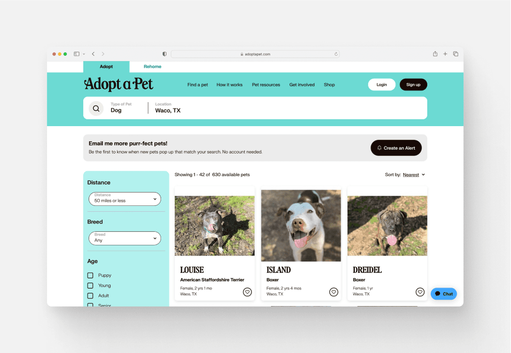
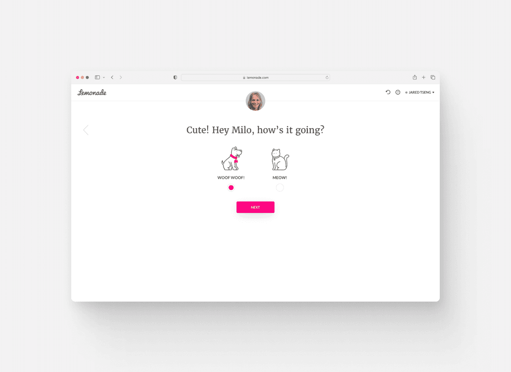
On the second day, I conducted lightning demos, analyzing websites like AirBnb, Zillow, Adopt a Pet, and Lemonade. My aim was to draw parallels between CityPups and these platforms, particularly in how they match users with homes, vacations, or pets based on specific preferences and filters. This research fueled my ideation process, directly influencing my sketching and ideation for CityPups.
Website #1: Airbnb
The layout of the images provides for easy scanning, with the option to click and enlarge when necessary.
The layout is clean and simple.
Website #2: Zillow
The layout of the images provides for easy scanning, with the option to click and enlarge when necessary.
The layout is clean and simple.
Website #3: Adopt a Pet
Looking at other adoption websites was beneficial for competitive analysis, finding areas of strength and areas that were lacking.
Website #4: Lemonade
Lemonade has a quiz that helps to customize your experience.
Their aesthetic is minimal, which allows for a simple and enjoyable experience.
Crazy Eight Sketches
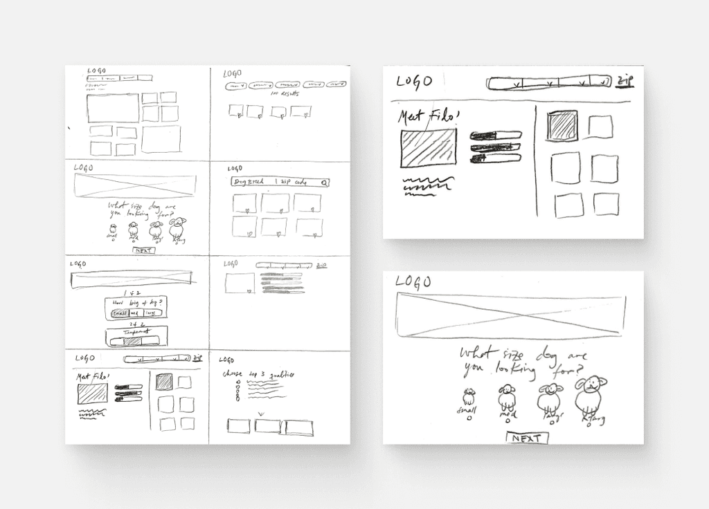
I then produced eight quick sketches to explore a variety of creative layouts and features.
Solution Sketch
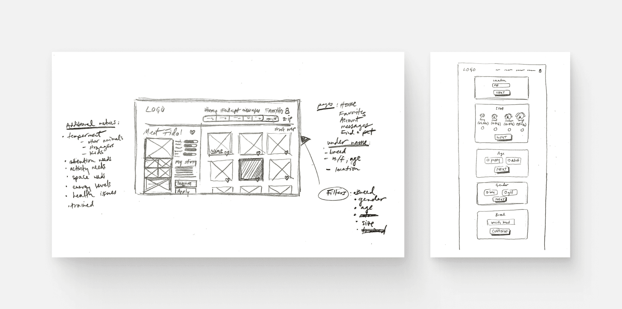
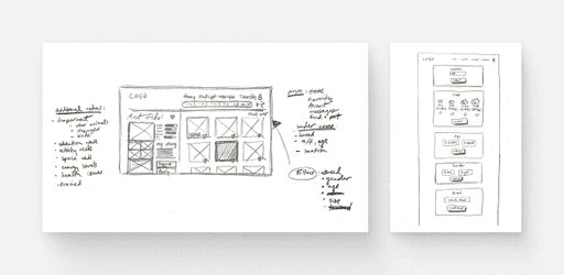
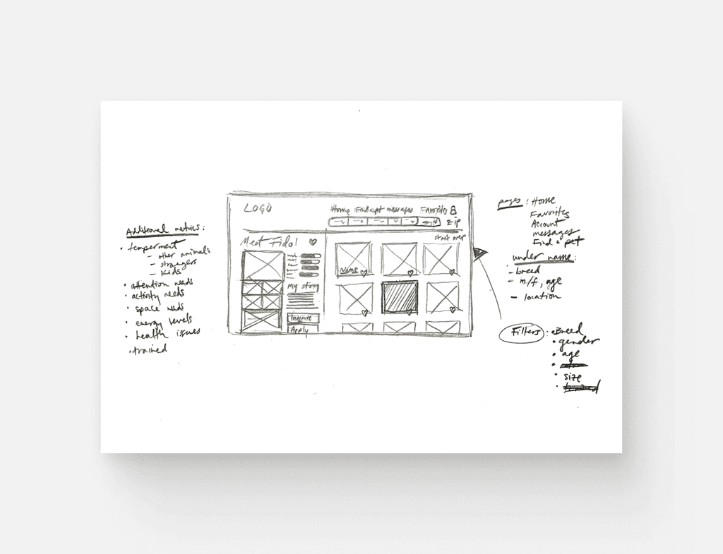
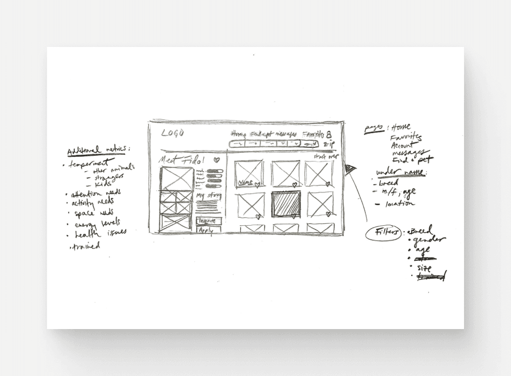
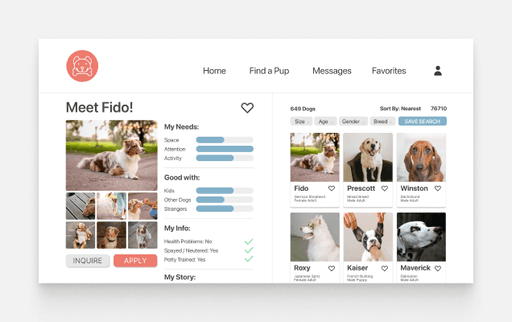
In evaluating the sketches produced during the Crazy 8s exercise, I selected the design from screen #7 as the foundation for my solution sketch, as it best aligned with the project's objectives and user needs. This search results page serves as the critical screen, allowing users to explore available dogs, assess ratings of each dog's needs and temperament, delve into their stories, and mark favorites for potential adoption.
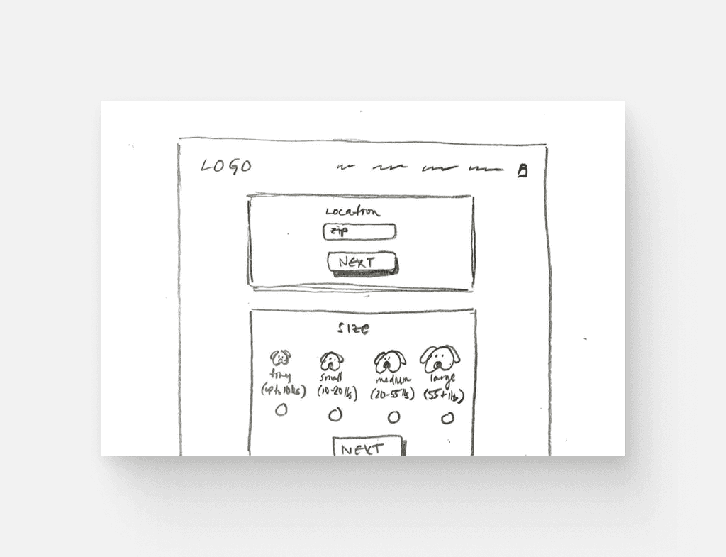
Additionally, I chose a concept for a "find a puppy" quiz (screen #3), which further refine searches by guiding users towards the most suitable options based on their preferences and lifestyle.
Design Solutions
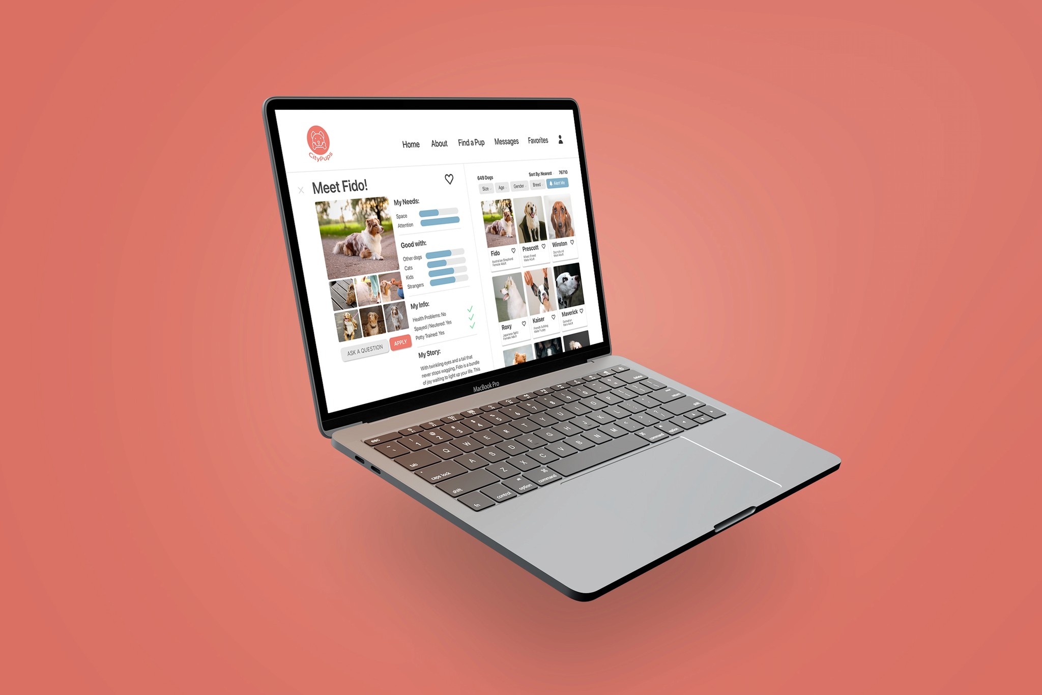
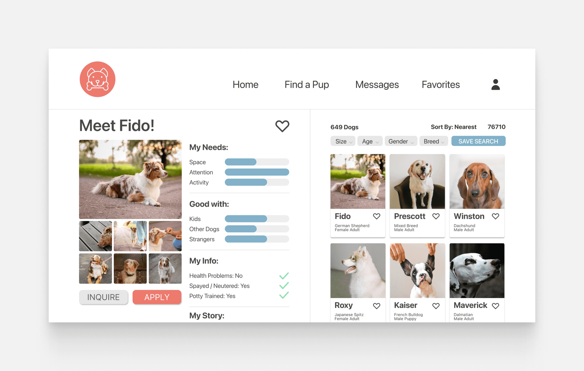
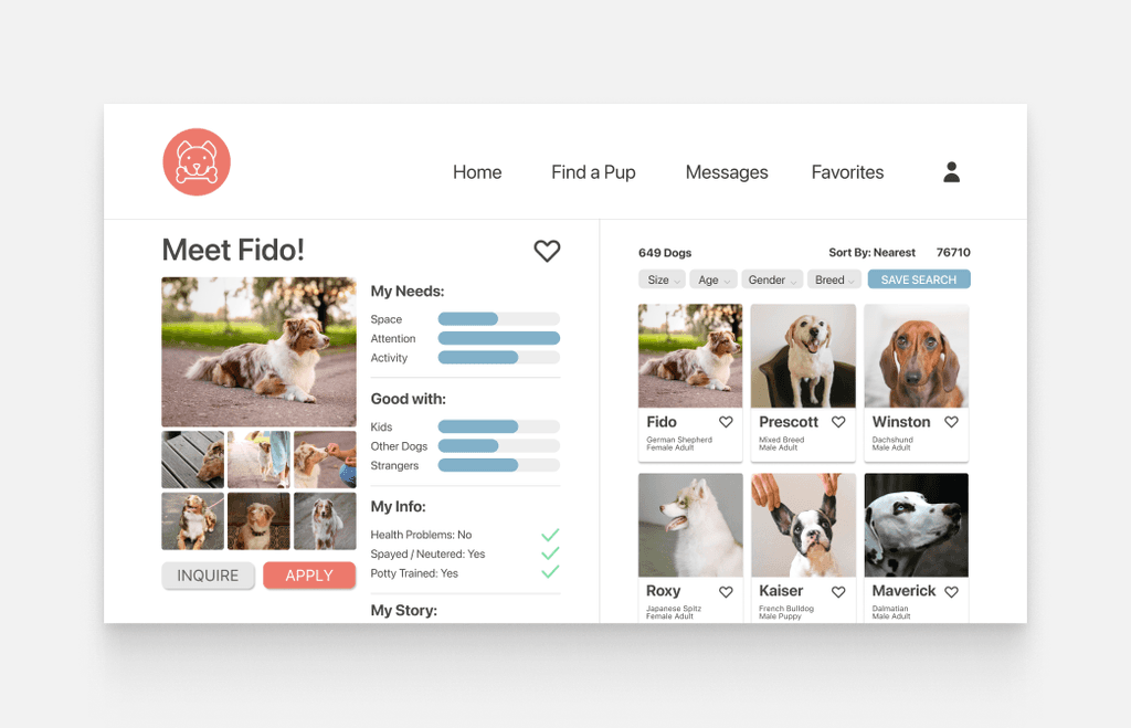
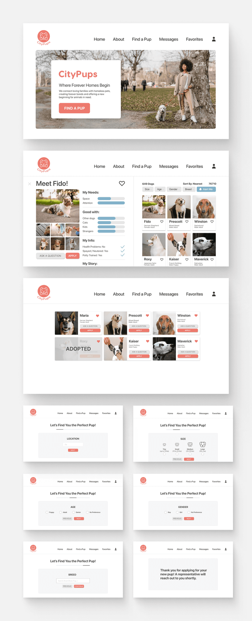
For the search results page, I elected to add a section to visually represent each dog's needs and compatibilities. This approach not only simplifies the decision-making process but also provides users with a clear, at-a-glance understanding of a dog's suitability for their urban lifestyle.
I opted for a split-screen layout, inspired by Zillow and Vrbo, to streamline the user experience. This design lets you view pictures and read details simultaneously, eliminating the need to toggle between screens.
I placed filters at the top for quick adjustments, unlike the side placement in many adoption sites. I also added bar graphs for at-a-glance assessment of a pet's suitability. Scrolling further reveals more details and an 'Apply' button.
I believed that by allowing users to quickly glance at a graph depicting the dogs' needs, they could more easily ascertain whether the dog aligns with their home and lifestyle, eliminating guesswork and streamlining the process.
Day 3: Decide and Storyboarding
While crafting the storyboards, I referred to the journey map I made on Day 1. This helped me outline the user's path from the homepage to the adoption process.
Storyboarding
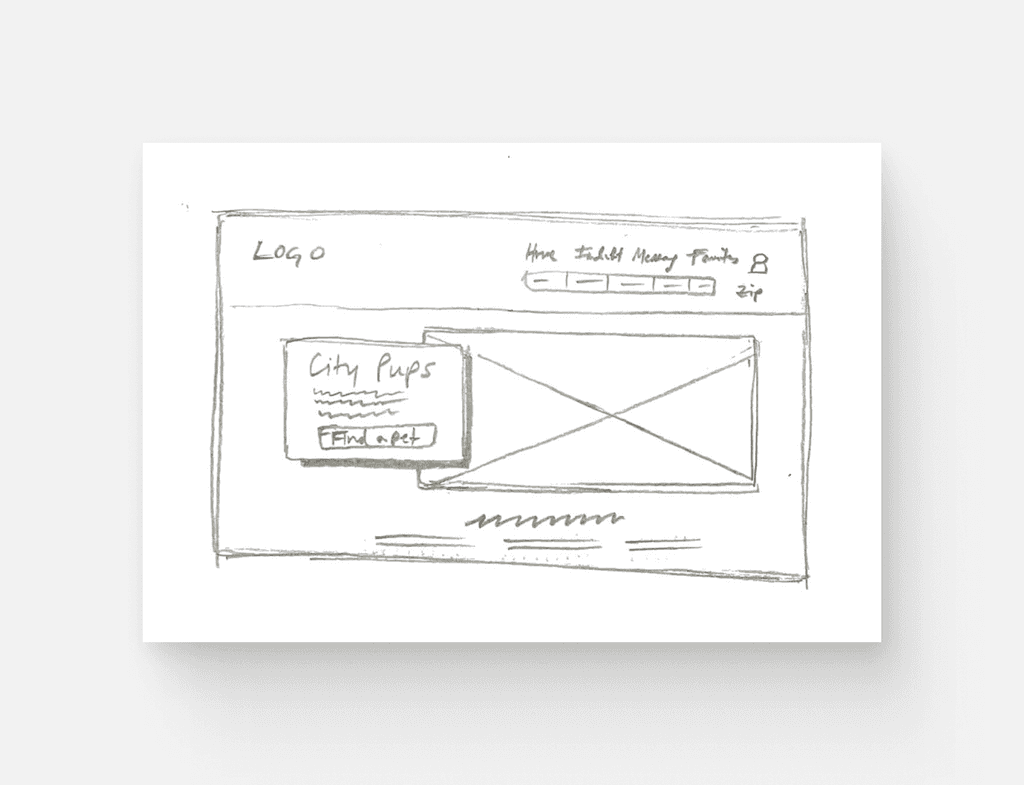
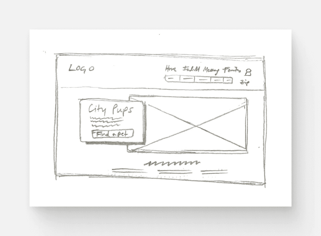
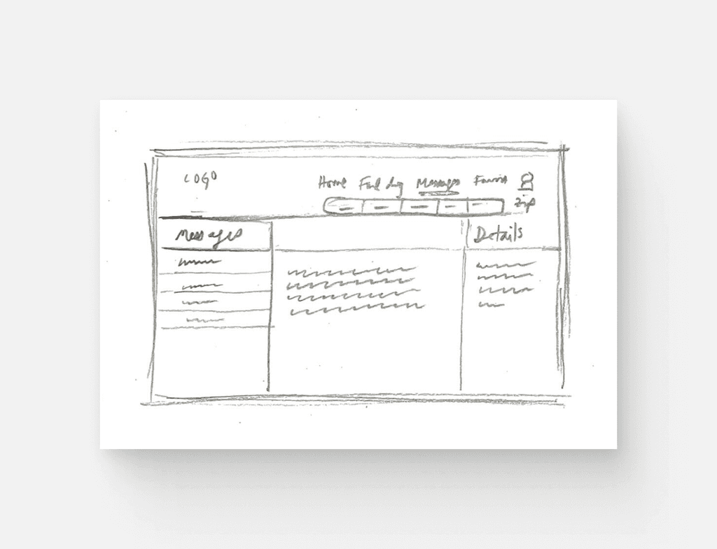
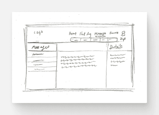
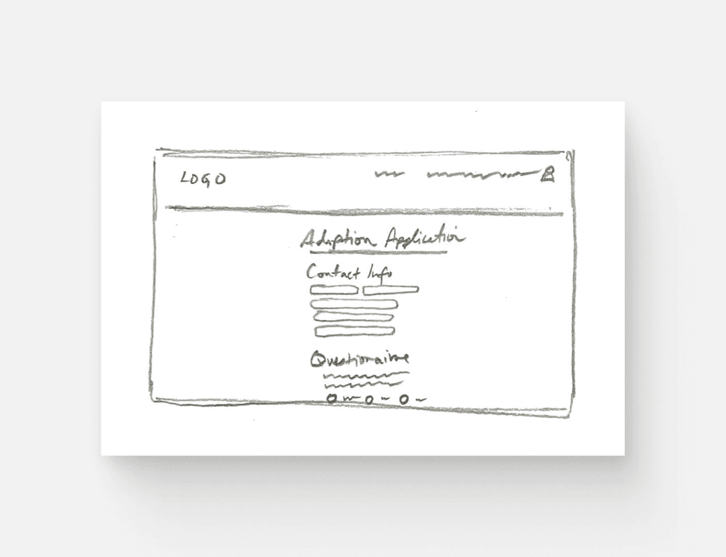
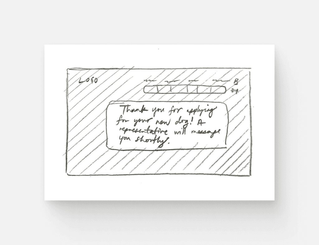
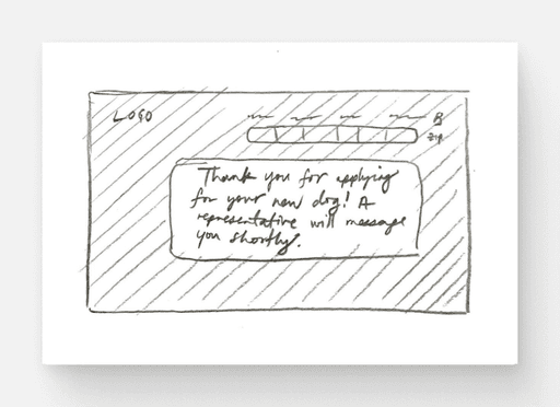
Sketching and wireframing allowed for rapid iteration and concept validation. These provided a low-fidelity, quick method for visualizing different design ideas and conceptualizing the user flow.
Home Page
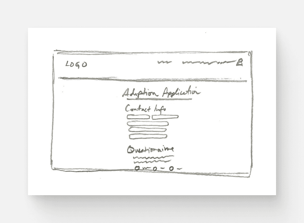
Adoption Application
Day 4 - Prototype
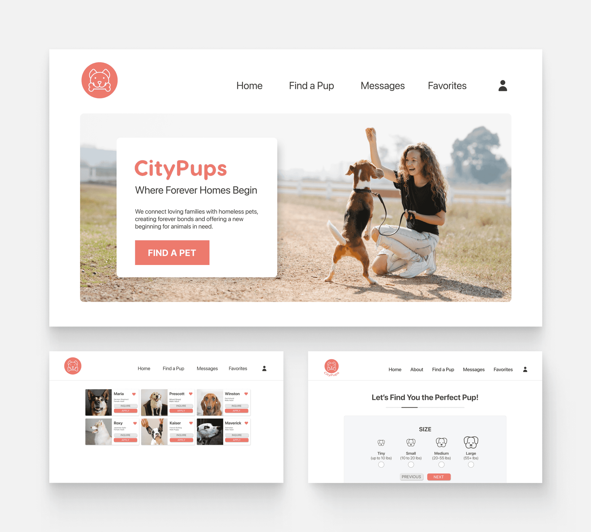
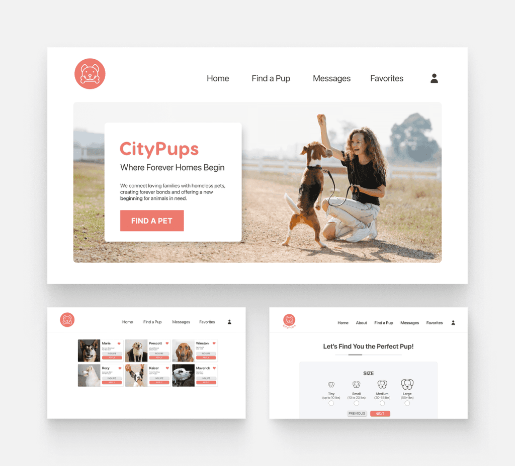
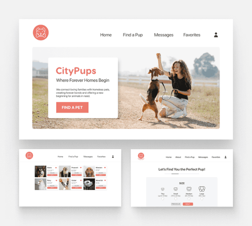
Transitioning from storyboard to prototype clarified which design elements were effective and which required further refinement. While the basic layout of my search page remained consistent, I adjusted the placement of certain buttons and text for a more intuitive UI.
I aimed for a lively and playful UI, resonating with the theme of pet adoptions. To maintain a gentle aesthetic, I rounded the edges of images, buttons, and text fields.
Search Results Page
I incorporated the logo's color into the primary CTA, "Apply," to maximize its prominence. I also introduced a sky blue, utilized for both the progress bar and the "Save Search" button. While my initial sketches overlooked details beneath the dog images (like name, breed, age), I recognized its significance for users' quick browsing.
Day 5 - Testing and Validating
Usability Test
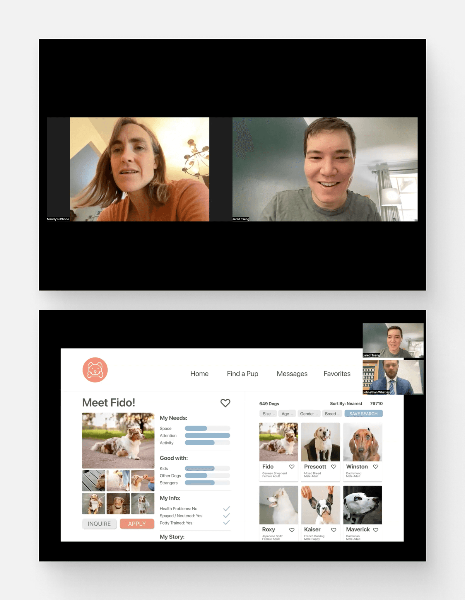
I conducted 5 usability tests with participants who live in cities of over 1 million residents and have either previously owned a dog or shown interest in owning one. This would be keeping in line with CityPup’s target customers. These tests were executed via Zoom using screen share.
Findings
Overall, most of the tasks were completed easily except one, the Alert task. The testing provided some great feedback, and the debriefing portion of the interview was especially helpful in helping me make a few important changes.
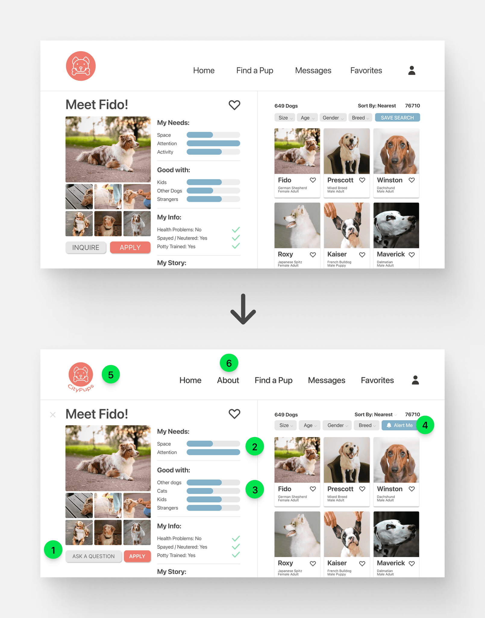
The vast majority of users struggled to complete the Alert Task, highlighting a significant design oversight on my part. The labeling of the "Save Search" button was misleading. While I intended for it to notify users when a match to their criteria was found, most interpreted it as a feature to resume their browsing from where they last stopped. This feedback underscores the need for more intuitive and clear button labeling to ensure user expectations align with the actual functionality.
Many users expressed that they were unsure of the difference between the “Inquire” and the “Apply” buttons within the Favorites page. They communicated that both imply initiating contact or expressing interest. I found that the difference between “Inquire” (seeking information) and “Apply” (desire to proceed) was too subtle of a distinction, and might not be immediately clear to everyone, potentially causing confusion or missteps.
Iterations
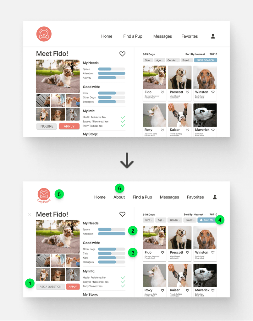
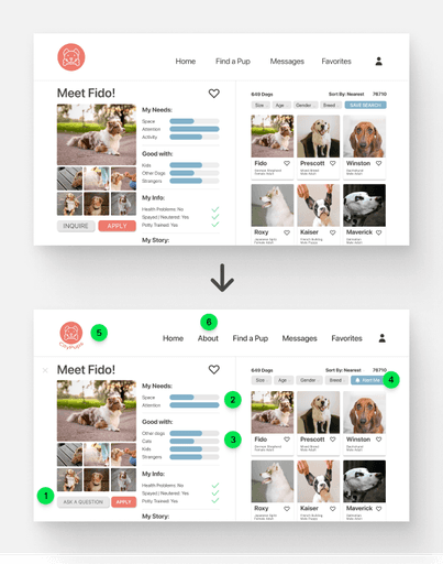
Clarified Inquiry: “Inquire” was renamed to “Ask a Question”. This would help to eliminate confusion with the “Apply” button.
Consolidated Needs: Space and Activity under the “My Needs” section were consolidated.
Expanded Categories: Cats were added as an additional category under the “Good with” section.
Button Clarity: The “Save Search” button was renamed to “Alert Me”. This would help to increase clarity of its functionality.
Brand Identity: The company name was added under the logo.
Additional Information: An “About” page was added, where users could find information about the company, pricing and process.
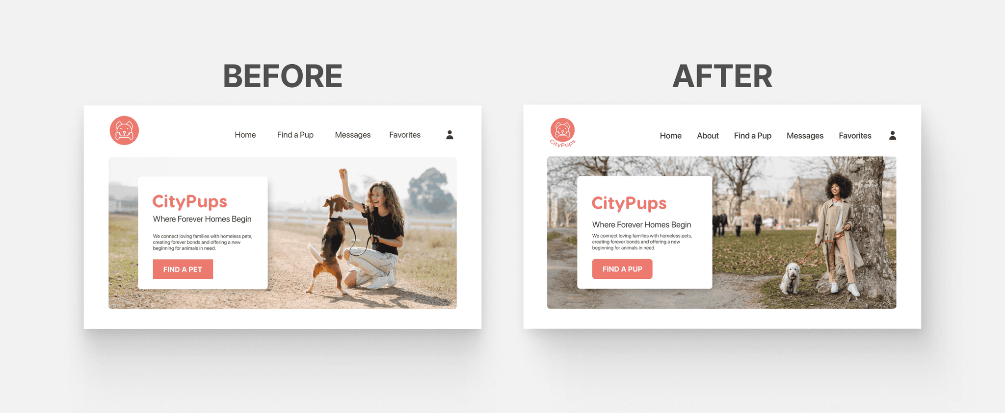
Focused Search: Changed "Find a Pet" to "Find a Pup" to reflect the site's exclusive focus on puppies.
Image Update: Swapped the hero image for one with a more distinct urban vibe, featuring a girl in a city park, to better align with the brand's identity.
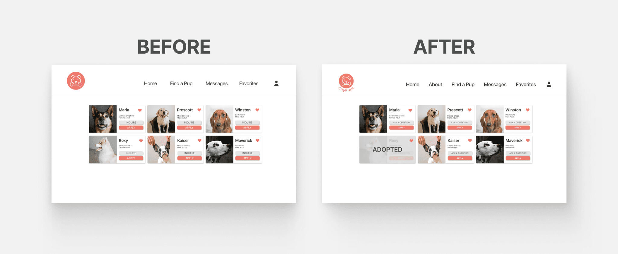
Adoption Status: Added an "Adopted" overlay to profiles in the favorites page to clearly indicate when a dog is no longer available.
Button Clarity: Changed "Inquire" to "Ask a Question" to more clearly differentiate it from "Apply" in order to better communicate their different purposes and avoid confusion.
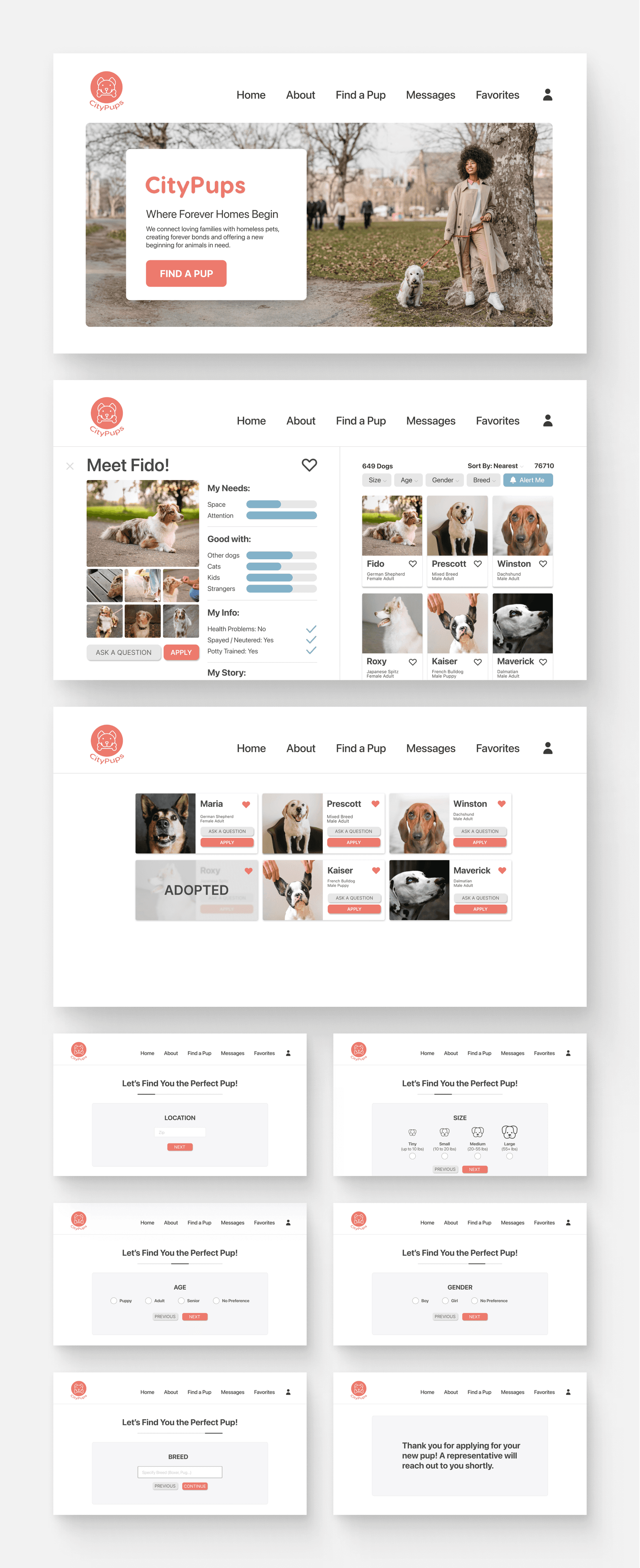
Final Design
Project Learnings
If I had more time dedicated to this project, my next steps would involve diving deeper into user feedback to refine and iterate on the design. Additionally, I would build out the About and Messages pages, ensuring comprehensive information and seamless communication for the user.
Next Steps
If I had more time dedicated to this project, my next steps would involve diving deeper into user feedback to refine and iterate on the design. Additionally, I would build out the About and Messages pages, ensuring comprehensive information and seamless communication for the user.
